SLIMLINE GUIDELINES
ersion
LOGO TYPES
Consistent usage of the
ertical V
V
Taupō District Council logo
is absolutely essential. Our
logo is representative of the
vibrant and energetic District
we live, work and play in,
therefore any variation of the
logo diminishes our visual
identity. The logo consists
of three elements: the ’circle
of life‘ macron, symbol and
the Taupō District Council
wordmark.
There are two variations of
the logo: a vertical version
ersion
and a horizontal version.
Never change any aspect of
ontal V
the typeface, symbol, colour,
or their relationships to the
logo. Always use approved
Horiz
electronic artwork. Usage
exceptions are noted in these
guidelines.
SPACING
Spacing
Minimum clear space has
been established to ensure
the corporate identity is not
crowded by typography or
graphic elements. To ensure
the identity stands out,
no other graphic element
or typography should be
positioned within the clear
space area. Wherever
possible, minimum clear
space should be increased.
The minimum amount of clear
space around the logo is
defined by the width of
‘ō’ on the end of ‘Taupō’ x 2.
Use this measurement to
Sizing
18mm
define a minimum clear space
18mm
around the logo at any given
size.
To prevent incorrect use of
the logo and also prevent
To ensure legibility for the vertical and horizontal logos, the minimum size of 18mm the width of the Taupō
District Council wordmark has been established.
it becoming illegible at
smaller sizes, minimum
When reproducing the vertical and horizontal format smaller than the 18mm format, the identity must not be
reproduced smaller than 12mm. This version should only be used on small items when absolutely necessary
size restrictions have been
(eg for reproduction on pens).
developed.


No colouring - strict black and white use only
No effects - bevel and emboss, inner shadows, etc
Use shift key when resizing
No rotation
No shear
No gradients
NO NO’S
Never scale, rotate, change
the colour of, add effects,
shear the logotype. This is not
within brand at all.


 PLACEMENT
Ensuring that you get the
FISHING
FISHING
right placement on posters or
flyers, you must use your best
COMPETITION
COMPETITION
judgement.
SEPTEMBER 21 - 30
SEPTEMBER 21 - 30
For example, we can see
TWO MILE BAY
TWO MILE BAY
that the left poster would
be a fishing competition
sponsored by Taupō District
Council, it also has enough
space around it so that it
wouldn’t be crowded by
the other logotypes on the
poster.
On the left, this is an example
of a council-run event, this
vertical logo can be used
or the horizontal type can
be used in the top left-hand
corner.
If the logo is to be used in
conjunction with another,
for example in a co-branded
event, please ensure the
minimum size and clearspace
are adhered to. Please use a
50% 1pt rule (line) to divide
the two logos as shown.
The co-branded logo needs
to be centred with the Taupō
District Council logo.


white logo over image without enough contrast
black logo over image without enough contrast
white logo over colour without enough contrast
DO’S AND DONT’S
Presenting the brand in a
consistent way is vital to
maintaining the brand. Please
follow these simple best
practise guidelines.
black logo over colour without enough contrast
 Ā, Ē, Ī, Ō, Ū, ā, ē, ī, ō and ū
TAUPŌ
Taupō District Council
Tūrangi
Māori
Ngāti Tūrangitukua
Ngāti Tūwharetoa
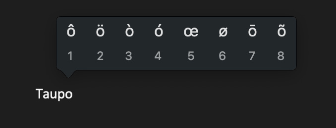
For Windows users, now you can easily enter a macronised
vowel by pressing ` (the key with ~ which is underneath Esc
at the top left of your keyboard) and then the vowel.
`a = ā
To enter a macronised capital vowel, press `, then hold down
shift and press the vowel, e.g.,
`A = Ā
Note you don’t have to hold down ` while you press the
vowel, just press ` then press the vowel.
Mac / Apple
For Mac users, in a document (though, not in Adobe
software) you can simply hold the key down you would like to
macronise and choose from the options given.
MACRON
If you are working in inDesign, you can do a Find and Replace.
For example, hit control + F
As the macron is a feature of
Find: Taupo
our logo, we need to use it
correctly and consistently.
Replace: Taupō
If you have any questions please call Amy Fowler
on 027 298 7632 or email afowler@Taupō.govt.nz