Usability Testing Feedback
Feedback
Where would you click for student
When viewing the first design (the design
accommodation?
without the Blackboard box):
Student feedback (4 May):
University Life
Apply for admission
I’d look for a search field
University life/admission
Apply for admission
Uni life
Unsure
Uni life
No idea – maybe apply for admission?
Apply for admission
Uni life
Apply for admission
Uni life
Apply for admission
Study?
Uni life or apply for admission
Uni life
Uni life or apply for admission
Uni life
Prospect feedback (10 May):
University Life
Services
Services
Don’t know
University Life (After scrol ing page
twice)
Apply for Admission (after a few scrol s)
Uni Life
Apply Admission
University Life
Services
Apply for admission?
University Life
University life or apply for admission
When viewing the second design first:
Student feedback (4 May):
Services
Apply for admission
Unsure
Al Tools
Services
Apply for admission
Prospect feedback (10 May):
Services
Services
Don’t know (After scrol ing a few times)
Services
Services
Don’t know
CareerHub?
Service/ Study
Don’t know (After reading al headers
careful y and scrol ing the page)
Search
Not sure (After a few scrol s, Oh Gosh.
Not sure)
Pay fees?
Pay fees
Services (After scrol ing a few times)
Where would you click to apply for a
When viewing the first design:
scholarship?
Student feedback (4 May):
Programmes and courses
Student Newsletter
Programmes and courses
Apply for admission
Study
Admission or Programmes and Courses
(depending on type of scholarship I was
looking for)
Apply for admission “or Study?… but
study doesn’t necessarily mean
scholarship…”
Apply for admission
Apply for admission
Apply for Admission
Unsure
Apply for admission
Unsure
Study
Apply for admission
Programmes and courses
Programmes and courses
Apply for admission
“Unsure but maybe apply for
admission? But it’s definitely not clear”.
Prospect feedback (10 May):
Programs and courses
I would not expect to get it. I don’t
know where I am going.
Programs and courses or apply for
admission
Programs and courses (maybe)
Admission
Don’t know
Apply for admission
Uni Life (I don’t need to apply)
Programs and courses
When viewing the second design first:
Student feedback (4 May):
Unsure
Study
Study
Apply for admission
Apply for admission
Study
Prospect feedback (10 May):
Study
Services?(Not sure)
Key Dates
Study
Study
CareerHub
MyDegree
Sorry nothing is prominent
No idea
Study
MyDegree
Study
Study
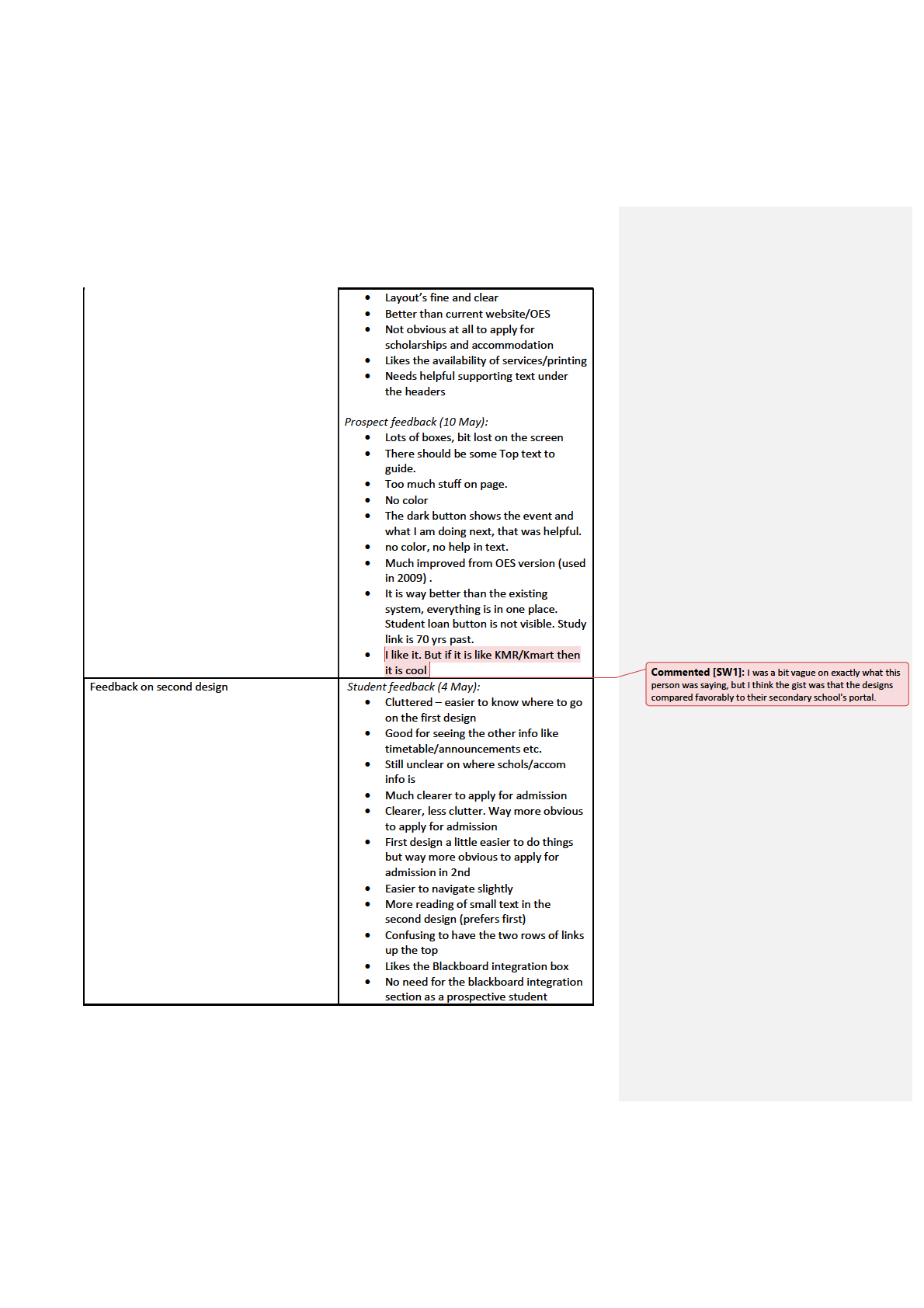
Feedback on first design
Student feedback (4 May):
Easy to read/accessible
More colours/graphics needed
Easier to navigate than the current
website/OES

Hard to find stuff quickly because it al
looks the same
More streamlined, eyes immediately
drawn to the Announcements section
Prospect feedback (10 May):
Design is not interactive
Respond to offer is not obvious.
Looks a lot easier than OES.
Scholarship and accomodation are not
evident
Apply for admission - Too smal text,
font top bar looks like check boxes
Accomodation was hard to find. Was
expecting text like - Future student or
something specific.
The search feature is missing.
Preference between First and Second Design
Student feedback (4 May):
First design is more useful as a
prospective student – info is more
obviously presented
Prefer second design
Prefer first design (but not majorly)
Second design much better.
First design is better
Prefer first
Prefer first
Prefer first design but second design
way more obvious for admission
Prefer the first
First one way better
Prefer first
First one much better
Second better
Prefer the clarity of the first one
Prefer second
Prefer the first
Prospect feedback (10 May):
First design is easy to navigate and
interact.
Prefer first design as everything is at
one place.
First design is much easier. Easy to see
everything at one place.
Mix of both design.
Prefer the first design
Design 1 – Easy to navigate and is
pretty good.
First design is better.
The first design is a bit overwhelming
The first design is a bit easy, however
there is no color.
Prefer second design
Prefer second design
The first design is good. Things are
specific.
Places where the student went wrong on the
Student feedback (4 May):
Admission application process
Clicked on Course Finder instead of
Respond to Offer (explained that they
thought they would need to choose
which courses they wanted)
Clicked on the Scholarships tab instead
of Respond to Offer (because of the tab
layout)
Prospect feedback (10 May):
Clicking on “Respond to Offer” was not
obvious (for 4 applicants.)
