
- if you want to read about
thoughts go to:
http://
.com/
He is a
services to agriculture
- I would not bother with him unless you feel the motivation too - it would give him oxygen to boast.
We'll deal with it - in time!
Best
-------- Forwarded Message --------
Subject:Fwd: Advice Please
Date:Sun, 10 Mar 2019 12:07:31 +1300
From:
To:
@gmail.com>
I have had time to consider these two websites and have taken advice from colleagues. I remain skeptical
(unconvinced of the AGW hypothesis)
1) Hansen’s land based temp graphs seem to change over time - why? This reminds me of the similar mystery
surrounding NIWAs 7SS?
2) I have read much about the Hockey Stick saga - I am not inclined therefore to take the site 'real-climate’ too
seriously.
3) I understand that the models are tuned to the land-based temp data. Sounds like poor science to me.
Lastly I am deeply disappointed with your recent suggestions in the NZ Herald that the press should not give any
space to ‘deniers’ - "Freedom of Speech”
PS I did not take too long for Santer's gold standard to be exposed for what it is!.
Regards
Dear
I recommend that you carefully read
http://www.realclimate.org/index.php/archives/2018/06/30-years-after-hansens-testimony/
and
http://www.realclimate.org/index.php/climate-model-projections-compared-to-observations
These discussions cover what you need to know
Chz


"The only antidote to pseudo-science is science itself"
Carl Sagan
Virus-free. www.avast.com


between the measurements and the models.”
7. You refute that claim of divergence by citing an article, “Tropospheric temperature trends: History of
an ongoing controversy” (Thorne et al.), published online in November 2010.
8. But Dr Spencer made those comparisons in April and June 2013 using satellite data from 1979–2012
and model projections for 1975–2025. Dr Spencer notes the comparisons are “courtesy of John Christy
and based upon data from the KNMI Climate Explorer.” The KNMI Climate Explorer is at
http://climexp.knmi.nl/start.cgi?id=someone@somewhere.
9. So the article you cite to refute Spencer’s claim of divergence, which article was concerned with
reconciling differences in vertical tropospheric temperature ranges rather than between surface and
satellite versions of the lower tropospheric temperature record, cites the IPCC AR4 published in 2007—
six years earlier.
10. Thorne et al.’s supporting references to Douglass et al. (2008) and Santer et al. (2008) are, similarly,
to papers that antedate Spencer’s graphs and data. We do not understand your references.
11. In any case, the progression of global temperatures since 2010 has extended the divergence beyond
any previous reconciliation.
12. Incidentally, it seems we may be talking about slightly different graphs—the graph you describe as
from Dr
does not match the graph he was sent, though they bear some resemblance—you describe
tropical models against radiosonde data but Dr
sent him an earlier graph with global models
versus satellite data. I mention this so we may both be aware of it, but it doesn’t matter.
13. What does matter is the increasing divergence in global temperature evolution between model
output and observation. That is evident in several of Dr Spencer’s graphs. Similar divergence appears in
other sources, including the Climate Lab Book at http://www.climate-lab-book.ac.uk/2013/comparing-
observations-and-simulations-again/ funded by the National Centre for Atmospheric Science in the UK
and, concerning the tropics, the IPCC WGI Fifth Assessment Report, Second Order Draft, Chapter 9,
appears to verify a divergence when it says:
9.4.1.3.2 Upper tropospheric temperature trends.
‘Nevertheless, almost all model ensemble members show a warming trend in both LT and
MT larger than observational estimates (McKitrick et al., 2010; Po-Chedley and Fu, 2012;
Santer et al., 2012).’
‘In summary, there is high confidence (robust evidence although only medium
agreement) that most, though not all, CMIP3 and CMIP5 models overestimate the
warming trend in the tropical troposphere during the satellite period 1979–2011.’
14. The conclusions of McKitrick et al. (2010) state: “Over the interval 1979 to 2009, model-projected
temperature trends are two to four times larger than observed trends in both the lower and mid-
troposphere and the differences are statistically significant at the 99% level.” Which is a robust
indication that the GCMs have yet to develop high predictive skill.
15. J. Knight, J.J. Kennedy, C. Folland, G. Harris, G.S. Jones, M. Palmer, D. Parker, A. Scaife, and P. Stott,
2009: Do global temperature trends over the last decade falsify climate predictions? [in “State of the
Climate in 2008”]. Bull. Amer. Meteor. Soc., 90 (8), S1–S196, said: “The simulations rule out (at the 95%
level) zero trends for intervals of 15 yr or more, suggesting that an observed absence of warming of this
duration is needed to create a discrepancy with the expected present-day warming rate.” That period
has now been exceeded, which by this statement invalidates the models.
16. We note that your response to Dr
fails to address the divergence described, and thus neither
explains nor excuses the poor performance of the models. This betrays the natural instinct when noting
in these graphs the clear disparity between models and observations—which is to ask: why are they so
different for so long?
17. It may be that we do not know, which means the models cause the disparity and thus fail the test of
reality.
18. Please forgive the bluntness of this inquiry, but there’s nothing else for it: Do you acknowledge the
divergence that is evident in the above and can you account for it? If you cannot account for it, does the
divergence change your advice to the government?
19. The evidence of a problem here is plain, unambiguous and easy to understand, even without
scientific knowledge, because the graph contains everything required to be known. The problem is a
lack of credibility in the predictions of global warming because they have failed.
20. We note the continuing lengthy stasis in temperature rise this millenium. One might claim 16 years
without significant warming, depending on the choice of dataset and error margin, or 17, 18, 20 or even
25 years.
21. We note the EU has abandoned its commitments to reducing its carbon footprint, approved
fracking for natural gas and plans new coal-fired power stations as higher costs of fuel and power lose
business to the US. The strongest incentive for this retreat is the knowledge that global warming no
longer looks dangerous.
22. Do not let us watch our chief climate scientist ignore an opportunity to address the obvious. The
divergence between models and reality is simple to understand and is quickly becoming common
knowledge because the graph is so simple.
23. This is an opportunity to announce possibly the greatest good news story of modern times—that
global warming has paused and the “greatest danger ever to face humanity” has faded. There is no
doubt of this, because global warming has failed to rise irresistibly higher under record amounts of
atmospheric carbon dioxide. If we are in luck, global warming is even over, though time will tell.
24. This is very good news. We can reassign our budgets to do other vital work and relieve suffering,
while our politicians can search out new things to tax but leave our energy supplies unencumbered for
our improvement.
Yours faithfully,

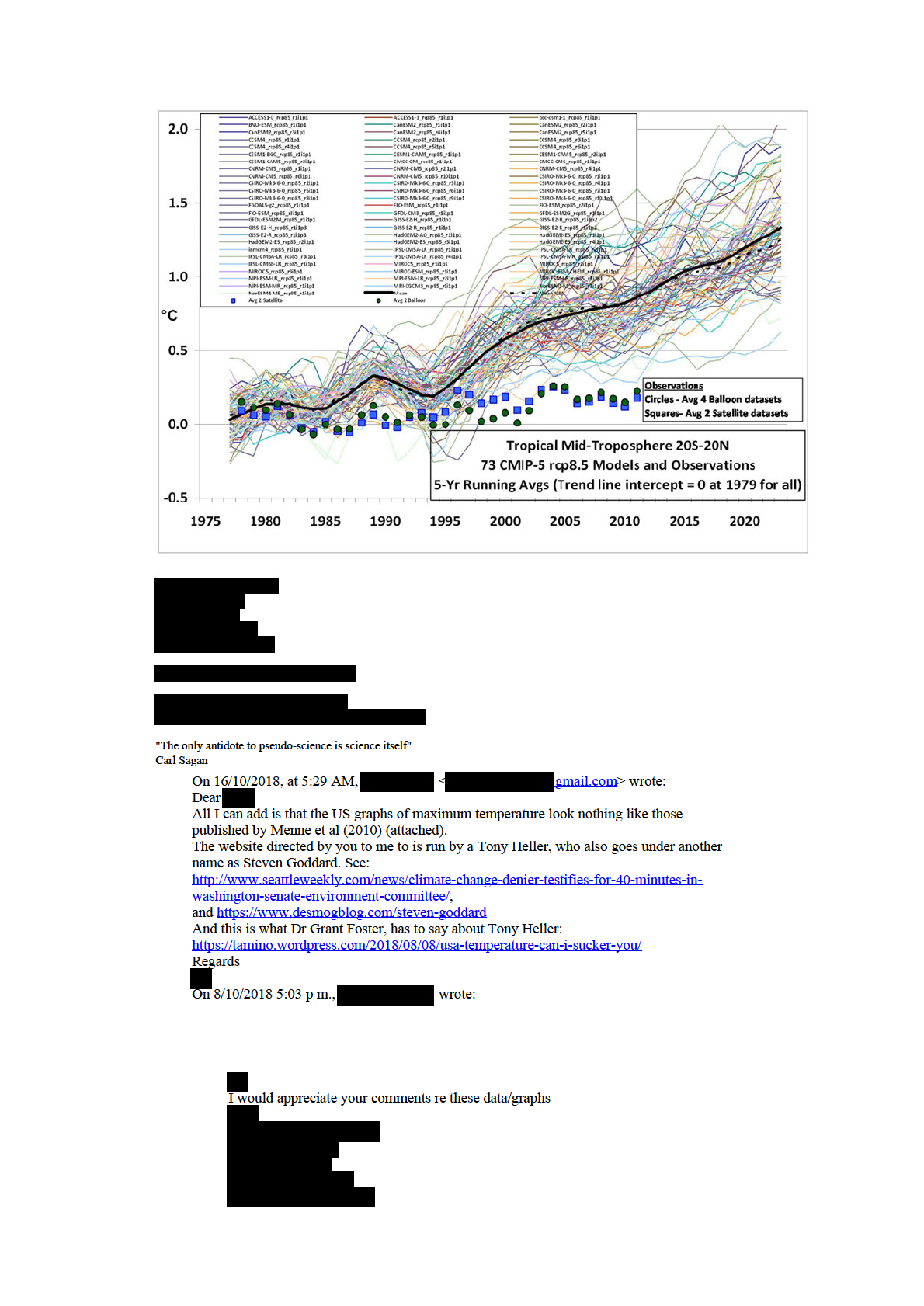
In this case, the models and observations have been plotted so that their respective 1979-2012 trend lines all
intersect in 1979, which we believe is the most meaningful way to simultaneously plot the models’ results for
comparison to the observations.
In my opinion, the day of reckoning has arrived. The modellers and the IPCC have willingly ignored the
evidence for low climate sensitivity for many years, despite the fact that some of us have shown that simply
confusing cause and effect when examining cloud and temperature variations can totally mislead you on cloud
feedbacks (e.g. Spencer & Braswell, 2010). The discrepancy between models and observations is not a new
issue…just one that is becoming more glaring over time.
It will be interesting to see how all of this plays out in the coming years. I frankly don’t see how the IPCC can
keep claiming that the models are “not inconsistent with” the observations. Any sane person can see otherwise.
If the observations in the above graph were on the UPPER (warm) side of the models, do you really
believe the modelers would not be falling all over themselves to see how much additional surface
warming they could get their models to produce?
Hundreds of millions of dollars that have gone into the expensive climate modelling enterprise has all but
destroyed governmental funding of research into natural sources of climate change. For years the modelers
have maintained that there is no such thing as natural climate change…yet they now, ironically, have to invoke
natural climate forces to explain why surface warming has essentially stopped in the last 15 years!
Forgive me if I sound frustrated, but we scientists who still believe that climate change can also be naturally
forced have been virtually cut out of funding and publication by the ‘humans-cause-everything-bad-that-
happens’ juggernaut. The public who funds their work will not stand for their willful blindness much longer.
Posted in Blog Article | 213 Comments ?
Global Microwave SST Update for May 2013: -0.01 deg. C
June 5th, 2013
The satellite-based microwave global average sea surface temperature (SST) update for May 2013 is -0.01
deg. C, relative to the 2003-2006 average (click for large version):


The anomalies are computed relative to only 2003-2006 because those years were relatively free of El Nino
and La Nina activity, which if included would cause temperature anomaly artifacts in other years. Thus, these
anomalies cannot be directly compared to, say, the Reynolds anomalies which extend back to the early 1980s.
Nevertheless, they should be useful for monitoring signs of recent ocean surface warming, which appears to
have stalled since at least the early 2000′s. (For those who also track our lower tropospheric temperature
["LT"] anomalies, these SST anomalies average about 0.20 deg. C cooler than LT since mid-2002, but there is
considerable variability in that number).
The SST retrievals come from Remote Sensing Systems (RSS), and are based upon passive microwave
observations of the ocean surface from AMSR-E on NASA’s Aqua satellite, the TRMM satellite Microwave
Imager (TMI), and WindSat. While TMI has operated continuously through the time period (but only over the
tropics and subtropics), AMSR-E stopped nominal operation in October 2011, after which Remote Sensing
Systems patched in SST data from WindSat. These various satellite SST datasets have been carefully
intercalibrated by RSS.
Despite the relatively short period of record, I consider this dataset to be the most accurate depiction of SST
variability over the last 10+ years due to these instruments’ relative insensitivity to contamination by clouds
and aerosols at 6.9 GHz and 10.7 GHz.
Posted in Blog Article | 18 Comments ?
FLASH! Global warming causes record-wide tornadoes!
June 4th, 2013
Just thought I’d try to be the first the make the connection between the record wide (2.6 miles) EF5 tornado
near Oklahoma City last Friday and Global Warming. (Click the above photo for the full story).
Of course, as I have discussed before, the missing ingredient in tornadoes is usually a cool air mass nearby. If
warm humid air was the missing ingredient, the tropics would be filled with tornadic thunderstorms…which is
not the case.
Posted in Blog Article | 9 Comments ?
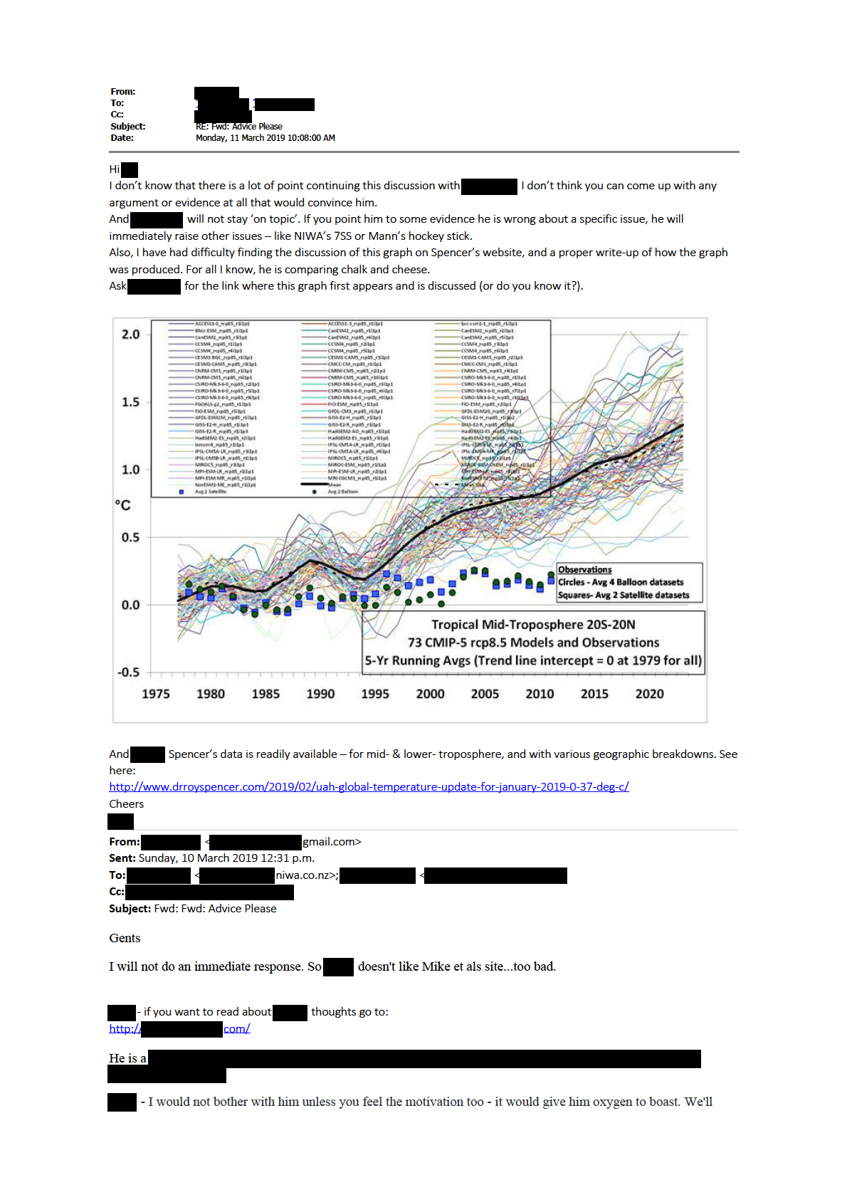
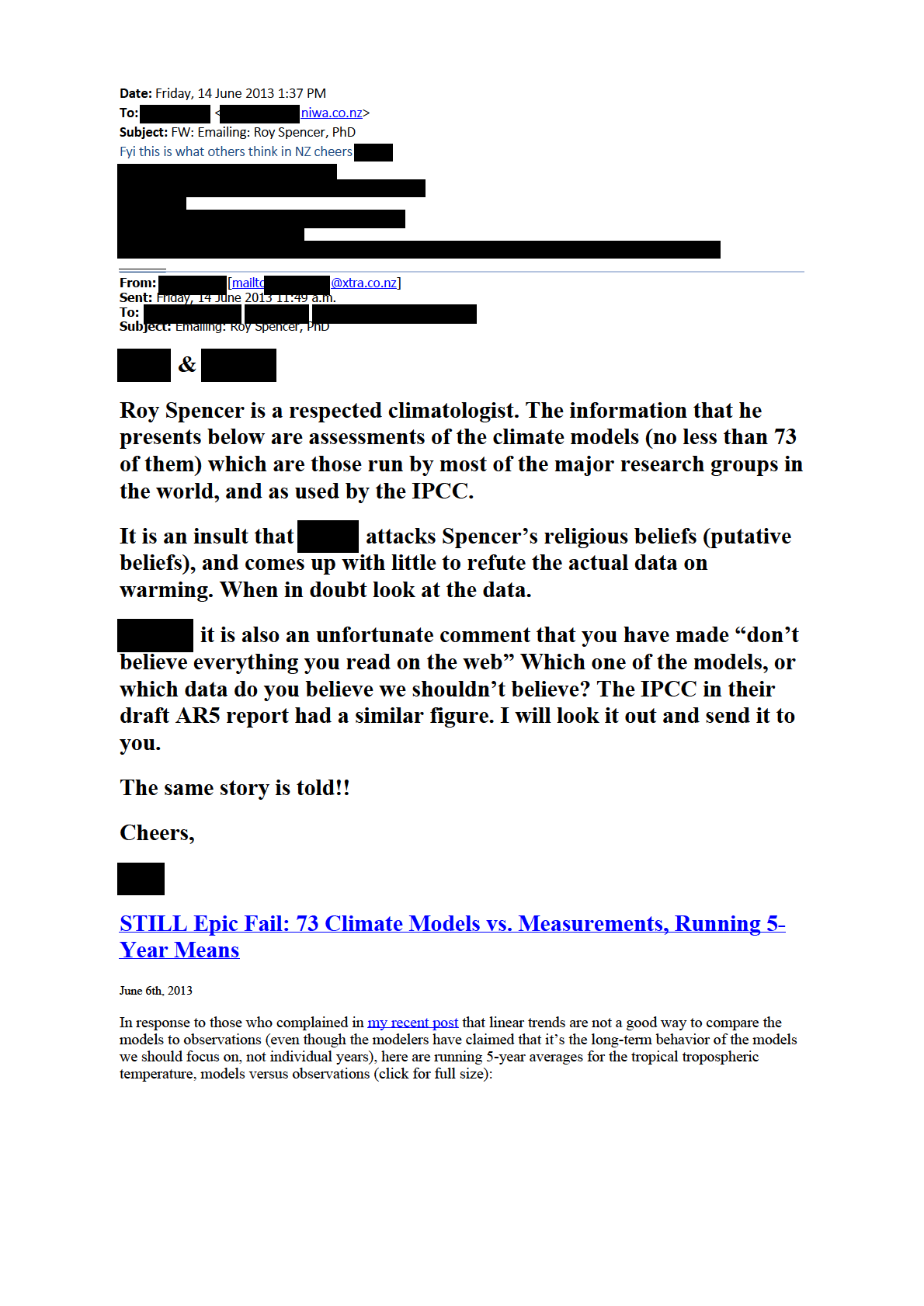
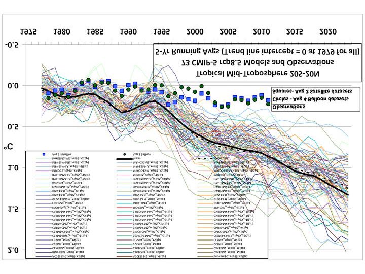
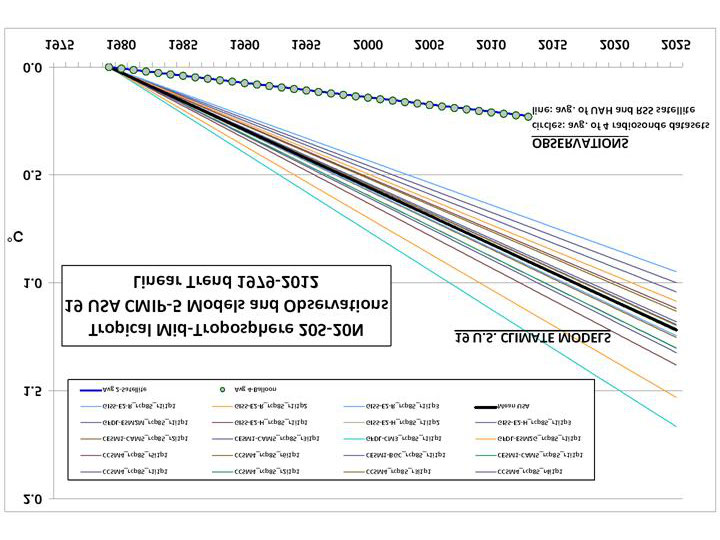
EPIC FAIL: 73 Climate Models vs. Observations for Tropical
Tropospheric Temperature
June 4th, 2013
Courtesy of John Christy, a comparison between 73 CMIP5 models (archived at the KNMI Climate Explorer
website) and observations for the tropical bulk tropospheric temperature (aka “MT”) since 1979 (click for
large version):
Rather than a spaghetti plot of the models’ individual years, we just plotted the linear temperature trend from
each model and the observations for the period 1979-2012.
Note that the observations (which coincidentally give virtually identical trends) come from two very different
observational systems: 4 radiosonde datasets, and 2 satellite datasets (UAH and RSS).
If we restrict the comparison to the 19 models produced by only U.S. research centers, the models are more
tightly clustered:

Now, in what universe do the above results not represent an epic failure for the models?
I continue to suspect that the main source of disagreement is that the models’ positive feedbacks are too
strong…and possibly of even the wrong sign.
The lack of a tropical upper tropospheric hotspot in the observations is the main reason for the disconnect in
the above plots, and as I have been pointing out this is probably rooted in differences in water vapor feedback.
The models exhibit strongly positive water vapor feedback, which ends up causing a strong upper tropospheric
warming response (the “hot spot”), while the observation’s lack of a hot spot would be consistent with little
water vapor feedback.
Posted in Blog Article | 125 Comments ?
UAH Global Temperature Update for May 2013: +0.07 deg. C
June 4th, 2013
Our Version 5.5 global average lower tropospheric temperature (LT) anomaly for May, 2013 is +0.07 deg. C,
down a little from +0.10 deg. C in April (click for large version):
The global, hemispheric, and tropical LT anomalies from the 30-year (1981-2010) average for the last 17
months are:
YR MON GLOBAL NH SH TROPICS
2012 1 -0.134 -0.065 -0.203 -0.256
2012 2 -0.135 +0.018 -0.289 -0.320
2012 3 +0.051 +0.119 -0.017 -0.238
2012 4 +0.232 +0.351 +0.114 -0.242
2012 5 +0.179 +0.337 +0.021 -0.098
2012 6 +0.235 +0.370 +0.101 -0.019
2012 7 +0.130 +0.256 +0.003 +0.142
2012 8 +0.208 +0.214 +0.202 +0.062
2012 9 +0.339 +0.350 +0.327 +0.153
2012 10 +0.333 +0.306 +0.361 +0.109
2012 11 +0.282 +0.299 +0.265 +0.172
2012 12 +0.206 +0.148 +0.264 +0.138
2013 1 +0.504 +0.555 +0.453 +0.371
2013 2 +0.175 +0.368 -0.018 +0.168
2013 3 +0.183 +0.329 +0.038 +0.226
2013 4 +0.103 +0.120 +0.086 +0.167
2013 5 +0.074 +0.162 -0.013 +0.113
Posted in Blog Article | 17 Comments ?
Diurnal Trends in Dewpoint Averaged over the U.S. Since 1973
June 4th, 2013
The Integrated Surface Hourly (ISH) weather data I have described before allows one to examine how various
surface weather elements have changed as a function of time of day. (The ISH data volume is very large and it
is not a trivial task to decode and analyze many years of it.) Three-hourly synoptic weather observations have
been made at many U.S. weather stations for at least 40 years: 1973 seems to be the year when the number of
stations reached a fairly large number, and so that is the year my analyses begin with.
I have previously mentioned that ISH surface data shows U.S. warming since 1973 (primarily a winter
phenomenon, due to unusually cold winters in the 1970s), and a curious decrease in surface wind speed.
Here I’d like to point out another curiosity: while the dewpoint temperature has increased in step with air
temperature at 12Z (around 6 a m.), it has increased much less so at other times of the day, and even decreased
slightly at 21Z (around 3 p m.), during the period 1973-2012:
Assuming that dewpoint sensor design changes over the years have not introduced a diurnally varying
measurement bias, a natural question arises: what would cause afternoon dewpoints to not rise in the face of
warming both day and night? (Note I have not made any adjustments for sensor changes, siting changes, or
urbanization in the above plot).
The first explanation that comes to my mind is a change in daytime convective mixing of the troposphere. If
there is a slight increase in the depth of convective mixing, then drier (lower dewpoint) air aloft will be mixed
down toward the surface. Such a change would probably also be associated with deeper moist convection and
probably an increase in heavy rain rates, evidence for which has been claimed elsewhere (e.g. here). The
implication of such a change for climate feedbacks is complicated and not obvious.
A second possibility is a long-term decrease in middle and upper tropospheric humidity, and no increase in
convective mixing. In this case, daytime mixing would bring down the lower humidity air to the surface from
the same altitude as before. There is some radiosonde evidence for such a decrease in absolute humidities
above the turbulent boundary layer (e.g. Paltridge, 2009). If real, such a decrease might well result in negative
water vapor feedback, since a small decrease in mid- and upper tropospheric humidity can have a natural
radiative cooling effect which outweighs the warming from a larger increase in lower tropospheric humidity
(e.g. Spencer and Braswell, 1997; Miskolczi, 2010). Of course, all climate models exhibit strongly positive
water vapor feedback, approximately doubling the direct warming effect of increasing CO2 alone.
I don’t have a strong opinion on which of these possibilities (sensor problems, deeper convection, or a dryer
mid- and upper troposphere) is more likely. Too little information, too many questions.
Posted in Blog Article | 8 Comments ?
On the Lighter Side: HAARP Tornado Vortex Clouds Attack!
May 17th, 2013
I get scattered e-mails from a lot of people, but I get routine updates from someone named “Ol’fisherman” on
the sinister weather modifying effects of the HAARP facility in Alaska. The Wikipedia page describing the
research facility even has a section on Conspiracy Theories.
Now, if you go to Google images and search on “lenticular clouds” you will find MANY photos similar to this
one, which Ol’fisherman sent to me:

Here is the description he provided of this photo (I am not making this up):
“
These are HAARP generated Vortex Clouds. The exact type formation as seen in NORWAY HE
LASER photos. The Energy here came down from Stratosphere Bounce from Earthbound HAARP
Machine Array in AK. The Particle Physics as seen in Photo say’s the Proton to Neutron Interaction
Threshold has not been reached yet at elevations shown. But when the spiral cone gets closer to Earth’s
Teller Currents, and it will; the E- GAP is bridged Electrically, and the Record Tornado size and
Speeds being reported, are the Result!!”
Now let’s see how long it takes for someone to post a comment that I shouldn’t be poking fun, since I’m a
believer in the greenhouse effect which is obviously a “conspiracy” of misguided physicists.
Posted in Blog Article | 59 Comments ?
A Simple Experiment to Show How Cool Objects Can Keep Warm
Objects Warmer Still
May 16th, 2013
The standard explanation of the “greenhouse effect” is that it keeps the surface of the Earth warmer than it
would otherwise be, through infrared radiation downwelling from the atmosphere. Even though this IR
radiation is being emitted at a lower temperature than the surface, it actually keeps the surface warmer. Some
people have trouble with this explanation, claiming it violates one or more laws of thermodynamics.
As I have discussed
ad nauseum, the temperature of a heated object is always determined by rates of energy
gain and energy loss, and that energy loss is almost always a function of the object’s cooler surroundings.
Whether one views the greenhouse effect as extra infrared energy gained by the surface from the cooler
atmosphere, or just a reduced rate of infrared energy loss by the surface to the atmosphere and outer space, the
effect is the same: a surface temperature increase.
I’ve been toying with a few different ways to demonstrate this effect with a simple experimental setup using
household items. Apparently the IR thermal imager, which I showed directly measures the surface temperature
effects of varying levels of downwelling IR sky radiation on a microbolometer within the instrument, is not
sufficient for some people.
So, I’ve come up with the following simple setup, and if I carry it out, I want predictions from readers here of
what will happen to the temperatures of the 2 heated metal plates:
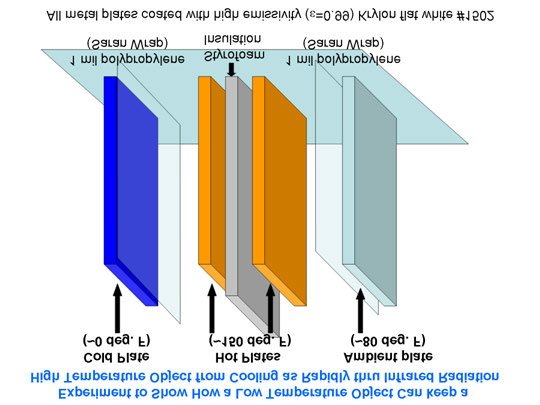
The two metal plates will be heated in the oven to the same temperature, then placed vertically next to each
other, but separated by a sheet of Styrofoam. Obviously, the plates will cool, partly by conduction to the
surrounding air. The above cartoon is just a rough approximation of the setup. I will probably have the ends of
the heated plates covered by Styrofoam as well, to help reduce conductive heat loss.
But the plates also cool from infrared energy loss. So, I will expose one of the heated plates to a third plate that
I will have chilled to at least 0 deg. F in the deep freeze.
Finally, I will expose the other heated plate to a 4th plate just at the ambient air temperature, say 80 deg. F.
Very thin sheets of polypropylene (Saran wrap), which are nearly transparent to IR radiation, will be used to
minimize the movement of air currents between the heated plates and their cooler counterparts. All 4 plates
will be coated with high emissivity (0.99) Krylon flat white #1502 paint.
My question is this:
Will the two hot plates cool at different rates? I predict the heated plate exposed to the
ambient (80 deg. F) plate will consistently stay warmer than the other heated plate exposed to the chilled (0
deg. F) plate.
Of course, if one waits long enough, all plates will come to the same temperature, since the hot plates are not
actively heated (like the climate system is by the Sun) and the cold plate is not actively chilled (which would
partly mimic the infrared energy sink of deep space).
The main point is that cooler objects which surround heated objects affect the heated objects temperature. As
far as I can tell, this is a universal truth, with examples all around you. I find it mind boggling that some
people do not accept it. (For anyone tempted to say, “But a cooler star doesn’t make a hotter star hotter still”,
stay tuned for an experiment Anthony Watts has been working on).
I will monitor the plates’ temperatures with my FLIR i7 thermal imager. Because there is still a small amount
of reflection from the heated plates (0.01) the thermal imager must be pointed at an angle which will not pick
up reflection from the cooler plates, which would bias the results. Another option would be to buy 2
inexpensive car thermometers with a remote display.
Again, I want to hear some predictions:
Will the hot plates cool at different rates? If so, do you see a
mechanism other than infrared energy transfer which will explain the different rates of cooling?
If you see pitfalls in the experimental setup, then feel free to point them out and suggest how to mitigate them.
UPDATE: I will be periodically checking in and deleting comments which do not directly address the above
experiment and what results it will produce…unfortunately, the comments are already getting sidetracked.
Posted in Blog Article | 524 Comments ?
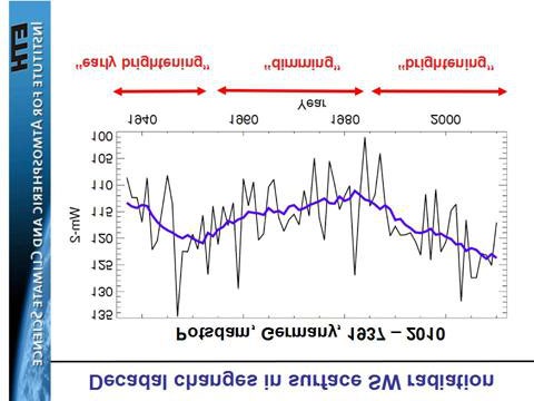
Surface Radiation Budget: Where’s the Proof?

May 13th, 2013
I’ve had several requests for evidence of the hundreds of watts of downwelling infrared sky radiation. I’ve
mentioned that there are many surface radiation budget observation sites around the world (but few in oceanic
areas for obvious reasons). I found this presentation summarizing comparisons that Martin Wild and co-
investigators have made between these measurements and the latest CMIP5 climate models at the observation
sites. It is quite informative, and includes their version of the Kiehl-Trenberth energy budget diagram to fit
better to the surface radiative energy budget observations.
For example, here’s a comparison for downward IR flux at the surface between the HadCM3 model and 41
Baseline Surface Radiation Network (BSRN) stations:
In this case, the model underestimates the downwelling sky radiation by about 9 W/m2. But for something
supposedly “non-existent”, there is remarkable agreement between the average model behavior and the
observations for this huge (300-400 W/m2) component of the surface energy budget.
What is MOST interesting to me is the existence of multidecadal changes in sunlight (downwelling shortwave)
reaching the surface, as some of the sites have such records extending back to the 1930s. For example, changes
at Potsdam, Germany look somewhat like how global temperatures have changed:
The authors admit this is behavior not seen in the climate models. I suppose scientists like Trenberth or
Dessler would claim these changes are positive cloud feedback in response to surface temperature changes.
But the continually neglected possibility is that they have causation reversed: that natural changes in cloud
cover have caused the temperature changes, and cloud feedbacks are in reality negative rather than positive.
And this is where I believe we should be spending our research time in the global warming debate. Not
arguing over the existence of something (“backradiation”) which is routinely measured at dozens of
observation sites around the world.
Posted in Blog Article | 175 Comments ?
Time for the Slayers to Put Up or Shut Up
May 10th, 2013
I have allowed the Sky Dragon Slayers to post hundreds of comments here containing their views of how the
climate system works (or maybe I should say how they think it doesn’t work).
As far as I can tell, their central non-traditional view seems to be that the atmosphere does not have so-called
“greenhouse gases” that emit thermal infrared radiation downward. A variation on this theme is that even if
those gases exist, they emit energy at the same rate they absorb, and so have no net effect on temperature.
I have repeatedly addressed these views and why they are false.
As far as the Slayer’s alternative explanations go, I have addressed why atmospheric pressure cannot explain
surface temperature. The atmospheric adiabatic lapse rate describes how temperature *changes* with height
for an air parcel displaced vertically, it does not tell you what the temperature,
per se, will be.
If it was just a matter of air pressure, why is the stratosphere virtually the same temperature over its entire
depth, despite spanning a factor of 100x in pressure, from about ~2 mb to ~200 mb?
For the adiabatic lapse rate to exist in the real atmosphere, there must be “convective instability”, which
requires BOTH lower atmospheric heating AND upper atmospheric cooling. But the upper atmosphere cannot
cool unless greenhouse gases are present! Without greenhouse gases, the atmosphere would slowly approach
an isothermal state through thermal conduction with a temperature close to the surface temperature, and
convection would then be impossible.
In other words, without the “greenhouse effect”, there would be no decrease in atmospheric temperature with
height, and no convection. The existence of weather thus depends upon the greenhouse effect to destabilize the
atmosphere.
Put Up…
The Slayers have had ample opportunity to answer my challenge: take your ideas, put them into an alternative
time-dependent model for surface temperature, and run it from any initial state and see if it ends up with a
realistic temperature.
Determining the actual temperature at any altitude requires computing rates of energy gain and energy loss. I
spent only an hour to provide a simple version of such a model based upon traditional physics, which produces
the observed average surface temperature of the Earth. It is the same physics used in many weather prediction
models every day, physics which if not included would cause those models forecasts to quickly diverge away
from how the real atmosphere behaves on average.
Surely, of the 200 scientists and meteorologists the Slayers claim to have at their disposal, they can produce
something similar.
Here’s the equation I used for surface temperature change with time, and it assumes a single atmospheric layer
with an average infrared effective emissivity of 0.9, based upon the Kiehl-Trenberth global average energy
budget diagram.
I also have a version of the model which adds the time rate of change of the bulk atmospheric temperature, too,
based upon the Kiehl-Trenberth diagram. These are very simple models…usually in modeling the atmosphere
and ocean are divided up into many mutually interacting layers, but I’m trying to keep it simple here.
…or Shut Up
The Slayers have ample opportunity to post comments here outlining their views, often dominating the
bandwidth, and those comments will remain for posterity.
But my blog is no longer going to provide them a platform for their unsupported pseudo-scientific claims…
they can post their cult science on their own blog. They have taken far too much of my time, which would be
better spent thinking about the more obvious shortcomings of global warming theory.
If and when they answer my challenge to provide a quantitative model of surface temperature change, I might
change my mind. But they must first provide a time-dependent model like that above which involves energy
gain and energy loss terms, which is the only way to compute the temperature of something from theory.
Those energy gain and loss terms must be consistent with experimental observations, and (of course) the
physical units of the terms must all be consistent.
But I don’t see how they can ever do that, because they will ignore the hundreds of watts of downward emitted
IR radiation from the sky, an energy flux which is routinely observed with a variety of instrumentation, and
explained with well-established theories of radiative transfer and laboratory evidence of the infrared
absorption characteristics of various gases.
If anyone challenges me to provide justification for anything I’ve stated above, well, I assume you know how
to use Google. There is abundant information out there…go educate yourself.
Posted in Blog Article | 606 Comments ?
This email message and any attachment(s) is intended solely for the addressee(s)
named above. The information it contains is confidential and may be legally
privileged. Unauthorised use of the message, or the information it contains,
may be unlawful. If yo
ved this message by mistake please call the
sender immediately on
or notify us by return email and erase the
original message and a
Thank you.
The
accepts no responsibility for changes
made
ments after transmission from the office.
--
Please consider the environment before printing this email.
NIWA is the trading name of the National Institute of Water & Atmospheric Research Ltd.
This email message and any attachment(s) is intended solely for the addressee(s)
named above. The information it contains is confidential and may be legally
privileged. Unauthorised use of the message, or the information it contains,
may be unlawful. If yo
ved this message by mistake please call the
sender immediately on
or notify us by return email and erase the
original message and a
Thank you.
The
accepts no responsibility for changes
mad
ments after transmission from the office.
 beliefs), and comes up with little to refute the actual data on
warming. When in doubt look at the data.
it is also an unfortunate comment that you have made “don’t
believe everything you read on the web” Which one of the models, or
which data do you believe we shouldn’t believe? The IPCC in their
draft AR5 report had a similar figure. I will look it out and send it to
you.
beliefs), and comes up with little to refute the actual data on
warming. When in doubt look at the data.
it is also an unfortunate comment that you have made “don’t
believe everything you read on the web” Which one of the models, or
which data do you believe we shouldn’t believe? The IPCC in their
draft AR5 report had a similar figure. I will look it out and send it to
you.
The same story is told!!
Cheers,
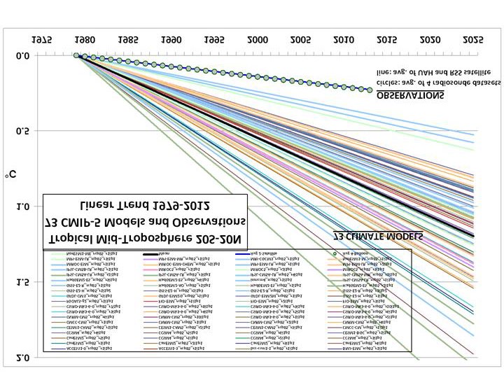
STILL Epic Fail: 73 Climate Models vs. Measurements, Running 5-
Year Means
June 6th, 2013
In response to those who complained in my recent post that linear trends are not a good way to compare the
models to observations (even though the modelers have claimed that it’s the long-term behavior of the models
we should focus on, not individual years), here are running 5-year averages for the tropical tropospheric
temperature, models versus observations (click for full size):
In this case, the models and observations have been plotted so that their respective 1979-2012 trend lines all
intersect in 1979, which we believe is the most meaningful way to simultaneously plot the models’ results for
comparison to the observations.
In my opinion, the day of reckoning has arrived. The modellers and the IPCC have willingly ignored the
evidence for low climate sensitivity for many years, despite the fact that some of us have shown that simply
confusing cause and effect when examining cloud and temperature variations can totally mislead you on cloud
feedbacks (e.g. Spencer & Braswell, 2010). The discrepancy between models and observations is not a new
issue…just one that is becoming more glaring over time.
It will be interesting to see how all of this plays out in the coming years. I frankly don’t see how the IPCC can
keep claiming that the models are “not inconsistent with” the observations. Any sane person can see otherwise.
If the observations in the above graph were on the UPPER (warm) side of the models, do you really
believe the modelers would not be falling all over themselves to see how much additional surface
warming they could get their models to produce?
Hundreds of millions of dollars that have gone into the expensive climate modelling enterprise has all but
destroyed governmental funding of research into natural sources of climate change. For years the modelers
have maintained that there is no such thing as natural climate change…yet they now, ironically, have to invoke
natural climate forces to explain why surface warming has essentially stopped in the last 15 years!
Forgive me if I sound frustrated, but we scientists who still believe that climate change can also be naturally
forced have been virtually cut out of funding and publication by the ‘humans-cause-everything-bad-that-
happens’ juggernaut. The public who funds their work will not stand for their willful blindness much longer.
Posted in Blog Article | 213 Comments ?
Global Microwave SST Update for May 2013: -0.01 deg. C
June 5th, 2013
The satellite-based microwave global average sea surface temperature (SST) update for May 2013 is -0.01
deg. C, relative to the 2003-2006 average (click for large version):
The anomalies are computed relative to only 2003-2006 because those years were relatively free of El Nino
and La Nina activity, which if included would cause temperature anomaly artifacts in other years. Thus, these
anomalies cannot be directly compared to, say, the Reynolds anomalies which extend back to the early 1980s.
Nevertheless, they should be useful for monitoring signs of recent ocean surface warming, which appears to
have stalled since at least the early 2000′s. (For those who also track our lower tropospheric temperature
["LT"] anomalies, these SST anomalies average about 0.20 deg. C cooler than LT since mid-2002, but there is
considerable variability in that number).
The SST retrievals come from Remote Sensing Systems (RSS), and are based upon passive microwave
observations of the ocean surface from AMSR-E on NASA’s Aqua satellite, the TRMM satellite Microwave
Imager (TMI), and WindSat. While TMI has operated continuously through the time period (but only over the
tropics and subtropics), AMSR-E stopped nominal operation in October 2011, after which Remote Sensing
Systems patched in SST data from WindSat. These various satellite SST datasets have been carefully
intercalibrated by RSS.
Despite the relatively short period of record, I consider this dataset to be the most accurate depiction of SST
variability over the last 10+ years due to these instruments’ relative insensitivity to contamination by clouds

and aerosols at 6.9 GHz and 10.7 GHz.
Posted in Blog Article | 18 Comments ?
FLASH! Global warming causes record-wide tornadoes!
June 4th, 2013
Just thought I’d try to be the first the make the connection between the record wide (2.6 miles) EF5 tornado
near Oklahoma City last Friday and Global Warming. (Click the above photo for the full story).
Of course, as I have discussed before, the missing ingredient in tornadoes is usually a cool air mass nearby. If
warm humid air was the missing ingredient, the tropics would be filled with tornadic thunderstorms…which is
not the case.
Posted in Blog Article | 9 Comments ?
EPIC FAIL: 73 Climate Models vs. Observations for Tropical
Tropospheric Temperature
June 4th, 2013
Courtesy of John Christy, a comparison between 73 CMIP5 models (archived at the KNMI Climate Explorer
website) and observations for the tropical bulk tropospheric temperature (aka “MT”) since 1979 (click for
large version):

Rather than a spaghetti plot of the models’ individual years, we just plotted the linear temperature trend from
each model and the observations for the period 1979-2012.
Note that the observations (which coincidentally give virtually identical trends) come from two very different
observational systems: 4 radiosonde datasets, and 2 satellite datasets (UAH and RSS).
If we restrict the comparison to the 19 models produced by only U.S. research centers, the models are more
tightly clustered:
Now, in what universe do the above results not represent an epic failure for the models?
I continue to suspect that the main source of disagreement is that the models’ positive feedbacks are too
strong…and possibly of even the wrong sign.
The lack of a tropical upper tropospheric hotspot in the observations is the main reason for the disconnect in
the above plots, and as I have been pointing out this is probably rooted in differences in water vapor feedback.
The models exhibit strongly positive water vapor feedback, which ends up causing a strong upper tropospheric
warming response (the “hot spot”), while the observation’s lack of a hot spot would be consistent with little
water vapor feedback.
Posted in Blog Article | 125 Comments ?
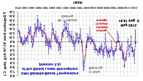
UAH Global Temperature Update for May 2013: +0.07 deg. C
June 4th, 2013
Our Version 5.5 global average lower tropospheric temperature (LT) anomaly for May, 2013 is +0.07 deg. C,
down a little from +0.10 deg. C in April (click for large version):

The global, hemispheric, and tropical LT anomalies from the 30-year (1981-2010) average for the last 17
months are:
YR MON GLOBAL NH SH TROPICS
2012 1 -0.134 -0.065 -0.203 -0.256
2012 2 -0.135 +0.018 -0.289 -0.320
2012 3 +0.051 +0.119 -0.017 -0.238
2012 4 +0.232 +0.351 +0.114 -0.242
2012 5 +0.179 +0.337 +0.021 -0.098
2012 6 +0.235 +0.370 +0.101 -0.019
2012 7 +0.130 +0.256 +0.003 +0.142
2012 8 +0.208 +0.214 +0.202 +0.062
2012 9 +0.339 +0.350 +0.327 +0.153
2012 10 +0.333 +0.306 +0.361 +0.109
2012 11 +0.282 +0.299 +0.265 +0.172
2012 12 +0.206 +0.148 +0.264 +0.138
2013 1 +0.504 +0.555 +0.453 +0.371
2013 2 +0.175 +0.368 -0.018 +0.168
2013 3 +0.183 +0.329 +0.038 +0.226
2013 4 +0.103 +0.120 +0.086 +0.167
2013 5 +0.074 +0.162 -0.013 +0.113
Posted in Blog Article | 17 Comments ?
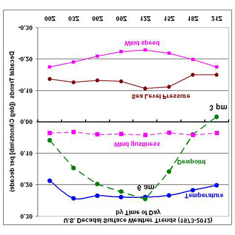
Diurnal Trends in Dewpoint Averaged over the U.S. Since 1973
June 4th, 2013
The Integrated Surface Hourly (ISH) weather data I have described before allows one to examine how various
surface weather elements have changed as a function of time of day. (The ISH data volume is very large and it
is not a trivial task to decode and analyze many years of it.) Three-hourly synoptic weather observations have
been made at many U.S. weather stations for at least 40 years: 1973 seems to be the year when the number of
stations reached a fairly large number, and so that is the year my analyses begin with.
I have previously mentioned that ISH surface data shows U.S. warming since 1973 (primarily a winter
phenomenon, due to unusually cold winters in the 1970s), and a curious decrease in surface wind speed.
Here I’d like to point out another curiosity: while the dewpoint temperature has increased in step with air
temperature at 12Z (around 6 a m.), it has increased much less so at other times of the day, and even decreased
slightly at 21Z (around 3 p m.), during the period 1973-2012:

Assuming that dewpoint sensor design changes over the years have not introduced a diurnally varying
measurement bias, a natural question arises: what would cause afternoon dewpoints to not rise in the face of
warming both day and night? (Note I have not made any adjustments for sensor changes, siting changes, or
urbanization in the above plot).
The first explanation that comes to my mind is a change in daytime convective mixing of the troposphere. If
there is a slight increase in the depth of convective mixing, then drier (lower dewpoint) air aloft will be mixed
down toward the surface. Such a change would probably also be associated with deeper moist convection and
probably an increase in heavy rain rates, evidence for which has been claimed elsewhere (e.g. here). The
implication of such a change for climate feedbacks is complicated and not obvious.
A second possibility is a long-term decrease in middle and upper tropospheric humidity, and no increase in
convective mixing. In this case, daytime mixing would bring down the lower humidity air to the surface from
the same altitude as before. There is some radiosonde evidence for such a decrease in absolute humidities
above the turbulent boundary layer (e.g. Paltridge, 2009). If real, such a decrease might well result in negative
water vapor feedback, since a small decrease in mid- and upper tropospheric humidity can have a natural
radiative cooling effect which outweighs the warming from a larger increase in lower tropospheric humidity
(e.g. Spencer and Braswell, 1997; Miskolczi, 2010). Of course, all climate models exhibit strongly positive
water vapor feedback, approximately doubling the direct warming effect of increasing CO2 alone.
I don’t have a strong opinion on which of these possibilities (sensor problems, deeper convection, or a dryer
mid- and upper troposphere) is more likely. Too little information, too many questions.
Posted in Blog Article | 8 Comments ?
On the Lighter Side: HAARP Tornado Vortex Clouds Attack!
May 17th, 2013
I get scattered e-mails from a lot of people, but I get routine updates from someone named “Ol’fisherman” on
the sinister weather modifying effects of the HAARP facility in Alaska. The Wikipedia page describing the
research facility even has a section on Conspiracy Theories.
Now, if you go to Google images and search on “lenticular clouds” you will find MANY photos similar to this
one, which Ol’fisherman sent to me:

Here is the description he provided of this photo (I am not making this up):
“
These are HAARP generated Vortex Clouds. The exact type formation as seen in NORWAY HE
LASER photos. The Energy here came down from Stratosphere Bounce from Earthbound HAARP
Machine Array in AK. The Particle Physics as seen in Photo say’s the Proton to Neutron Interaction
Threshold has not been reached yet at elevations shown. But when the spiral cone gets closer to Earth’s
Teller Currents, and it will; the E- GAP is bridged Electrically, and the Record Tornado size and
Speeds being reported, are the Result!!”
Now let’s see how long it takes for someone to post a comment that I shouldn’t be poking fun, since I’m a
believer in the greenhouse effect which is obviously a “conspiracy” of misguided physicists.
Posted in Blog Article | 59 Comments ?
A Simple Experiment to Show How Cool Objects Can Keep Warm
Objects Warmer Still
May 16th, 2013
The standard explanation of the “greenhouse effect” is that it keeps the surface of the Earth warmer than it
would otherwise be, through infrared radiation downwelling from the atmosphere. Even though this IR
radiation is being emitted at a lower temperature than the surface, it actually keeps the surface warmer. Some
people have trouble with this explanation, claiming it violates one or more laws of thermodynamics.
As I have discussed
ad nauseum, the temperature of a heated object is always determined by rates of energy
gain and energy loss, and that energy loss is almost always a function of the object’s cooler surroundings.
Whether one views the greenhouse effect as extra infrared energy gained by the surface from the cooler
atmosphere, or just a reduced rate of infrared energy loss by the surface to the atmosphere and outer space, the
effect is the same: a surface temperature increase.
I’ve been toying with a few different ways to demonstrate this effect with a simple experimental setup using
household items. Apparently the IR thermal imager, which I showed directly measures the surface temperature
effects of varying levels of downwelling IR sky radiation on a microbolometer within the instrument, is not
sufficient for some people.
So, I’ve come up with the following simple setup, and if I carry it out, I want predictions from readers here of
what will happen to the temperatures of the 2 heated metal plates:

The two metal plates will be heated in the oven to the same temperature, then placed vertically next to each
other, but separated by a sheet of Styrofoam. Obviously, the plates will cool, partly by conduction to the
surrounding air. The above cartoon is just a rough approximation of the setup. I will probably have the ends of
the heated plates covered by Styrofoam as well, to help reduce conductive heat loss.
But the plates also cool from infrared energy loss. So, I will expose one of the heated plates to a third plate that
I will have chilled to at least 0 deg. F in the deep freeze.
Finally, I will expose the other heated plate to a 4th plate just at the ambient air temperature, say 80 deg. F.
Very thin sheets of polypropylene (Saran wrap), which are nearly transparent to IR radiation, will be used to
minimize the movement of air currents between the heated plates and their cooler counterparts. All 4 plates
will be coated with high emissivity (0.99) Krylon flat white #1502 paint.
My question is this:
Will the two hot plates cool at different rates? I predict the heated plate exposed to the
ambient (80 deg. F) plate will consistently stay warmer than the other heated plate exposed to the chilled (0
deg. F) plate.
Of course, if one waits long enough, all plates will come to the same temperature, since the hot plates are not
actively heated (like the climate system is by the Sun) and the cold plate is not actively chilled (which would
partly mimic the infrared energy sink of deep space).
The main point is that cooler objects which surround heated objects affect the heated objects temperature. As
far as I can tell, this is a universal truth, with examples all around you. I find it mind boggling that some
people do not accept it. (For anyone tempted to say, “But a cooler star doesn’t make a hotter star hotter still”,
stay tuned for an experiment Anthony Watts has been working on).
I will monitor the plates’ temperatures with my FLIR i7 thermal imager. Because there is still a small amount
of reflection from the heated plates (0.01) the thermal imager must be pointed at an angle which will not pick
up reflection from the cooler plates, which would bias the results. Another option would be to buy 2
inexpensive car thermometers with a remote display.
Again, I want to hear some predictions:
Will the hot plates cool at different rates? If so, do you see a
mechanism other than infrared energy transfer which will explain the different rates of cooling?
If you see pitfalls in the experimental setup, then feel free to point them out and suggest how to mitigate them.
UPDATE: I will be periodically checking in and deleting comments which do not directly address the above
experiment and what results it will produce…unfortunately, the comments are already getting sidetracked.
Posted in Blog Article | 524 Comments ?
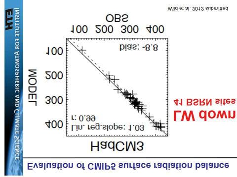
Surface Radiation Budget: Where’s the Proof?

May 13th, 2013
I’ve had several requests for evidence of the hundreds of watts of downwelling infrared sky radiation. I’ve
mentioned that there are many surface radiation budget observation sites around the world (but few in oceanic
areas for obvious reasons). I found this presentation summarizing comparisons that Martin Wild and co-
investigators have made between these measurements and the latest CMIP5 climate models at the observation
sites. It is quite informative, and includes their version of the Kiehl-Trenberth energy budget diagram to fit
better to the surface radiative energy budget observations.
For example, here’s a comparison for downward IR flux at the surface between the HadCM3 model and 41
Baseline Surface Radiation Network (BSRN) stations:
In this case, the model underestimates the downwelling sky radiation by about 9 W/m2. But for something
supposedly “non-existent”, there is remarkable agreement between the average model behavior and the
observations for this huge (300-400 W/m2) component of the surface energy budget.
What is MOST interesting to me is the existence of multidecadal changes in sunlight (downwelling shortwave)
reaching the surface, as some of the sites have such records extending back to the 1930s. For example, changes
at Potsdam, Germany look somewhat like how global temperatures have changed:
The authors admit this is behavior not seen in the climate models. I suppose scientists like Trenberth or
Dessler would claim these changes are positive cloud feedback in response to surface temperature changes.
But the continually neglected possibility is that they have causation reversed: that natural changes in cloud
cover have caused the temperature changes, and cloud feedbacks are in reality negative rather than positive.
And this is where I believe we should be spending our research time in the global warming debate. Not
arguing over the existence of something (“backradiation”) which is routinely measured at dozens of
observation sites around the world.
Posted in Blog Article | 175 Comments ?
Time for the Slayers to Put Up or Shut Up
May 10th, 2013
I have allowed the Sky Dragon Slayers to post hundreds of comments here containing their views of how the
climate system works (or maybe I should say how they think it doesn’t work).
As far as I can tell, their central non-traditional view seems to be that the atmosphere does not have so-called
“greenhouse gases” that emit thermal infrared radiation downward. A variation on this theme is that even if
those gases exist, they emit energy at the same rate they absorb, and so have no net effect on temperature.
I have repeatedly addressed these views and why they are false.
As far as the Slayer’s alternative explanations go, I have addressed why atmospheric pressure cannot explain
surface temperature. The atmospheric adiabatic lapse rate describes how temperature *changes* with height
for an air parcel displaced vertically, it does not tell you what the temperature,
per se, will be.
If it was just a matter of air pressure, why is the stratosphere virtually the same temperature over its entire
depth, despite spanning a factor of 100x in pressure, from about ~2 mb to ~200 mb?
For the adiabatic lapse rate to exist in the real atmosphere, there must be “convective instability”, which
requires BOTH lower atmospheric heating AND upper atmospheric cooling. But the upper atmosphere cannot
cool unless greenhouse gases are present! Without greenhouse gases, the atmosphere would slowly approach
an isothermal state through thermal conduction with a temperature close to the surface temperature, and
convection would then be impossible.
In other words, without the “greenhouse effect”, there would be no decrease in atmospheric temperature with
height, and no convection. The existence of weather thus depends upon the greenhouse effect to destabilize the
atmosphere.
Put Up…
The Slayers have had ample opportunity to answer my challenge: take your ideas, put them into an alternative
time-dependent model for surface temperature, and run it from any initial state and see if it ends up with a
realistic temperature.
Determining the actual temperature at any altitude requires computing rates of energy gain and energy loss. I
spent only an hour to provide a simple version of such a model based upon traditional physics, which produces
the observed average surface temperature of the Earth. It is the same physics used in many weather prediction
models every day, physics which if not included would cause those models forecasts to quickly diverge away
from how the real atmosphere behaves on average.
Surely, of the 200 scientists and meteorologists the Slayers claim to have at their disposal, they can produce
something similar.
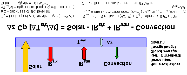
Here’s the equation I used for surface temperature change with time, and it assumes a single atmospheric layer
with an average infrared effective emissivity of 0.9, based upon the Kiehl-Trenberth global average energy
budget diagram.

I also have a version of the model which adds the time rate of change of the bulk atmospheric temperature, too,
based upon the Kiehl-Trenberth diagram. These are very simple models…usually in modeling the atmosphere
and ocean are divided up into many mutually interacting layers, but I’m trying to keep it simple here.
…or Shut Up
The Slayers have ample opportunity to post comments here outlining their views, often dominating the
bandwidth, and those comments will remain for posterity.
But my blog is no longer going to provide them a platform for their unsupported pseudo-scientific claims…
they can post their cult science on their own blog. They have taken far too much of my time, which would be
better spent thinking about the more obvious shortcomings of global warming theory.
If and when they answer my challenge to provide a quantitative model of surface temperature change, I might
change my mind. But they must first provide a time-dependent model like that above which involves energy
gain and energy loss terms, which is the only way to compute the temperature of something from theory.
Those energy gain and loss terms must be consistent with experimental observations, and (of course) the
physical units of the terms must all be consistent.
But I don’t see how they can ever do that, because they will ignore the hundreds of watts of downward emitted
IR radiation from the sky, an energy flux which is routinely observed with a variety of instrumentation, and
explained with well-established theories of radiative transfer and laboratory evidence of the infrared
absorption characteristics of various gases.
If anyone challenges me to provide justification for anything I’ve stated above, well, I assume you know how
to use Google. There is abundant information out there…go educate yourself.
Posted in Blog Article | 606 Comments ?
This email message and any attachment(s) is intended solely for the addressee(s)
named above. The information it contains is confidential and may be legally
privileged. Unauthorised use of the message, or the information it contains,
may be unlawful. If yo
ved this message by mistake please call the
sender immediately on
or notify us by return email and erase the
original message and a
Thank you.
The
accepts no responsibility for changes
made
ments after transmission from the office.
Document Outline