Updated 29 June 2017
Metro Brand
Identity Guide.
Working together to provide Christchurch public transport.
Page 1
Metro Brand Identity Guide
Brand
Identity.
Metro is a business made up of many
This document is intended to be a guide
partners working together to provide
as to how our brand functions and how it
essential transport services. With so many
is best utilised.
unique individuals working together it is
These guidelines are designed to help
vital that we express a single, compelling,
everybody involved in the production of
voice in everything we do. A unified brand
our communications. They also play an
identity helps us to achieve this.
important role in building our brand.
The combination of the logo, visuals,
Thank you for taking the time to read and
and words we use to describe the Metro
understand them.
business enables us to establish and
maintain a clear, unified brand identity,
We are all guardians of the Metro brand.
both for internal communications and
when we are talking with our customers
and business partners.
Page 2
Metro Brand Identity Guide
Brand
Values.
The following brand values were established at two brand
workshops with operational partners.
1. CARE
2. RELIABLE
3. GENUINE
4. FOCUSSED
Here to help.
We’ll get you there.
Real people. Real friendly.
On the same journey.
Looking after passengers is
You can rely on us to take
We are the genuine article and
We’re keen to share a common
a big responsibility which we
you places in good time for
we love making peoples’ day.
vision of where we’re going
take very seriously.
a fair price.
Our voice isn’t trying to be
and who we want to be.
Our messaging should focus
At a time when Christchurch
cool or on trend. We are real
The most important element
on the benefits. If we bring
roads are being heavily
and self aware. Happy to poke
is that we share this voice
these to the fore, it backs up
impacted by congestion,
fun at ourselves before others
together. That we all
the idea that we care and are
this message is strong.
do. We are the genuine friend
understand who we are and
here to help.
Take the bus and get there
that you can rely on because
how we are communicating
safer and cheaper.
we have your back.
with the people of
Christchurch.
Page 3
Metro Brand Identity Guide
Tone of
Voice.
From the values, we developed a Metro tone of voice.
Simple.
Honest.
Positive.
Consistent.
People get it straight away.
We feel we are getting it
The majority of our users like
Part of being on the same
The language is direct and not
straight without any spin.
the Metro service. Presenting
journey together is to be
complicated. Simple can also
Another way of saying this is
our messaging in a bright, bold sure we are consistent with
be construed as BOLD.
GENUINE.
and positive context is a way
our voice and messaging
The imagery uses bold single
We show that we are well
of making them feel valued.
across all channels both
colours. The images are
aware of who we are and how
Giving credibility to their
internal and external.
uncluttered.
people perceive us. We don’t
travel decision by highlighting
all the positive benefits they
The messaging is single
try to be anyone we are not.
are receiving as a result of
minded. We don’t run the
Honest people are folk we can
choosing us, and hopefully
risk that anyone feels “dumb”
rely upon, as there doesn’t
giving them a smile.
by not getting it and feel
seem to be any agendas.
excluded or angry.
They say it like it is.
Page 4
Metro Brand Identity Guide
Brand
Platform.
Colours.
Imagery.
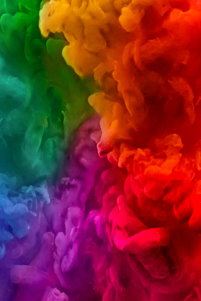
The bold High Frequency Line colours
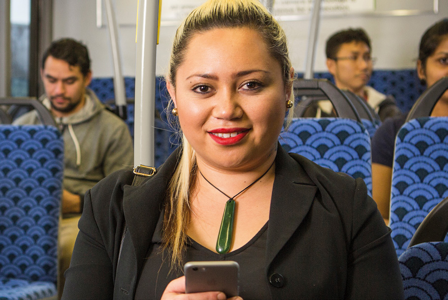
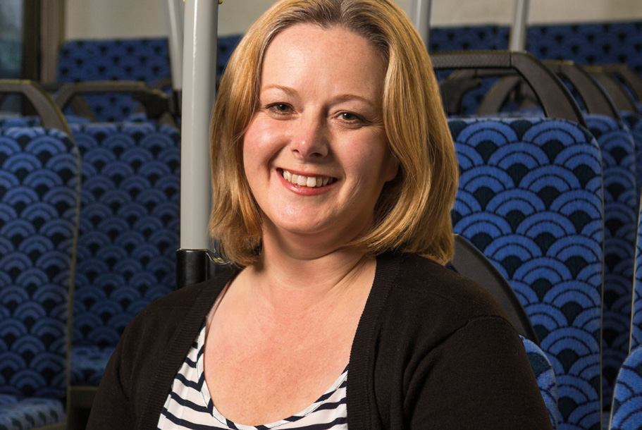
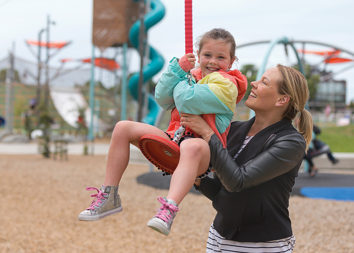
Everyday real people (actual or potential
become the primary campaign colours
customers), finding the positive, looking
and are used individually as needed to
on the bright side and/or illustrated
support messages and bring these
positive icons e.g. the smile.
colours to life.
Icons.
ToV.
Recognisable icons of approval, moving
Simple, Honest, Positive, Consistent.
forward, doing well.
All communication will focus on ‘looking
The strapline – Way to go.
on the bright side’, shining the light on
the positive. Where possible we will bring
Way to go informs our tone of voice
the Metrocard in to the communications
and can be used in everyday language
as the ‘helpful hero’.
as well as a sign-off to communications.
Way to go is an informal thank you and
affirmation with ultimate flexibility.
Page 5
Metro Brand Identity Guide
Key
Messages.
A city that flows, flourishes.
Catching the bus means a more
Catching a bus means we play a part in
Buses these days are modern, clean and
sustainable city, more room to walk
creating the city we want.
comfortable.
around town – it’s the pedestrian friendly,
Catching a bus just once a week means
There are five quality, accessible high
open space and clean environment we
one less car journey – less traffic
frequency Metro Lines that take people
asked for in Share an Idea.
congestion.
where they want to go.
Streets full of people mean lots of footfall
Catching a bus gives you more time to
Catching the bus could be an option on
for the shops and businesses they pass
yourself.
some days.
by; streets full of cars mean congested
through-traffic.
Catching a bus reduces driving stress
Public transport supports a modern,
and stress looking for a car park.
vibrant and sustainable city.
Public transport reduces congestion to
keep freight moving so the economy
can thrive.
Page 6
Metro Brand Identity Guide
Key
Language.
Standard sign-off.
Correct CASE use for key words.
Metrocard
Short:
Metro
(title case, one word)
Way to go.
(title case)
Metroinfo
You’re making a positive difference
Metro Network
(title case, one word)
to our city.
(title case)
Top-up, top-ups
(hyphenated)
Long:
High Frequency Lines
Each time you get on board with us,
(title case)
03 366 88 55
you’re making a positive difference
Metro Lines
(no brackets, spaces as shown)
to our city – way to go.
(title case)
metroinfo.co.nz
(lower case, www. omitted)
Page 7
Metro Brand Identity Guide
Brand
Elements.
In this section:
Logo
Colours
Typeface
Footer lock-up
Footer strapline
Image gradient
Inline graphics
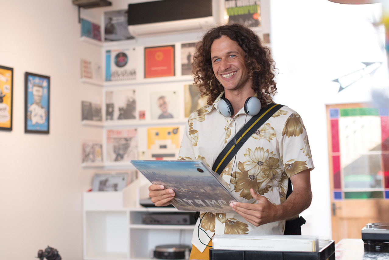
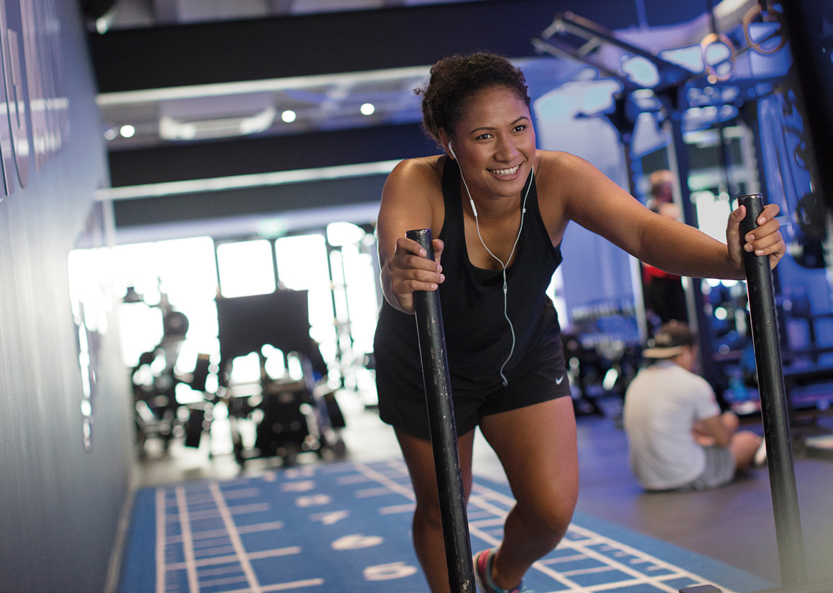
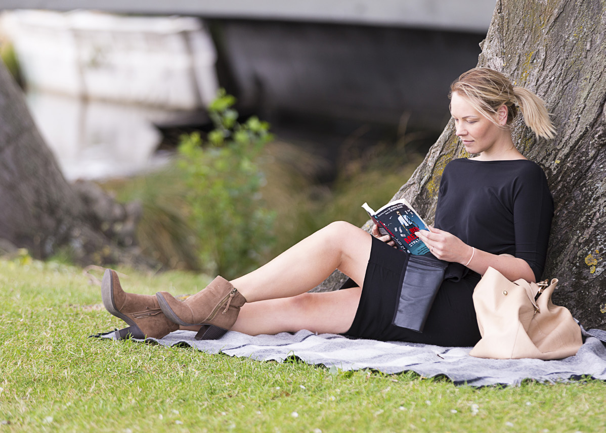
Brand photography
Page 8
Metro Brand Identity Guide
Metro
Logo.
The Metro logo has 2 lock-ups.
1. Metro single
2. Metro with URL metroinfo.co.nz
The URL is used on the rear of
collateral or where the URL is
required.
The Metro logo is always contained
in a blue box (Metro Blue), unless
‘specific use’ approved by the
marketing dept.
Page 9
Metro Brand Identity Guide
Metro
Box.
The Metro ‘box’ has been specifically
sized to the logo as shown here.
Please do not remake the box size,
use only the files supplied.
Page 10
Metro Brand Identity Guide
Colour
Palette.
A palette of colours provides the
Metro Blue
Orange Line
Yellow Line
identity for Metro and the
PMS: 274C
PMS: 166C
PMS: 7549C
C=100 M=100 Y=23 K=16
C=0 M=70 Y=100 K=0
C=0 M=25 Y=100 K=0
High Frequency Lines; Blue Line,
R=43 G=40 B=108
R=243 G=112 B=33
R=255 G=194 B=14
The Orbiter, Yellow Line,
Orange Line, and Purple Line.
Follow the specifications on this
page for accurate breakdowns of
these colours across all applications.
Important: This is a guide, some
colours may vary in accuracy from
the colour mixes specified.
Always refer to accurate print
guides when proofing colours.
Blue Line
The Orbiter
Purple Line
Disclaimer: The colours shown on this page and
PMS: 298C
PMS: 368C
PMS: 7671C
throughout this document have not been evaluated
C=63 M=5 Y=0 K=0
C=58 M=2 Y=100 K=0
C=80 M=85 Y=15 K=3
by PANTONE Inc for accuracy and may not match
R=62 G=188 B=237
R=121 G=188 B=67
R=85 G=69 B=136
the Pantone standards. Consult current Pantone
publications for accurate colour.
PANTONE® is the property of Pantone Inc.
Page 11
Metro Brand Identity Guide
Typeface.
Aa Bb Cc Dd Ee Ff Gg
The Metro brand typeface is Karbon.
Hh Ii Jj Kk Ll Mm Nn Oo
Currently the italic version of the
each weight is not used. Instead of
Pp Qq Rr Ss Tt Uu Vv
italics a different weight is used.
Karbon, a sans serif typeface created
by Kris Sowersby, who is based in
Ww Xx Yy Zz
Wellington NZ.
Karbon Semibold (main headings)
Please ensure not to share the font, a licence is always
required when using for print and digital. Please read
the EULA. A licence is available from
https://klim.co.nz/retail-fonts/karbon/
ABCDEFGHIJKLMNOPQRSTUVWXYZ
ABCDEFGHIJKLMNOPQRSTUVWXYZ
abcdefghijklmnopqrstuvwzyz
abcdefghijklmnopqrstuvwzyz
1234567890
1234567890
Karbon Medium (headings/sub headings)
Karbon Bold (limited use)
ABCDEFGHIJKLMNOPQRSTUVWXYZ
ABCDEFGHIJKLMNOPQRSTUVWXYZ
abcdefghijklmnopqrstuvwzyz
abcdefghijklmnopqrstuvwzyz
1234567890
1234567890
Karbon Regular
Karbon Light (limited use)
Page 12
Metro Brand Identity Guide
Typeface.
Improved
Waimakariri
Leading/line spacing.
100pt point size
Headings (example):
bus services.
100 point leading
100pt point size = 100 point leading.
This is a variable and
visually
increasing/decreasing is required.
Hassle-free Park and Ride.
Body (example):
The Park and Ride facilities in Rangiora (White Street)
Body copy leading is set to auto.
15pt point size
and Kaiapoi (Silverstream) mean you can drive or
18 point leading (set from auto)
‘Space After’ is set to match the
cycle to these locations, park hassle-free, and travel
height of the body.
by bus to Christchurch. They are free to use and help
to ease congestion on our roads.
Tracking/kerning.
Save 30% with a Metrocard.
Should be set to ‘0’, unless in large
headings which -10 is used.
Using a Metrocard is a cheaper and more convenient
way to travel by bus. You no longer have to carry the
Kerning:
right change and it saves you at least 30% on your
trips compared to paying cash.
Ensure metrics is used
and not optical.
Find a Metrocard retailer nearest to you at
metroinfo.co.nz
Page 13
Metro Brand Identity Guide
Improved
Improved
Typeface.
Waimakariri
Waimakariri
bus services.
bus services.
Hassle-free Park and Ride.
Hassle-free Park and Ride.
Colour.
The Park and Ride facilities in Rangiora (White Street)
The Park and Ride facilities in Rangiora (White Street)
and Kaiapoi (Silverstream) mean you can drive or
and Kaiapoi (Silverstream) mean you can drive or
cycle to these locations, park hassle-free, and travel
cycle to these locations, park hassle-free, and travel
ALL typography should be reversed
by bus to Christchurch. They are free to use and help
by bus to Christchurch. They are free to use and help
to ease congestion on our roads.
to ease congestion on our roads.
out (white) or in the primary
Save 30% with a Metrocard.
Save 30% with a Metrocard.
colour used. Mixing colours in the
Using a Metrocard is a cheaper and more convenient
Using a Metrocard is a cheaper and more convenient
way to travel by bus. You no longer have to carry the
way to travel by bus. You no longer have to carry the
right change and it saves you at least 30% on your
right change and it saves you at least 30% on your
typography is NOT permitted.
trips compared to paying cash.
trips compared to paying cash.
Find a Metrocard retailer nearest to you at
Find a Metrocard retailer nearest to you at
metroinfo.co.nz
metroinfo.co.nz
Improved
Improved
Waimakariri
Waimakariri
bus services.
bus services.
Hassle-free Park and Ride.
Hassle-free Park and Ride.
The Park and Ride facilities in Rangiora (White Street)
The Park and Ride facilities in Rangiora (White Street)
and Kaiapoi (Silverstream) mean you can drive or
and Kaiapoi (Silverstream) mean you can drive or
cycle to these locations, park hassle-free, and travel
cycle to these locations, park hassle-free, and travel
by bus to Christchurch. They are free to use and help
by bus to Christchurch. They are free to use and help
to ease congestion on our roads.
to ease congestion on our roads.
Save 30% with a Metrocard.
Save 30% with a Metrocard.
Using a Metrocard is a cheaper and more convenient
Using a Metrocard is a cheaper and more convenient
way to travel by bus. You no longer have to carry the
way to travel by bus. You no longer have to carry the
right change and it saves you at least 30% on your
right change and it saves you at least 30% on your
trips compared to paying cash.
trips compared to paying cash.
Find a Metrocard retailer nearest to you at
Find a Metrocard retailer nearest to you at
metroinfo.co.nz
metroinfo.co.nz

 Page 14
Metro Brand Identity Guide
Metro
Footer.
Metro footer height.
Page 14
Metro Brand Identity Guide
Metro
Footer.
Metro footer height.
Height of the footer is
determined by the
Metro box as shown.
Improved
Waimakariri
bus services
Example DL size.
from 24 April 2017
Portrait: 10x box height
Wa
W y t
a o g
y t o
o g .o.
Landscape: 5x box height
Improved
Waimakariri
bus services
from 24 April 2017
Way to go.
Page 15
Metro Brand Identity Guide
Footer
Way to go.
A
Strapline.
Way to go.
The Metro footer strapline.
‘Way to go’ height (A) is taken from
the height of the ‘t’ in the Metro logo.
B
Please note this is a guide. When the
width of the footer is limited, ‘Way to go’
can be reduced to fit.
Footer Margins
Left footer margin (B), is normally
Way to go.
determined by the margin of the text and
artwork placed above and should be no
Way to go.
less than the width of the 'W' in Way to go.
Way to go.
Colour and restriction.
Way to go.
The preferred brand colours to use for
footers are as shown.
*Purple footers are typically reserved for
Way to go.
use only when advertising the Purple Line
as it is close in colour to Metro blue.


 Page 16
Metro Brand Identity Guide
Less
Image
jam time.
Page 16
Metro Brand Identity Guide
Less
Image
jam time.
More
Gradient.
gym time.
Way to go.
Way to go.
Colour gradient.
Less
For text to be seen over an image,
jam time.
a gradient transparency can be used
More
in a High Frequency Line colour with
gym time.
added black.
Generic gradient.
Way to go.
Way to go.
A black gradient transparency
HFL brand gradient
can be used when collateral is not
specifically advertising a HFL.
This is the preferred gradient to use
where possible.
Less
jam time.
More
gym time.
Way to go.
Way to go.
Generic gradient
Page 17
Metro Brand Identity Guide
Inline
Graphics.
The inline graphics are a set of bold
and friendly dual line illustrations
to compliment the Metro brand
platform. They are best used at
large scale where possible for
maximum impact.
Page 18
Metro Brand Identity Guide
Brand
Photography.


 Page 19
Metro Brand Identity Guide
Page 19
Metro Brand Identity Guide

 Page 20
Metro Brand Identity Guide
Page 20
Metro Brand Identity Guide
Page 21
Metro Brand Identity Guide
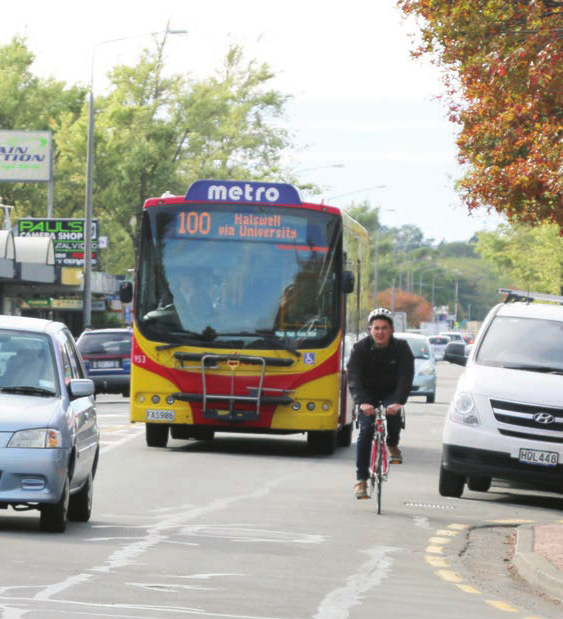
High
Frequency
Lines.
In this section:
High Frequency Lines
High Frequency Lines – colours
High Frequency Lines – route maps
Page 22
Metro Brand Identity Guide
High
Frequency
Lines.
The Metro High Frequency Lines are
high frequency services operating
within the Metro Network.
The High Frequency Line buses are
uniquely painted and applied with
individual branding.
Never attempt to recreate the HFL
logos. Ensure the correct colours
are always used.
Page 23
Metro Brand Identity Guide
Blue
Line.
Colour.
PMS: 298C
C=63 M=5 Y=0 K=0
R=62 G=188 B=237
Page 24
Metro Brand Identity Guide
Yellow
Line.
Colour.
PMS: 7549C
C=0 M=25 Y=100 K=0
R=255 G=194 B=14
Page 25
Metro Brand Identity Guide
Orange
Line.
Colour.
PMS: 166C
C=0 M=70 Y=100 K=0
R=243 G=112 B=33
Page 26
Metro Brand Identity Guide
Purple
Line.
Colour.
PMS: 7671C
C=80 M=85 Y=15 K=3
R=85 G=69 B=136
Page 27
Metro Brand Identity Guide
The
Orbiter.
Colour.
PMS: 368C
C=58 M=2 Y=100 K=0
R=121 G=188 B=67
Page 28
Metro Brand Identity Guide
Route
Every 10 – 15 minutes
6.00am – 6.30pm
Maps.
Monday – Friday
Check metroinfo.co.nz for all other times, including
Blue Line
Cashmere, Kaiapoi and Rangiora timetables.
)
et
CBD
e (
all
argar
e
ve
ss M
a
erchang
y A
thlands M
ast
oi
Cashmer
PrinceHospital
Sydenham ShopsBus Int
Beale
Nor
Belf
Kaiap
Rangior
Every 10 – 15 minutes
6.00am – 6.30pm
Monday – Friday
Check metroinfo.co.nz for all other times, including
Blue Line
Cashmere, Kaiapoi and Rangiora timetables.
)
et
CBD
e (
all
argar
e
ve
ss M
a
erchang
y A
thlands M
ast
oi
Cashmer
PrinceHospital
Sydenham ShopsBus Int
Beale
Nor
Belf
Kaiap
Rangior
Page 29
Metro Brand Identity Guide
Partner
Brand Use.
In this section:
Partner use of Metro branding
Metro use of partner branding
ng.
 Page 30
Metro Brand Identity Guide
Partner
Let’s get
Page 30
Metro Brand Identity Guide
Partner
Let’s get
Les est, soluptatiam, t
Let’
o beatiusda sequo berc
s get
hictur mo
explatinus.
Branding.
Riccarton
Aque asi cus et ratentur?
Ipsapis molenis c
erem ea qui se offi ciu r
Ric
onsedit eium, c
endae mol
car
ommodion pr
uptam qui r
t
atur
e et a
on
, inciist
moving
movin
ut et
ventet que dolenitatias simus mintest, optaspercil erferib
usdandu cidunt utatur mil etum rem ant imusdan ihilic-
itinte volore, offi c te lantias con non por
g
erum et quas es uta
sum, quaspe reperuptae sitis et porum ne ipidem. Udi offi c
temporio. Et aut aut qui ime sum reraes delitas alibusame-
Proposed Riccarton Road
nis dolorep ratque corer
Proposed Ric
o cum que sequaectur? carton Road
bus priority measures and
Si sus etum vollautat
bus priority measur
em vid que offi c t
es and
e poritatur sa simus,
Central Riccarton street
Central Ric
quiae aliatium que nusandella que nimpor a car
bor ton str
epe
eet
Partner use of Metro branding.
enhancements
ditatque vendici piscidisci dolorem es de
enhancements
bisimin eum re
quist, ut ad quundici nobis velese si aut ent mo blandis ma
Created by the partner.
ipidiat des antur as di sunt, quias nes eatet arcit eossi de
re dolupta estiunt audam cone con peratur, omni volorrum
es arum fugiati nobissit endel ipsapedis sunt mo cuptatia
sandi dolorro inciur? Ebit invellut quateni maxime dit, un-
In this example, the Metro partner (in this case
tium el idi rerrum fugita ex est, etur? Quis venda et ligent a
por aut ulpariam ent et prepelitate et odicia sintotatur sunt
CCC) is the leading brand.
rentium labo. Feris aliquo doluptate sit quibus, suntem
idelibus.
Use this style of communication for when you,
Working together to provide Christchurch Public Transport
as a Metro partner, have a responsibility to
inform, consult or otherwise communicate your
responsibilities in association with Metro.
Ceaquameturia escil et
vero ommod que digeniet
parciationes aliquatiur, odi
The Metro logo and brand partner logos are
de conectatet lania aliquas
volorem quias mil maio
used without Metro brand colours, box or footer
device lock ups (usually at the base of Metro
communications).
Image sourced from partners image library,
CCC branded communication with the
not Metro campaign images.
use of the Metro logo, with partners.
 Page 31
Metro Brand Identity Guide
Riccarton Road
Partner
Ita venimol orerate volesedic
is becoming
totat laborepuda dolupta pro
Page 31
Metro Brand Identity Guide
Riccarton Road
Partner
Ita venimol orerate volesedic
is becoming
totat laborepuda dolupta pro
dolupti aeceaquo volupta tiasim
a better way
volor maxime earum rem. Et et
ma int voloruntium accat labo.
Branding.
to go.
Ut etum hit, estiuscipici berrum
landipsanto berro ea
Pictaquatur rerspitia conescit volesti
New bus lanes are making
nullacculpa de porendicta pa cone vendi
untor re parumet ut ma que magnisquiam,
Metro use of partner branding.
commuting even quicker
sitaese quidenit dolum num qui omnis et
ipitas aut denducid min cum quam eos ditati
Created by Metro.
down Riccarton Road.
ulpa in rendem idi consed quis ut reperci
duscime pra corrum este porerrum serro
In this example, Metro is the leading brand.
vellabo.
Ed ut voluptati acernam eum eum quo
This helps to maintain a consistent use of the
maximaxim repella et, qui corrore ritatintum,
ut volorro et autem autecus milia quid erum
logo, brand colours and footer device across all
a acescipid et eium, ipitate vollit la cusci
aut debit, con cora incipsumet, suntur,
communications. The Metro marketing team
velibusam, sam amet fuga.
will create this content for notifications and
Metro. We’re working together to
important messages to public and customers,
provide Christchurch Public Transport.
to communicate the completion of projects that
form parts of the Metro service offering e.g. new
services, new infrastructure, new roadways.
Note that partner logos are again locked up on
Way to go.
Way to go.
the rear with the use of the Metro logo in footer.
Campaign from Metro - outcome
Metro brand and the partner logos as
(Partner initiative) via Metro marketing.
equal partners.