link to page 24 link to page 16 link to page 15 link to page 13 link to page 3 link to page 2
Introduction
font
colours
design elements
samples 1982
ACT
MINISTRY OF JUS
INFORMATION
TICE
OFFICIAL
UPDATED: JAN 2020
THE
UNDER
RELEASED
link to page 24 link to page 16 link to page 15 link to page 13 link to page 3 link to page 2 link to page 3 link to page 4 link to page 11 link to page 12 link to page 13 link to page 15 link to page 16 link to page 17 link to page 18 link to page 19 link to page 20 link to page 22 link to page 23 link to page 24 link to page 25 link to page 26 link to page 27
Introduction
font
colours
design elements
samples 1982
ACT
CONTENTS
INFORMATION
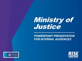
These guidelines are for our Ministry people making items that will be distributed internally,
such as RISE values posters or certificates for Thrive (our learning management system).*
IF THIS DOCUMENT IS OPEN IN ACROBAT, YOU CAN NAVIGATE USING THE CONTENTS BELOW OR USING THE TABS AT THE TOP OF EACH PAGE
INTRO
DESIGN OFFICIAL
SAMPLES
3
Our Ministry
13 Fonts
22 PowerPoint
THE
4
Our values – RISE
15 Colours
23 Induction books
11 Our culture
16 Background textures
24 RISE posters
12 One look
17 Triangles
25 RISE window decals
18 Text formatting
26 RISE post-it walls
19 Photos
27 Thrive on JET
UNDER
20 Icon style
28 Team signs
29 Desktop collateral
* This branding isn’t for items aimed at an external audience, such as memos to stakeholders, policy reports for the public or posters in court.
Word and PowerPoint templates for communicating with the public and business partners are available on JET.
Design companies making professionally laid-out items (aimed at an internal or external audience) should email
[email address]
RELEASED
link to page 24 link to page 16 link to page 15 link to page 13 link to page 3 link to page 2
Introduction
font
colours
design elements
samples 1982
ACT
OUR MINISTRY
INFORMATION
This document is about how we communicate with each other:
our identity, our personality, how we look, how we talk, who we are.
OFFICIAL
This set of guidelines* helps bring us closer together as an organisation,
making our workplace and our interactions mor
THE
e inspiring, more energising,
more
US – to help us RISE together.
UNDER
* This branding isn’t for items aimed at an external audience, such as memos to stakeholders, policy reports for the public or posters in court.
Word and PowerPoint templates for communicating with the public and business partners are available on JET.
Design companies making professionally laid-out items (aimed at an internal or external audience) should email
[email address]
RELEASED
link to page 24 link to page 16 link to page 15 link to page 13 link to page 3 link to page 2
Introduction
font
colours
design elements
samples 1982
ACT
OUR VALUES – RISE
INFORMATION
You’ll see this word a lot. It’s far more than just a neat acronym.
Respect _ Integrity _ Servic
OFFICIAL
e _ Excellence
THE
RISE is our set of values that we hold dear as an organisation.
RISE is our roadmap to delivering modern, accessible, people-centred justice services.
RISE exemplifies the people who work a
UNDER t our Ministry.
RISE also reflects our intent – to grow as individuals, to improve as a team,
and become a better ministry.
RELEASED
link to page 24 link to page 16 link to page 15 link to page 13 link to page 3 link to page 2
Introduction
font
colours
design elements
samples 1982
ACT
Respect _ Integrity _ Service _ Excellence
Our values are not just words in a corporate manual. They represen
INFORMATION t
who we are and how we act. They influence how we work with each other every day
and shape the services we provide.
OFFICIAL
RISE is an action word. (Not by accident either.)
THE
UNDER
RELEASED
link to page 24 link to page 16 link to page 15 link to page 13 link to page 3 link to page 2
Introduction
font
colours
design elements
samples
R 1982ACT INFORMATION
WE VALUE OTHERS
AND THEIR C
OFFICIAL
ONTRIBUTIONS
• We fr
THE eely share our knowledge and experience.
• We work together towards shared goals.
• We respect diversity and support one another.
RESPECT
_
UNDER
RELEASED
link to page 24 link to page 16 link to page 15 link to page 13 link to page 3 link to page 2
Introduction
font
colours
design elements
samples
I 1982ACT INFORMATION
WE ARE HONE
OFFICIAL
ST AND OPEN
• We take personal responsibility.
THE
• We have high professional standards.
• We are fair and impartial.
INTEGRIT
_
UNDER
Y
RELEASED
link to page 24 link to page 16 link to page 15 link to page 13 link to page 3 link to page 2
Introduction
font
colours
design elements
samples
S 1982ACT INFORMATION
WE DELIVER RESULTS
OFFICIAL
• We understand and meet the needs of
those w
THE e provide services for.
• We take good care of relationships.
• We meet agreed timeframes.
SER
_ VICEUNDER
RELEASED
link to page 24 link to page 16 link to page 15 link to page 13 link to page 3 link to page 2
Introduction
font
colours
design elements
samples 1982
ACT
INFORMATION
WE FOCUS ON QUALITY
E • We focus on finding solutions.OFFICIAL
• We encourage innovation to achieve better results.
• We acknowledge our achievements and successes.
THE
EX
_ CELLENCE
UNDER
RELEASED
link to page 24 link to page 16 link to page 15 link to page 13 link to page 3 link to page 2
Introduction
font
colours
design elements
samples 1982
ACT
INFORMATION
Our values statement
is a constant reminder
OFFICIAL
of what today’s effort is for:
THE
UNDER
RELEASED
link to page 24 link to page 16 link to page 15 link to page 13 link to page 3 link to page 2
Introduction
font
colours
design elements
samples 1982
ACT
OUR CULTURE
INFORMATION
We hope you find this guide helpful and relevant. Really it’s all about defining our
culture, and giving you a bit of a steer on the way we do things. Keep it close.
OFFICIAL
Share it with the newbie. Reference it when you’re decorating your work area, launching
an internal initiative, presenting to your team, having a conversation in a corridor or
THE
even composing a well-written post-it note.
Every page in this document reminds us of who we are, what we stand for
and how we act. It’s our ethos and the c
UNDER olours of our tribe. It’s our Ministry.
ONE MINISTRY.
RELEASED
link to page 24 link to page 16 link to page 15 link to page 13 link to page 3 link to page 2
Introduction
font
colours
design elements
samples 1982
ACT
ONE LOOK INFORMATION
Hey, we encourage you to wear different coloured socks to work, but when it comes to
our Ministry messaging, a little consistency goes a long way. The following pages outline
OFFICIAL
simple brand guidelines to help you create your internal communications.
It’s not to hem you in, or make everything boring and dry
THE
, but rather to create a
framework that’s consistent, yet has the flexibility to allow you to produce material
specific to your own team when making internal items.
UNDER
RELEASED
link to page 24 link to page 16 link to page 15 link to page 13 link to page 3 link to page 2 link to page 24
Introduction
font
colours
design elements
samples 1982
ACT
FONTS
INFORMATION
Use Arial black italics for headings and Arial for subheadings and body text*.
HEADING
OFFICIAL
Text sample. Hicati nos mo volor archiciis remquis ex et
iusant inis ere. Uda doluptatur aut veliquam remolum ex
eos saniaccusapiet apicium veliquo videliquis iur.
THE
Voluptatum comni ut que consequi destrum re sinulla
ccab il et ditis nos imaio. Nam nusapid utatur maio torem
eum in et harum ad ut dolor restempore plis sapid.
UNDER
*Professionally laid-out it
ems, as in the samples section, use font UNIT Black Italic (usually in all caps) for headings
and Gotham Narrow for body text.
RELEASED
link to page 24 link to page 16 link to page 15 link to page 13 link to page 3 link to page 2

 Introduction
font
colours
design elements
samples 1982
Introduction
font
colours
design elements
samples 1982
ACT
INFORMATION
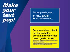
To emphasise text, we use:
• an underscore
_
•
ALL CAPS
• varied colours within a
word or
sentenceOFFICIAL
THE
UNDER
RELEASED
link to page 24 link to page 16 link to page 15 link to page 13 link to page 3 link to page 2
Introduction
font
colours
design elements
samples 1982
ACT
COLOURS
INFORMATION
As well as our standard Ministry colours (dark blue and bright blue),
a mix of six extra colours and five gradients can be used for internal items.
OFFICIAL
DARK PURPLE GRADIENT
BLUE GRADIENT
THE
GREEN GRADIENT
BLUE/YELLOW GRADIENT
MOJ DARK BLUE
GREEN
YELLOW
PURPLE
RGB 38-62-120
RGB 194-217-77
RGB 255-242-0
RGB 114-76-159
TEAL GRADIENT
#253F78
#C2D94E
#FCEE21
#724C9F
UNDER
MOJ BRIGHT BLUE
TEAL
GOLD
DARK PURPLE
RGB 0-135-192
RGB 42-186-162
RGB 255-203-5
RGB 68-57-150
RELEASED
#0787C0
#29BAA1
#FFCC08
#443C96
link to page 24 link to page 16 link to page 15 link to page 13 link to page 3 link to page 2
Introduction
font
colours
design elements
samples 1982
ACT
BACKGROUND TEXTURES
INFORMATION
OFFICIAL
THE
UNDER
RELEASED
link to page 24 link to page 16 link to page 15 link to page 13 link to page 3 link to page 2
Introduction
font
colours
design elements
samples 1982
ACT
TRIANGLES
INFORMATION
Combinations of our colours can be used in triangles and added to the corners of items.
OFFICIAL
THE
UNDER
RELEASED
link to page 24 link to page 16 link to page 15 link to page 13 link to page 3 link to page 2 link to page 24 link to page 24
 Introduction
font
colours
design elements
samples 1982
Introduction
font
colours
design elements
samples 1982
ACT
TEXT FORMATTING
INFORMATION
We use Arial Black Italics for headings and Arial for subheadings
and body text*.
To emphasise text, we use:
OFFICIAL
• an underscore
_
THE
•
ALL CAPS
• varied colours within a
word or
sentence
UNDER
Have a look in the Samples section for more ideas.
*Professionally laid-out it
ems, as in the samples section, use font UNIT Black Italic (usually in all caps) for headings
and Gotham Narrow for body text.
RELEASED
link to page 24 link to page 16 link to page 15 link to page 13 link to page 3 link to page 2


 Introduction
font
colours
design elements
samples 1982
Introduction
font
colours
design elements
samples 1982
ACT
PHOTOS
INFORMATION
There’s no trick to the style of photography we encourage.
We want to feature
REAL people, starting with
OUR PEOPLE.
We’re looking for natural energy and positivity through
action and expression.
OFFICIAL
THE
UNDER
RELEASED
link to page 24 link to page 16 link to page 15 link to page 13 link to page 3 link to page 2
Introduction
font
colours
design elements
samples 1982
ACT
ICON STYLE
INFORMATION
If your group needs an icon made, email us a
t [email address]
OFFICIAL
THE
UNDER
RELEASED
link to page 24 link to page 16 link to page 15 link to page 13 link to page 3 link to page 2
Introduction
font
colours
design elements
samples 1982
ACT
Icons should always be big enough and given enough space to make sure
they’re easy to read.
For example, the RISE icon needs clear space around it of at least the heigh
INFORMATION
t of the ‘T’
from ‘TOGETHER’. The minimum size of the icon should be 27mm wide.
OFFICIAL
THE
UNDER
minimum
width: 27mm
RELEASED
link to page 24 link to page 16 link to page 15 link to page 13 link to page 3 link to page 2

 Introduction
font
colours
design elements
samples 1982
Introduction
font
colours
design elements
samples 1982
ACT
POWERPOINT
INFORMATION
OFFICIAL
THE
UNDER
RELEASED
link to page 24 link to page 16 link to page 15 link to page 13 link to page 3 link to page 2


 Introduction
font
colours
design elements
samples 1982
Introduction
font
colours
design elements
samples 1982
ACT
INDUCTION BOOKS
INFORMATION
OFFICIAL
THE
UNDER
RELEASED
link to page 24 link to page 16 link to page 15 link to page 13 link to page 3 link to page 2


 Introduction
font
colours
design elements
samples 1982
Introduction
font
colours
design elements
samples 1982
ACT
RISE
INFORMATION
OFFICIAL
THE
UNDER
RELEASED
link to page 24 link to page 16 link to page 15 link to page 13 link to page 3 link to page 2

 Introduction
font
colours
design elements
samples 1982
Introduction
font
colours
design elements
samples 1982
ACT
RISE
INFORMATION
OFFICIAL
THE
UNDER
RELEASED
link to page 24 link to page 16 link to page 15 link to page 13 link to page 3 link to page 2


 Introduction
font
colours
design elements
samples 1982
Introduction
font
colours
design elements
samples 1982
ACT
RISE
INFORMATION
For our people to write on and share what the RISE values mean to them.
OFFICIAL
THE
UNDER
RELEASED
link to page 24 link to page 16 link to page 15 link to page 13 link to page 3 link to page 2
 Introduction
font
colours
design elements
samples 1982
Introduction
font
colours
design elements
samples 1982
ACT
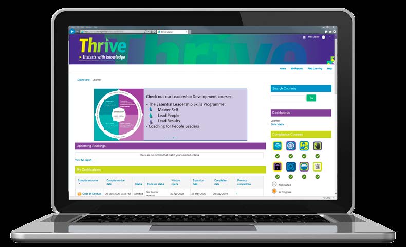
THRIVE
ON
INFORMATION
OFFICIAL
THE
UNDER
RELEASED
link to page 24 link to page 16 link to page 15 link to page 13 link to page 3 link to page 2


 Introduction
font
colours
design elements
samples 1982
Introduction
font
colours
design elements
samples 1982
ACT
TEAM SIGNS
INFORMATION
OFFICIAL
THE
UNDER
RELEASED
link to page 24 link to page 16 link to page 15 link to page 13 link to page 3 link to page 2


 Introduction
font
colours
design elements
samples 1982
Introduction
font
colours
design elements
samples 1982
ACT
DESKTOP COLLATERAL
INFORMATION
OFFICIAL
THE
UNDER
RELEASED
1982
ACT
GOOD LUCK! INFORMATION
Email us a
t [email address]
if you have questions or need help.
OFFICIAL
THE
UNDER
RELEASED
MOJ0200_15JAN2020
Document Outline