Version 2.0 | August 2021
MetService
brand style guide
1
 Overview
From the storm warning that safeguards a fishing fleet, to forecasts that help
power companies meet demand, whether you’re staying dry, staying safe or stay-
ing ahead of the competition, MetService, as New Zealand’s oldest continuous
scientific institution is right there with you.
Our brand represents our organisation within New Zealand and further afield,
and these guidelines outline how our branding can be used.
If you’ve got questions about the MetService brand, our guidelines, or need
to request a logo or files, please contact the MetService design team through
[email address]
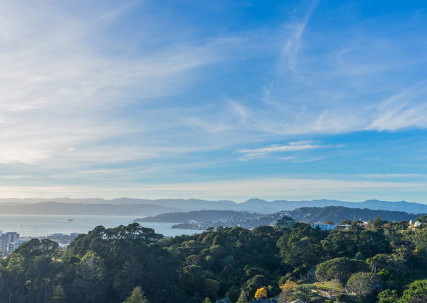
MetService headquarters can be seen in this image, nestled at the top of the Wel ington Botanic Garden.
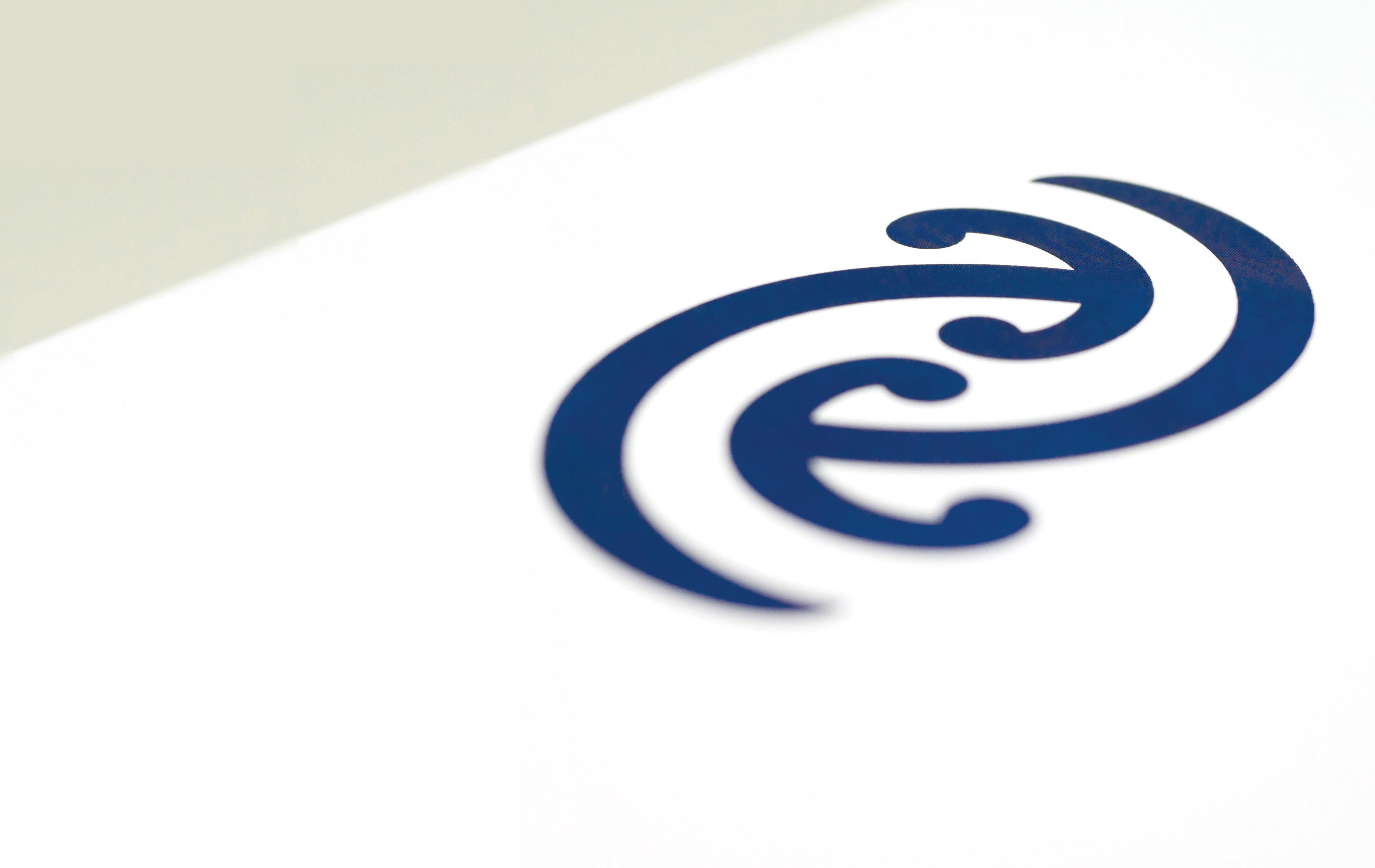 Our Mangopare
The Mangopare represents strength, leadership, agility, tenacity, unrelenting determination, courage, and wealth.
The twin Mangopare design reflects the two key aspects of our business; weather prediction and oceanography and
their interrelationship. The twin Mangopare are equal y balanced, each component as vital as the other.
To emphasise our brand, we show Mangopare symbol in different ways.
3
Recent changes to the MetService logo see the kerning adjusted to keep inter-character spacing consistent, and the
MetService Logo
‘Mangopare’ have been resized in the horizontal application to match the sizing in the stacked version.
A direct Maori translation of our name ‘TE RATONGA TIRORANGI’ has been also added to the brand, reinforcing the
bi-culturalism embodied by the Mangopare. This translation lockup must always be included whenever the MetService
logotype is applied.
Stack type
x
x
x
x
x
Minimum size 23.5mm for
print or 120px for digital wide.
x
x
x
Clean space around the logos is required to maintain brand presence and hierarchy.
Horizontal type
x
x
x
x
x
Minimum size 65mm (185px) wide due to size
x
x
x
of translation text.
Clean space around the logos is required to maintain brand presence and hierarchy.
4
MetraWeather Logo
MetraWeather, the international commercial brand of the Meteorological Service of New Zealand, is a global leader in
providing innovative weather information services, contributing to the bottom line of businesses and the wellbeing of
millions of people around the world.
Stack type
x
x
x
x
x
x
x
x
Clean space around the logos is required to maintain brand presence and hierarchy.
Horizontal type
x
x
x
x
x
x
x
x
Clean space around the logos is required to maintain brand presence and hierarchy.
5
MetOcean Logo
MetOcean Solutions is a science-based consultancy that offers specialist numerical modelling and analytical services
in meteorology and oceanography. We provide high quality environmental data and expert interpretation to meet the
rigorous requirements of the offshore and maritime industries as well as regulatory, defence and government agencies.
MetOcean Solutions is a division of state-owned enterprise, Meteorological Service of New Zealand (MetService).
Stack type
x
x
x
x
x
Minimum size 23.5mm for
x
x
x
print or 120px for digital wide.
Clean space around the logos is required to maintain brand presence and hierarchy.
Horizontal type
x
x
x
x
x
Minimum size 65mm (185px) wide due to size
x
x
x
of translation text.
Clean space around the logos is required to maintain brand presence and hierarchy.
6


 Group Logo
MetService, MetraWeather and the newly-aligned MetOcean logos are available in either horizontal or stacked versions.
Both variations can be used in a horizontal three-grouping as shown.
These logos must not be grouped in any other formation. Padding between the logos can be justified by utilising the hammerheads
as a guide.
Stack type
Horizontal type
7
Alternative Logotype
The grouped icons represent the weather, and are regularly used with the MetService logo across different platforms.
The icons can be used singularly, as a stand-alone grouping, or stacked with the logotype (example below).
Alternative options
8
Colour palette
The colour palette strengthens visual consistency with the app and the website design, as well as broader coherency across
all brands, platforms, products and graphic outputs.
Main Blue
Dark Blue
White
RGB
R23 G35 B68
RGB
R35 G53 B99
RGB
R255 G255 B255
HEX
#172344
HEX
#233563
HEX
#FFFFFF
CMYK
C97 M88 Y43 K47
CMYK
C98 M87 Y33 K23
CMYK
C0 M0 Y0 K0
Digital - Radial Gradient
RGB
R48 G127 B190 - R36 G56 B115
HEX
#307fbe - #243873
CMYK
C80 M43 Y2 K0 - C100 M89 Y26 K12
9
Typography
MetService use ‘Calibre’. MetService also used the free font style ‘Open Sans’ for documentation and presentations.
Calibre (Semi-bold)
Open Sans (Bold)
Heading Sentence Case
Heading Sentence Case
A B C D E F G H I J K L M N O P Q R S
A B C D E F G H I J K L M N O P Q R S T
T U V W X Y Z a b c d e f g h i j k l m n
U V W X Y Z a b c d e f g h i j k l m n o p
o p q r s t u v w x y z 1 2 3 4 5 6 7 8 9 0
q r s t u v w x y z 1 2 3 4 5 6 7 8 9 0
% ! @ # $ ^ & * ( ) _ + { } “ ‘ : ?
% ! @ # $ ^ & * ( ) _ + { } “ ‘ : ?
Calibre (Regular) - Sub-heading Sentence Case
Open Sans (Semi-bold) - Sub-heading Sentence Case
Calibre (Regular) - Body copy
Open Sans (Regular) - Body copy
A B C D E F G H I J K L M N O P Q R S T U V W X Y Z
A B C D E F G H I J K L M N O P Q R S T U V W X Y Z
a b c d e f g h i j k l m n o p q r s t u v w x y z
a b c d e f g h i j k l m n o p q r s t u v w x y z
1 2 3 4 5 6 7 8 9 0 % ! @ # $ ^ & * ( ) _ + { } “ ‘ : ?
1 2 3 4 5 6 7 8 9 0 % ! @ # $ ^ & * ( ) _ + { } “ ‘ : ?
10
Do and Don’t
To make sure our logotype appears as consistently as possible throughout our communications, we’ve identified
a few ways we don’t want our logotype to appear.
Do
Do
Do
Don’t
Don’t use weather icons in different orders
Use dark blue if it’s necessary.
White logo for dark background colour.
You can use singular icon for highlighting platforms
and parts
Don’t
Don’t
Don’t
Don’t
Absence of Maori translation.
Wrong ratio.
Use different colour
Don’t use logo with icons in different orders.
11

 Do and Don’t
To make sure our logotype appears as consistently as possible throughout our communications, we’ve identified
a few ways we don’t want our logotype to appear.
Do
Don’t
Logotype
Logotype
Greater than the other one’s logo size.
Don’t
Absence of one of MetService brands.
12
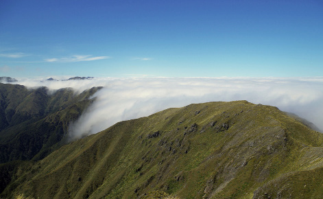
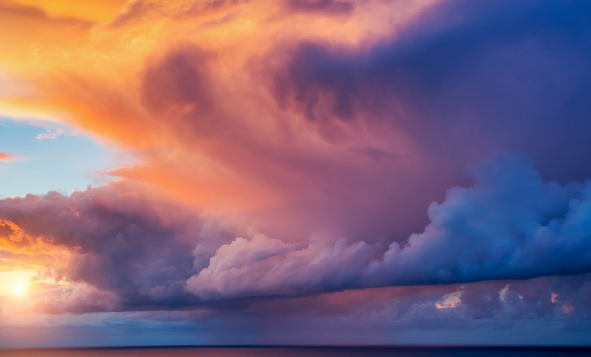
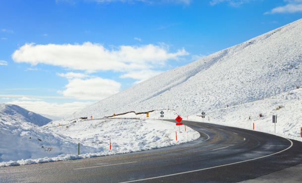
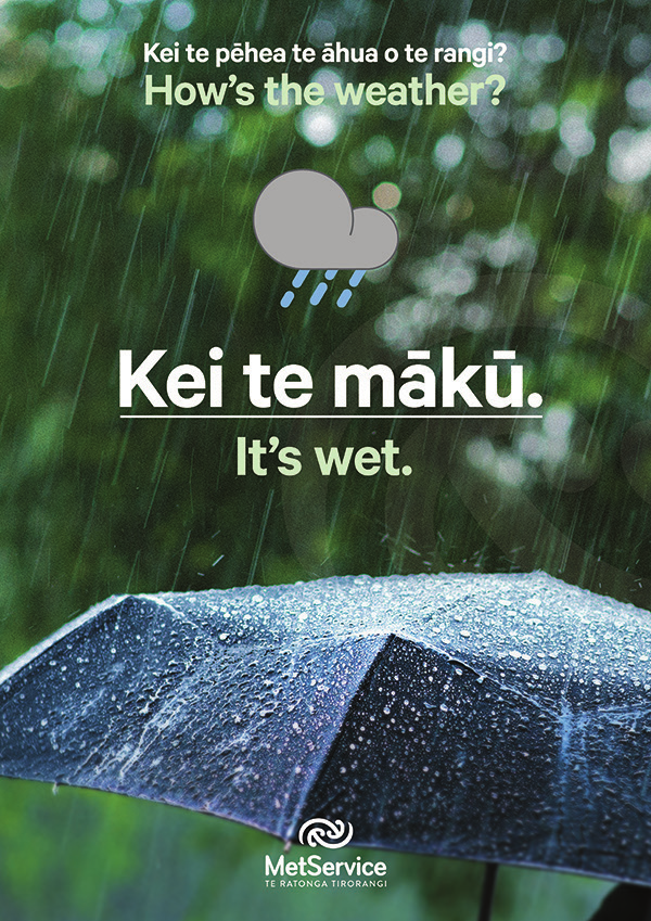
 Photography
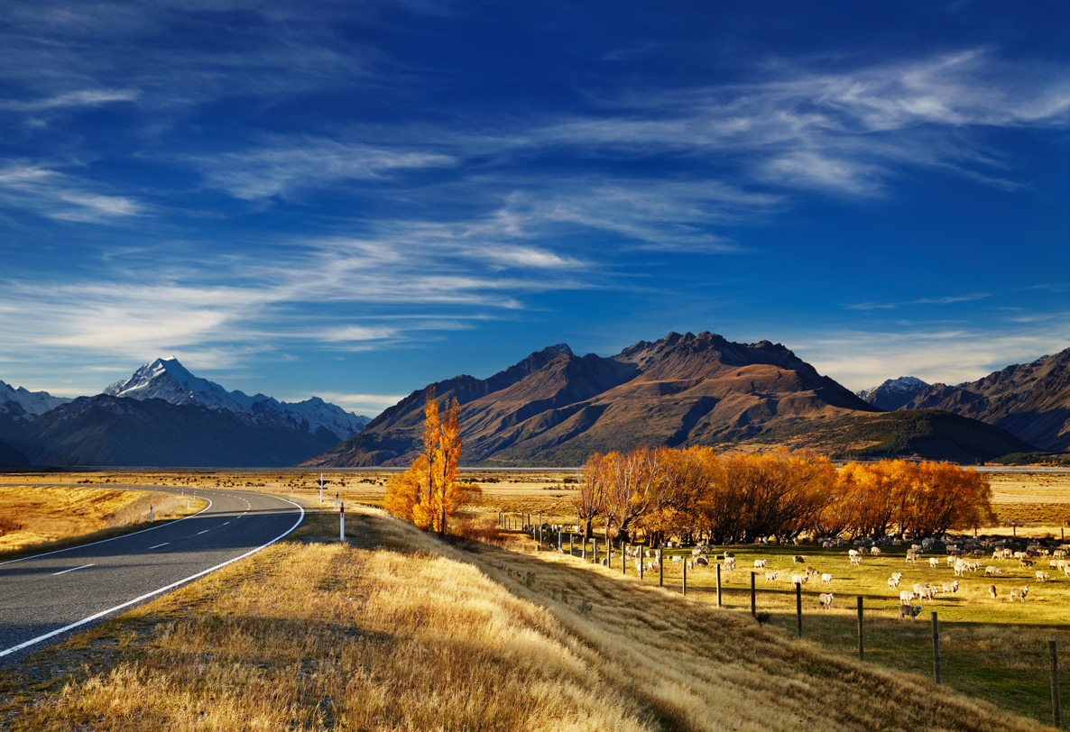
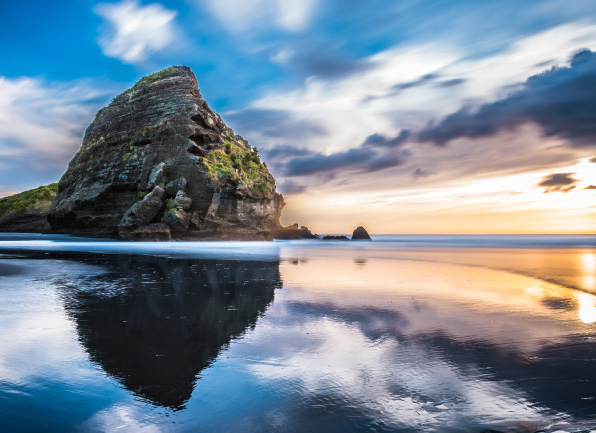
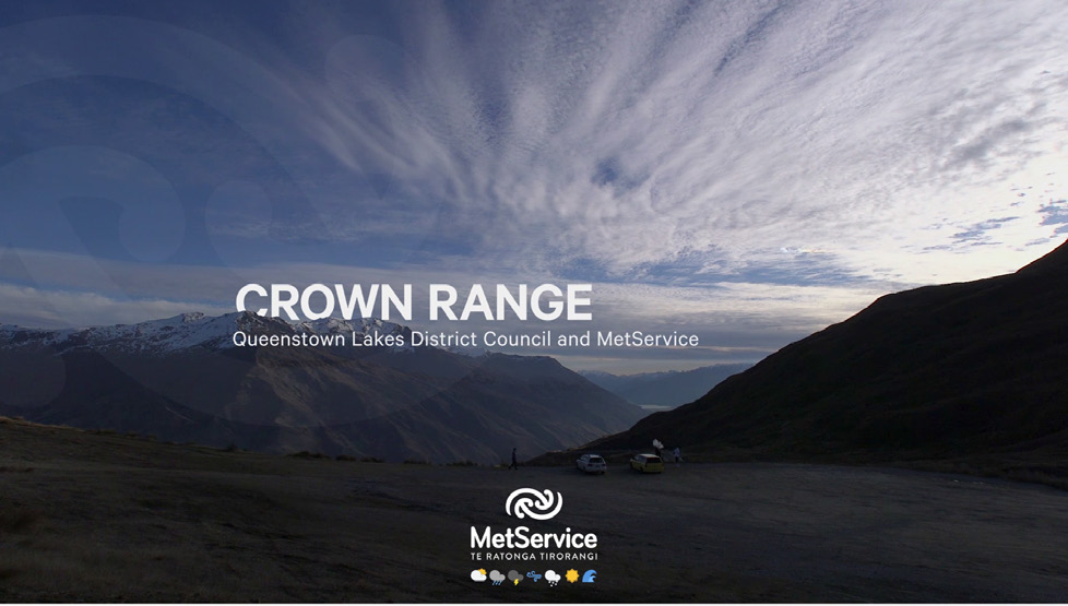
Our images should be shot in a way that captures the beauty of the weather in New Zealand. It’s clean and vibrant.
For international brand, which is MetraWeather, they can use the local beauty with the weather, but weather should be more
focused than their own culture.
Where possible, we should also leave a generous amount of negative space in the frame to create room for visual elements
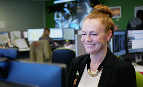
such as logo lock-ups and headline copy. When a model is in a photo, the background should be related to the weather context.
13
 Mangopare in social media
 The Mangopare symbol often appears our social media in order to make a credit
that it’s MetService’s contents.
Video
Social media
Print
14
ALL RIGHTS RESERVED 2021