Contents
Introduction 3
Brandmark 4
Sub-brandmarks
5
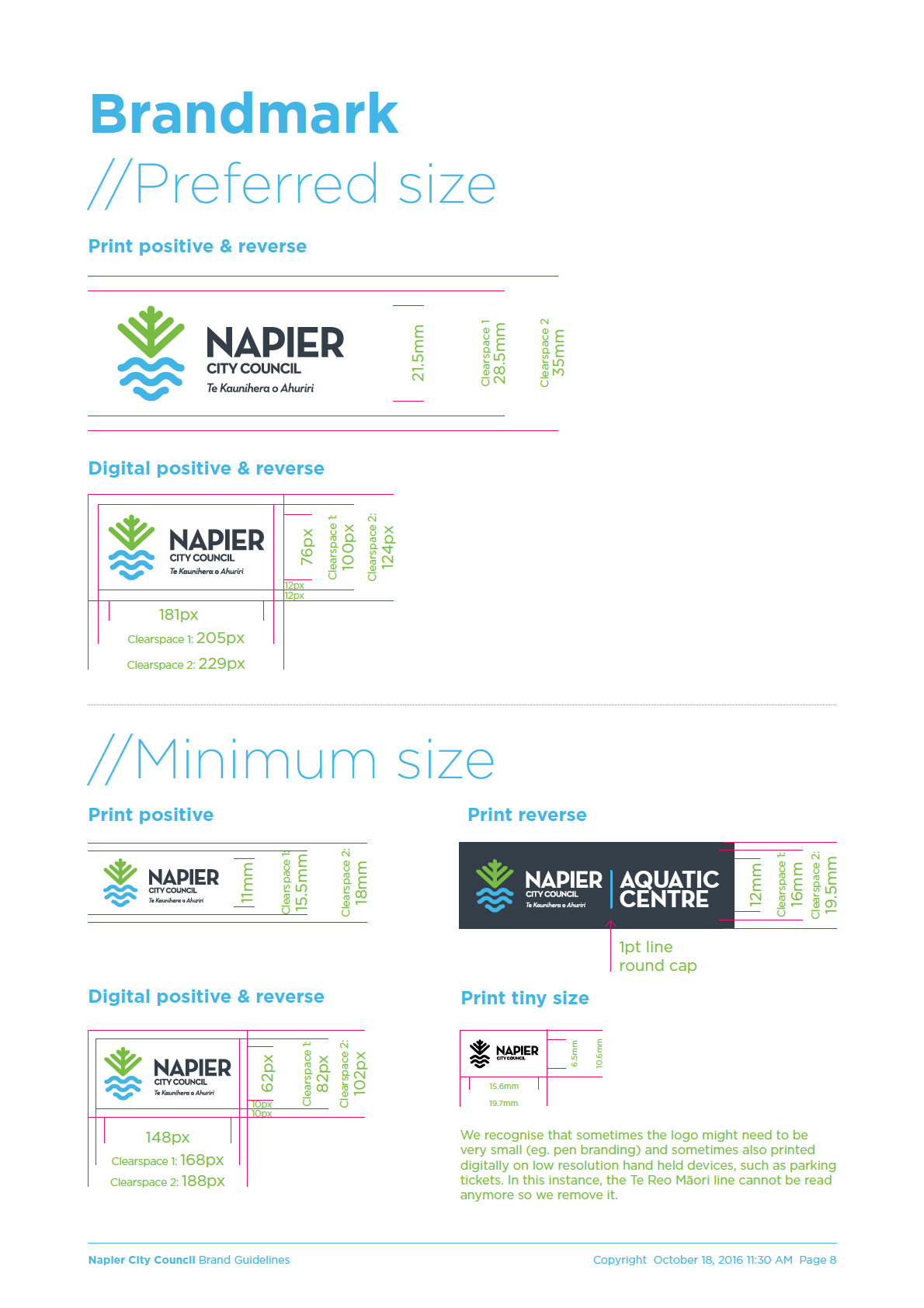
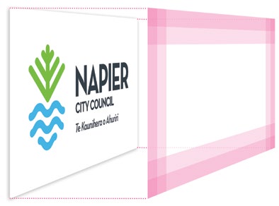
Clearspace
6
Minimum size
8
Logo files overview
9
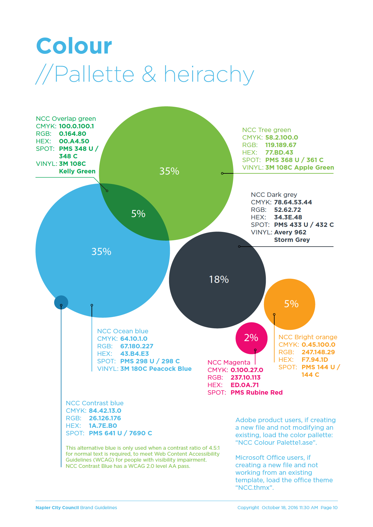
Colour – Pallette & heirachy
10
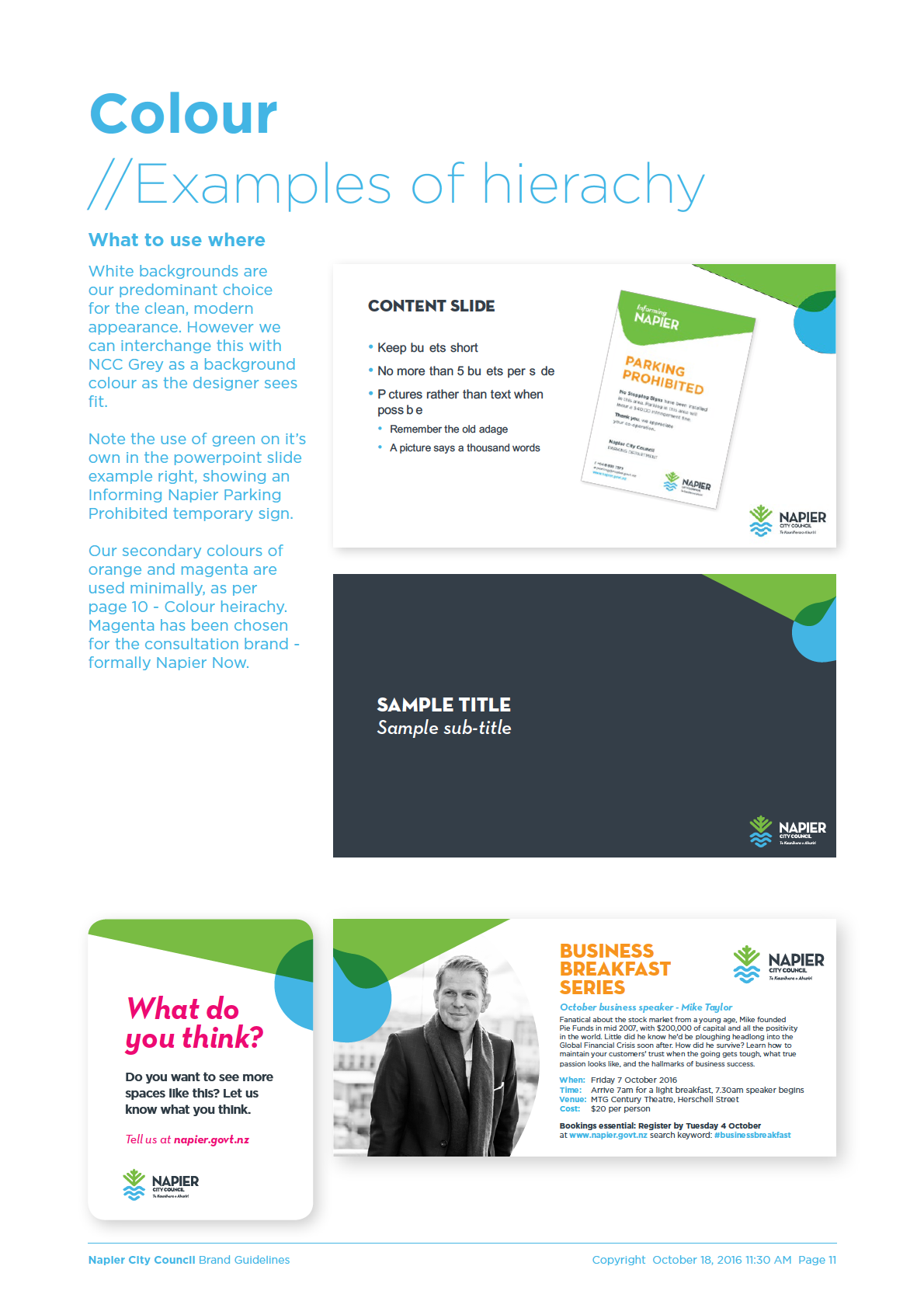
Examples of hierachy
11
Typography 12
Fonts
12
Type heirachy
13
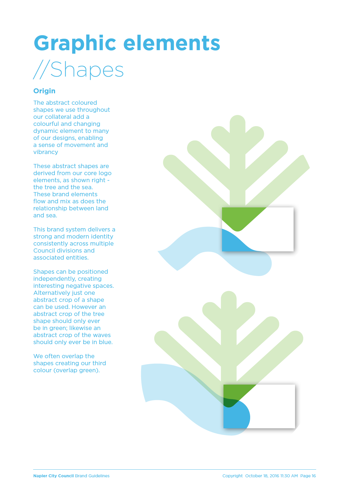
Graphic elements
16
Stationery 19
Letterhead
19
Business card
20
Paper stock
20
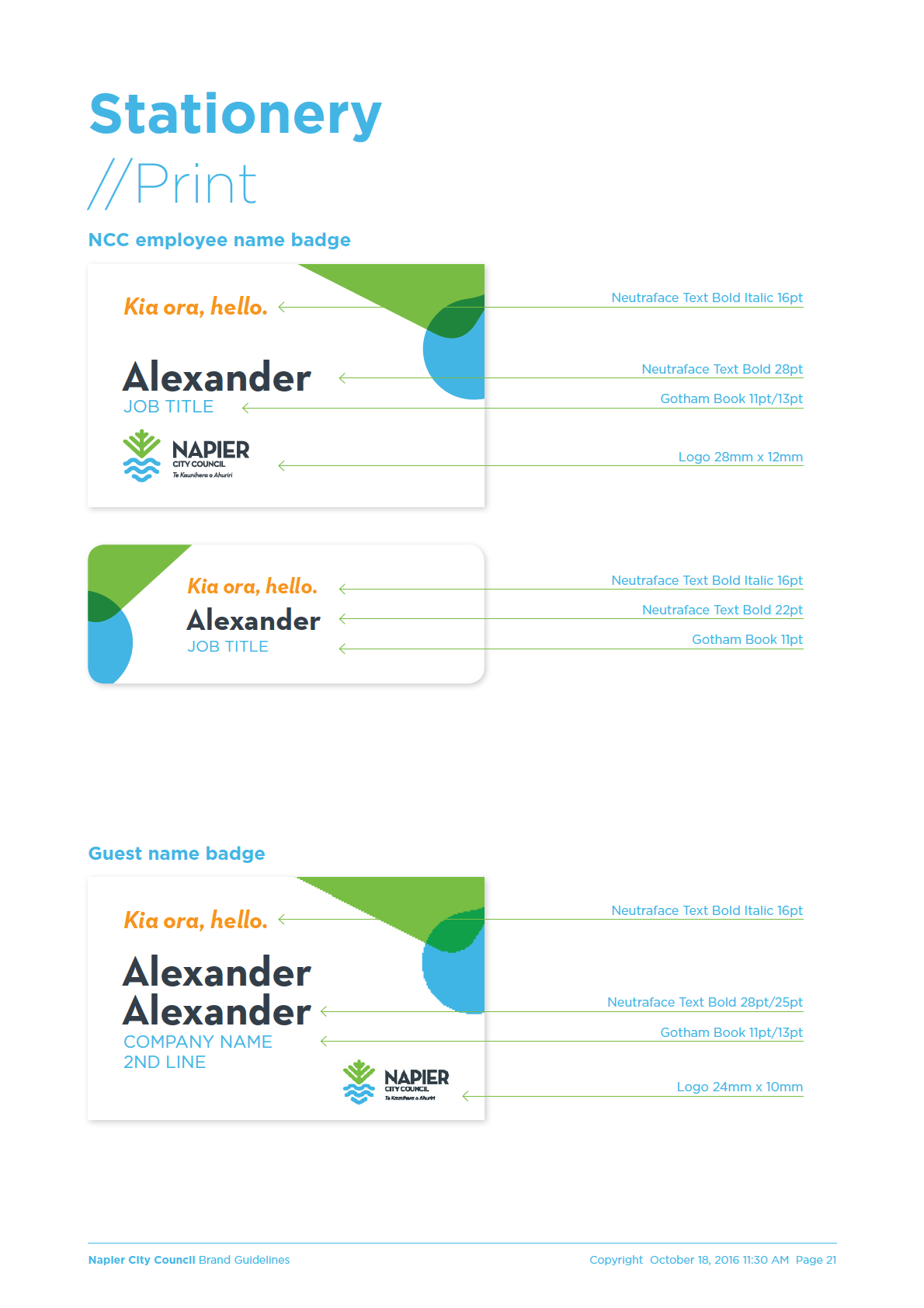
Name badge
21
Email
22
Stationery templates
25
Letterhead template
25
Internal comms template
26
Media release and Memo templates
27
Forms
28
Napier City Council Brand Guidelines
Copyright October 18, 2016 11:30 AM Page 2
Introduction
This brand guide is intended
Brand Napier
to promote consistent use
of the Napier City Council
Napier is a city with a very well documented history. The
brand. This makes it easier
catastrophic events of 1931 shaped the city we know today,
for people to recognize
creating a unique urban environment that has provided a
Napier City Council assests
domestic and international tourism proposition that has
and communications and
been well leveraged over the years.
avoids confusion.
However, the time has come to stop exclusively looking
This edition is:
back and look at all of what Napier is now – a vibrant,
» NCC Brand Guide 2016
modern, multi-cultural city that has taken the creativity
Collateral.pdf
of the art deco era to its heart and channelled it into all
sorts of fantastic culinary, viticultural, artistic, sporting and
For a simpler guide relating
cultural ventures.
solely to logo use, see:
Napier is so much more than Napier then.
» NCC Brand Guide 2016
Logo.pdf
For more detailed brand
The characteristics that have made
guidance relating to
and are still making Napier:
photography, language,
signage and other aspects
Creative
of our visual identity system,
Spirited
see:
Tenacious
» NCC Brand Guide 2016
Proud
Signage.pdf
Strong
Intelligent
» NCC Brand Guide
Personality.pdf
Optimistic
Brand direction
Our logo is representative of the landscape with strong
fresh colours sitting free on clear space. It is modern
and progressive, with a hint of our Art Deco renaissance
through the typographic style of a 1930’s inspired
geometric sans serif.
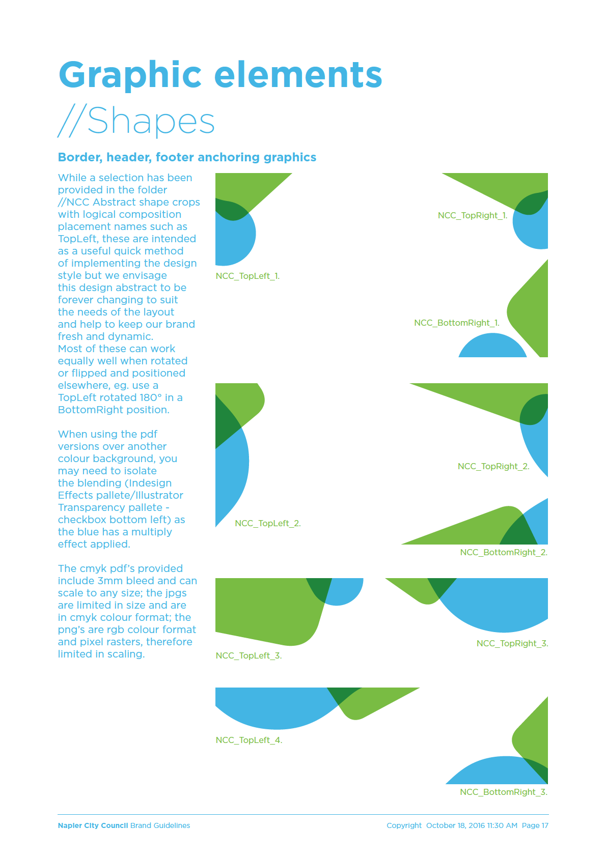
Our brand style is representative of our geography – the
interactive between land and sea, constantly changing and
dynamic, fresh and clean, vibrant and energetic. This is
most obvously seen in the changing abstract shapes in our
border graphic elements.
We encourage keeping our brand alive with the changing
and evolving graphic elements, mixes of colour within our
pallette and fresh photography.
Napier City Council Brand Guidelines
Copyright October 18, 2016 11:30 AM Page 3
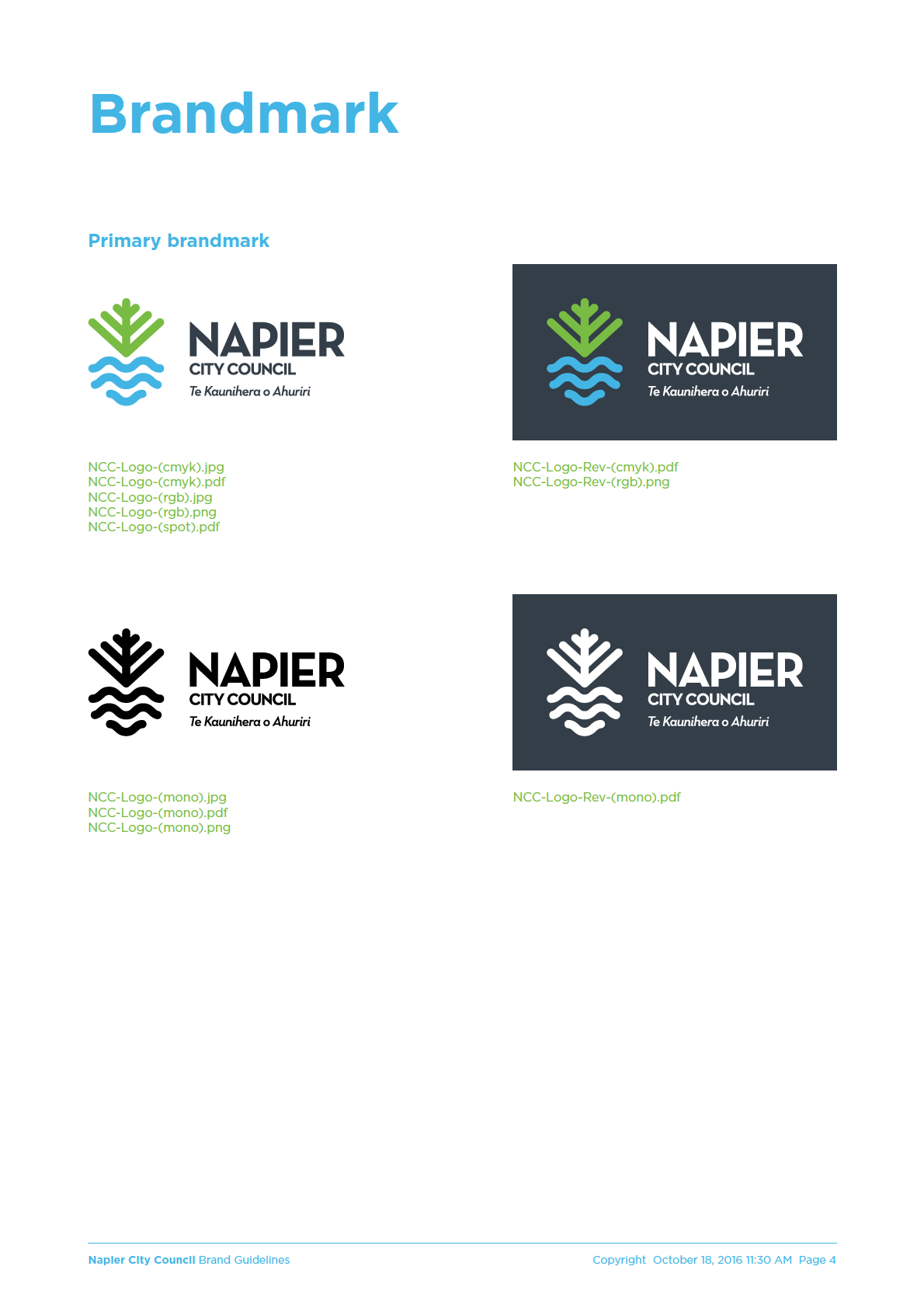
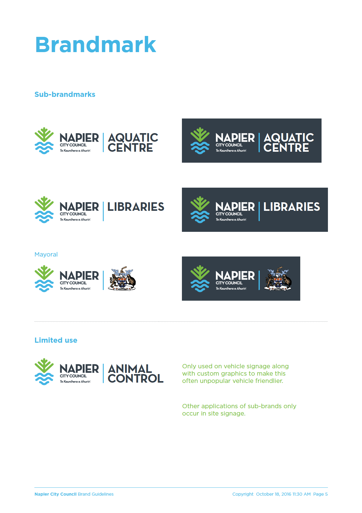
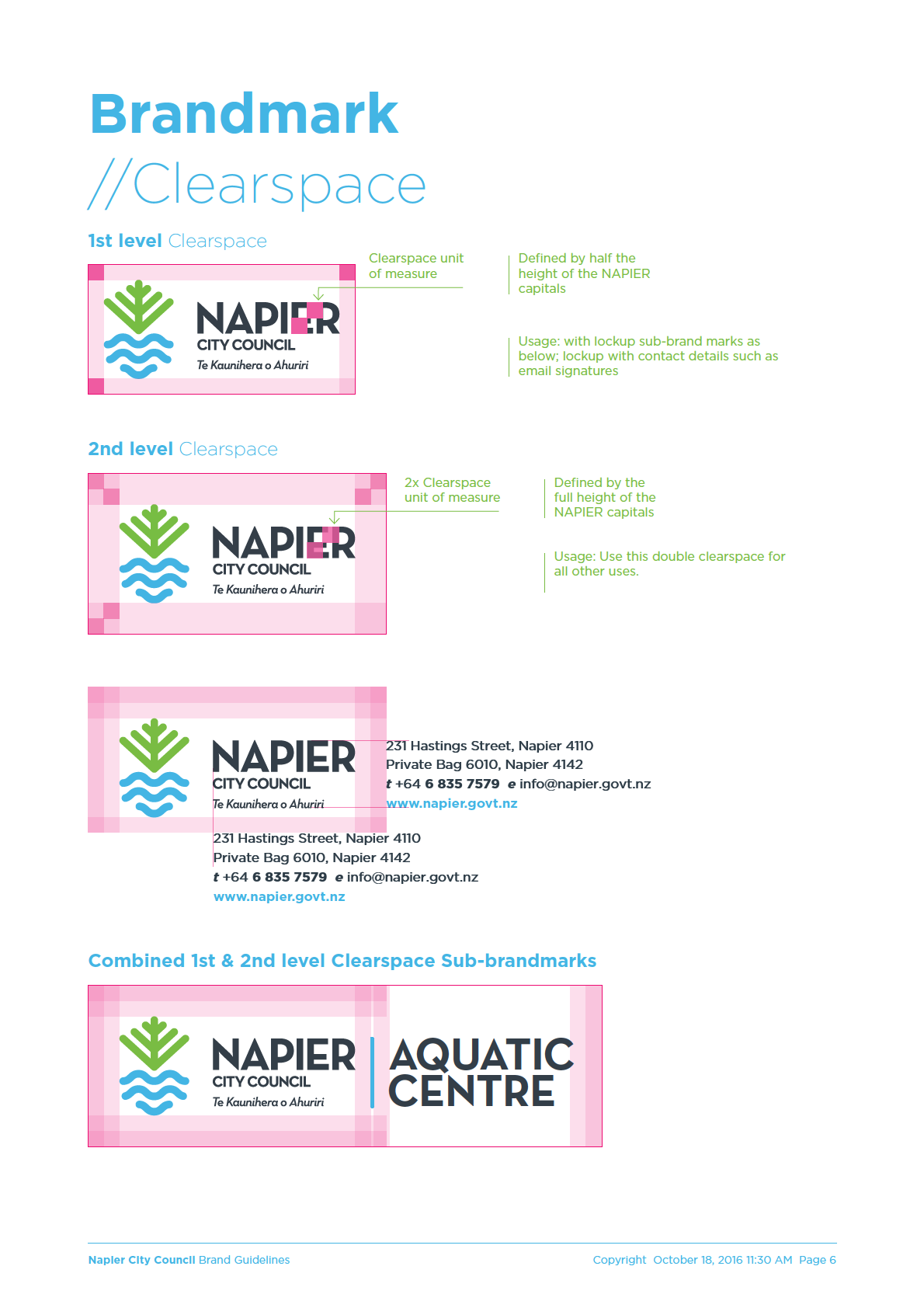
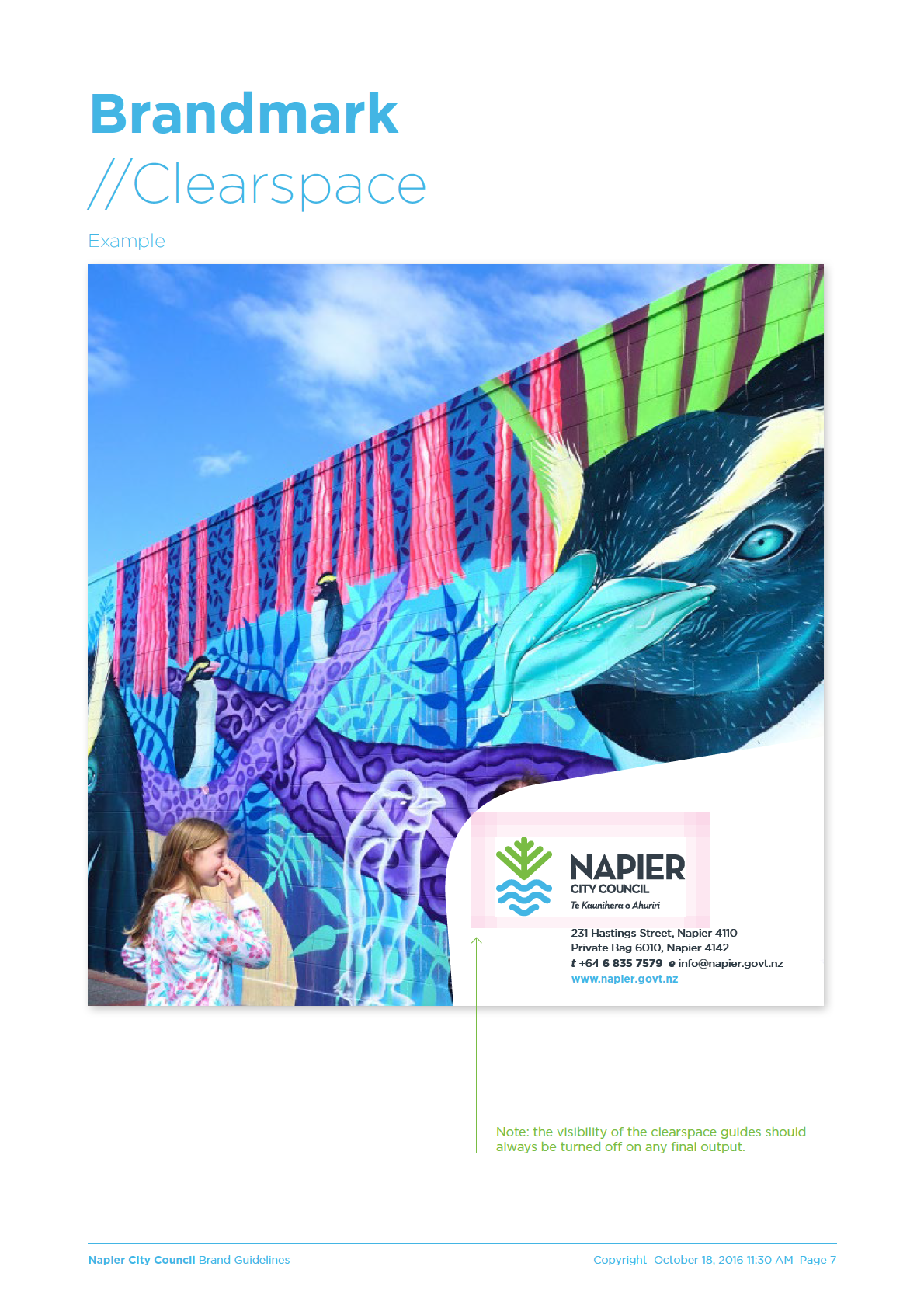
 Logo files
//Digital artwork
//Overview
Understanding our supplied files
NCC logo
NCC sub brand example
NCC logo minimum size
NCC-Logo-(cmyk).jpg
NCC-Logo-Aquatic-(cmyk).jpg
NCC-Logo-Minimum-(cmyk).jpg
NCC-Logo-(cmyk).pdf
NCC-Logo-Aquatic-(cmyk).pdf
NCC-Logo-Minimum-(cmyk).pdf
NCC-Logo-(mono).jpg
NCC-Logo-Aquatic-(mono).jpg
NCC-Logo-Minimum-(mono).jpg
NCC-Logo-(mono).pdf
NCC-Logo-Aquatic-(mono).pdf
NCC-Logo-Minimum-(mono).pdf
NCC-Logo-(mono).png
NCC-Logo-Aquatic-(mono).png
NCC-Logo-Minimum-(mono).png
NCC-Logo-(rgb).jpg
NCC-Logo-Aquatic-(rgb).jpg
NCC-Logo-Minimum-(rgb).png
NCC-Logo-(rgb).png
NCC-Logo-Aquatic-(rgb).png
NCC-Logo-Minimum-Rev(cmyk).pdf
NCC-Logo-(spot).pdf
NCC-Logo-Aquatic-(spot).pdf
NCC-Logo-Minimum-Rev(mono).pdf
NCC-Logo-Rev-(cmyk).pdf
NCC-Logo-Aquatic-Rev(cmyk).pdf
NCC-Logo-Minimum-Rev(mono).png
NCC-Logo-Rev-(mono).pdf
NCC-Logo-Aquatic-Rev(mono).pdf
NCC-Logo-Minimum-Rev(rgb).png
NCC-Logo-Rev-(rgb).png
NCC-Logo-Aquatic-Rev(rgb).png
NCC-Logo-Tiny-(mono).jpg
NCC-Logo-Tiny-(mono).pdf
Use
png if the use is digital requiring
a transparent background.
Use
jpg if the use is print and you
don’t have professional design
software.
For any professional, whether
signwriter, design, advertising etc,
we would expect you use
pdf.
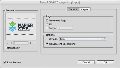
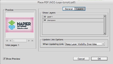
In each
pdf, there is a clearspace
layer to assist with positioning
elements around the logo. This is
turned
off by default.
If using Indesign, to turn this on
while designing, either do so when
placing the logo graphic using
the layers tab in the place dialog,
or with the logo selected, choose
Object / Object Layer Options...
Layer-1
Clearspace
Place dialog/ Show Import Options.
Experiment with layers and the different ‘Crop to:’
options to find what suit your needs.
Napier City Council Brand Guidelines
Copyright October 18, 2016 11:30 AM Page 9

 Typography
//Fonts
Overview
Our preferred chosen fonts
are geometric sans-serif
in style, based on the 1927
designed Futura.
neutraface display titling - caps only
Our heirachy of fonts starts
with Neutraface, used in the
NEUTRAFACE Text Bold & Bold Italic
logo in bold and demi italic
styles. Designed in 2002,
NEUTRAFACE Text Demi &
Demi Italic
with art deco inspiration,
yet highly readable in both
NEUTRAFACE Text Book &
Book Italic
caps and lower case.
On the napier.govt website
VERLAG Bold &
our webfont alternative for
Neutraface is Verlag.
VERLAG Book & Book Italic
We follow this with Gotham,
designed in 2000, highly
GOTHAM Black & Black Italic
legible at all sizes and
styles. This is our workhorse
GOTHAM Bold & Bold Italic
for use in everything other
GOTHAM Book &
Book Italic
than titles. Very similar in
style to Neutraface but
GOTHAM NARROW Black &
Black Italic
without the quirky bits that
make Neutraface special.
GOTHAM NARROW Bold & Bold Italic
Finally, when forced to use
GOTHAM NARROW Book &
Book Italic
default system fonts; on
Windows OS we leave our
geometric type styling, left
ARIAL Bold & Bold Italic
with the neo-grotesque
Arial. Arial would be used
ARIAL Regular &
Italic
by NCC staff for html emails
and documents produced
internally.
We envisage all designers
and signwriters, including
NCC internal graphic
designers to use Neutraface
and Gotham for print
documents and signage.
Napier City Council Brand Guidelines
Copyright October 18, 2016 11:30 AM Page 12
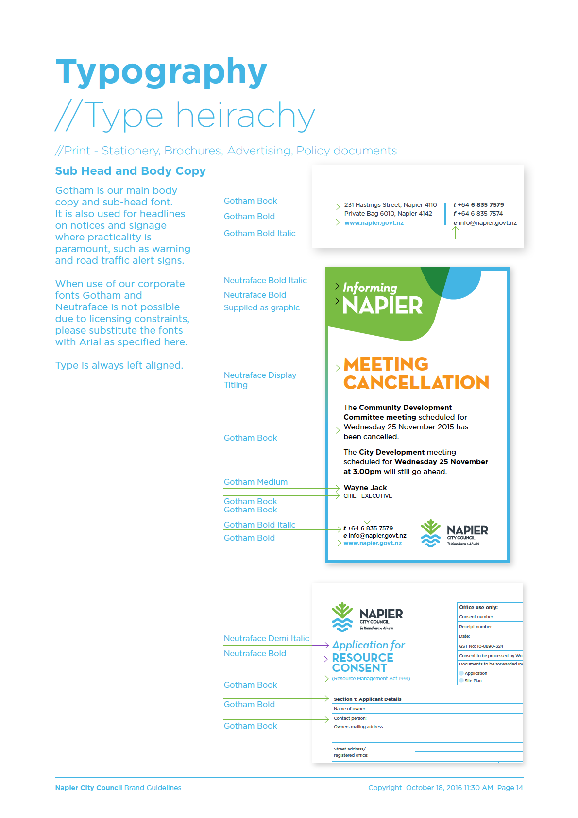
Typography
//Type heirachy
//Print - Brochures, Advertising, Policy documents
Titles / Headings
To keep our brand fluid and
dynamic we have loose
Neutraface Text Bold Italic
Informing
rules around typography
usage, intended as a guide
to allow the brand identity
Neutraface Text Bold
NAPIER
to grow in a uniform
direction, with variations to
maintain interest across a
broad range of applications.
August 2016
Neutraface Text Bold Italic
We interchange CAPS,
Titlecase and lowercase
Neutraface Display Titling
RATES
to suit both the look and
heirachy of the title.
Neutraface Text Demi Italic
news
Type is always left aligned.
As a guide for this
treatment, if we prioritise
the words of a title, the #1
priority word appears in
Freedom
Neutraface Text Demi Italic
capitals Neutraface Display
Titling or Neutraface Text
CAMPING
Bold, with the #2 priority
Neutraface Display Titling
type in Neutraface Text
Bold Italic or Demi Italic.
For example, there are
many policy documents,
so ‘policy’ is not the
DOG
top priority, hence DOG
Neutraface Display Titling
CONTROL
policy; or
for arguments sake, there
CONTROL
are multiple types of
camping potentially, ‘paid’
or ‘by donation’ or ‘free’,
policy
therefore
Freedom is
Neutraface Text Demi Italic
secondary and CAMPING is
top priority.
Reviewed May 2014
Neutraface Text Demi
Napier City Council Brand Guidelines
Copyright October 18, 2016 11:30 AM Page 13


 Typography
//Type heirachy
//Digital - Email stationery, Website
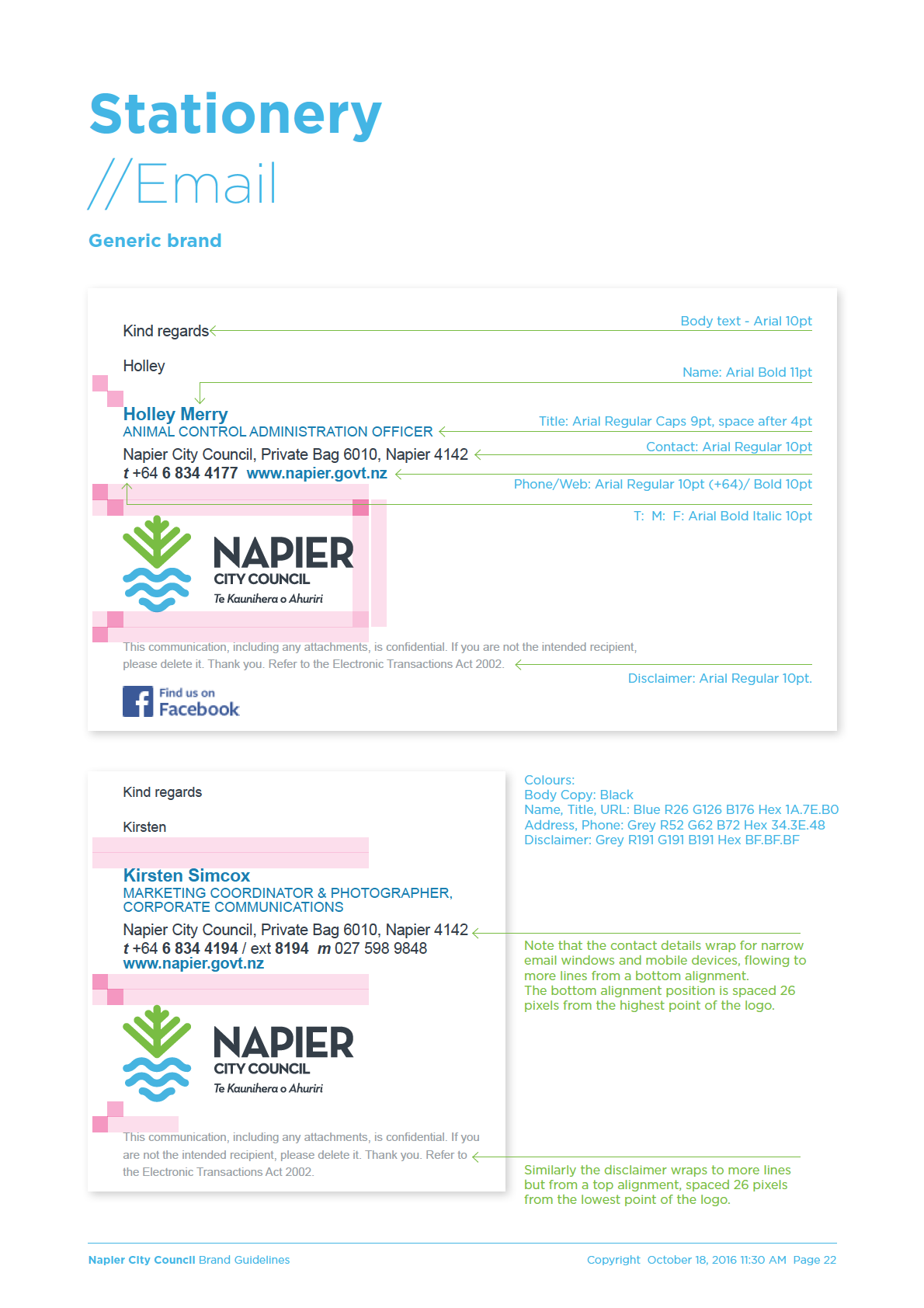
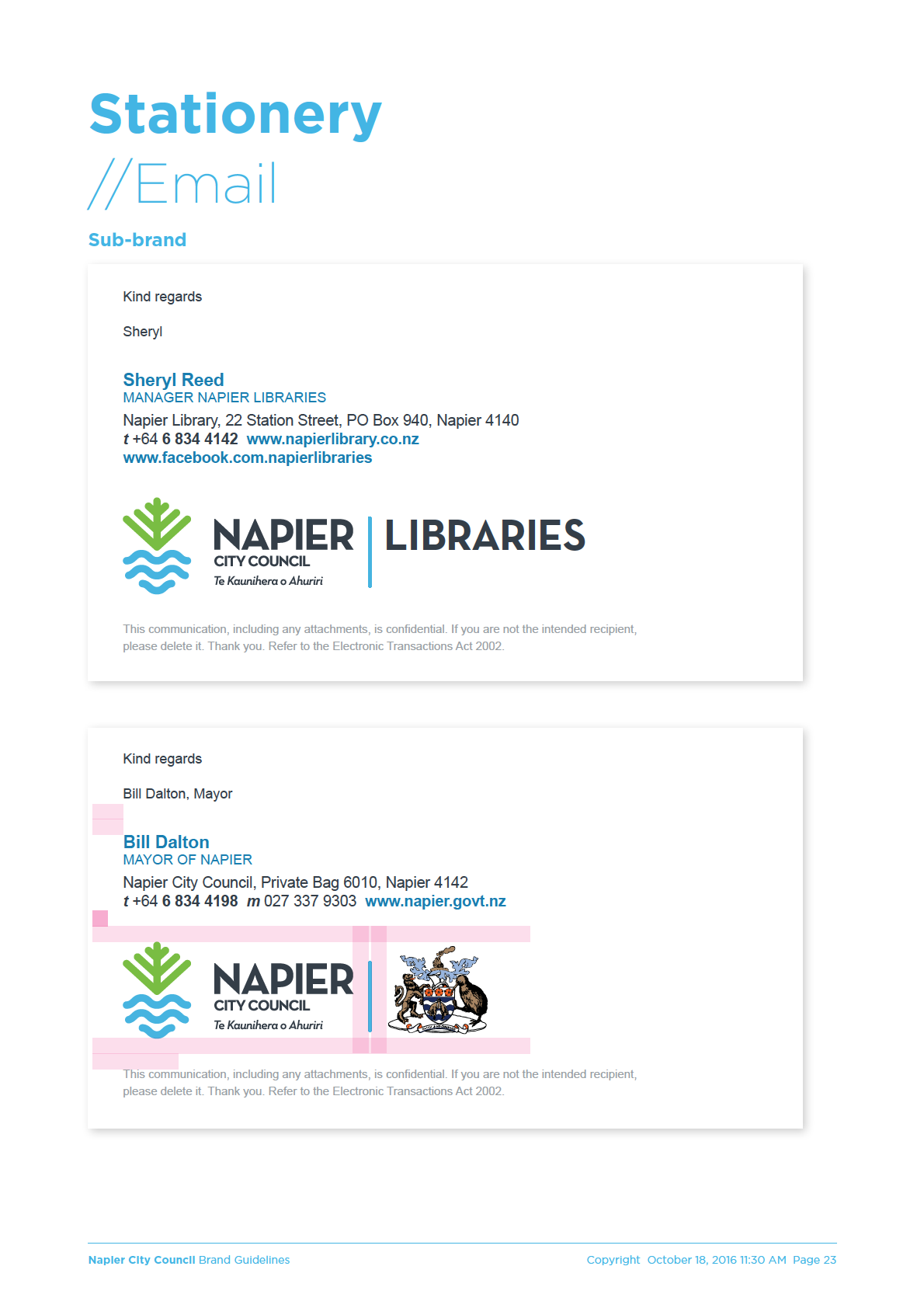
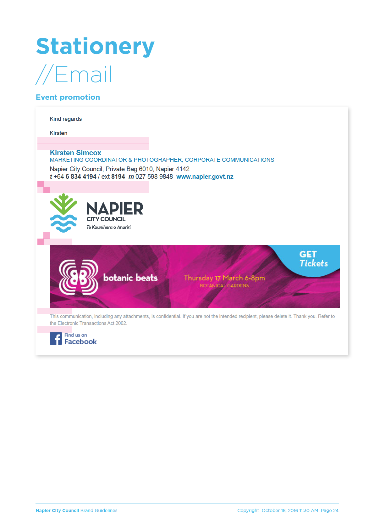
Email signatures
Email body text and
1. ARIAL Regular,
Bold & Bold Italic
signatures are covered in
detail on pages x to x. Due
to the current inability of
email client applications to
work to any standards, html
emails need to use system
fonts. We have therefore
adopted the lowest
common denominator for
sans serif type on most
operating systems.
InfoCouncil created
documents will use Arial.
Website
//Titles
Napier City Council have
1.
purchased webfonts to
enable the use of Verlag
VERLAG Bold &
online.
Verlag is the closest we can
2. ARIAL Bold & Bold Italic
get to Neutraface for title
use, without an exorbitant
fee.
//Secondary Headings
For the napier.govt.nz site
and subsites our heirachy
1. VERLAG Bold &
is as per right, using fall-
back font choices as per
2. ARIAL Bold & Bold Italic
numbering as a backup.
We use Sentence case
and Title Case as much
//Body Copy
as possible online for
maximum readability.
ARIAL Regular &
Italic
Napier City Council Brand Guidelines
Copyright October 18, 2016 11:30 AM Page 15
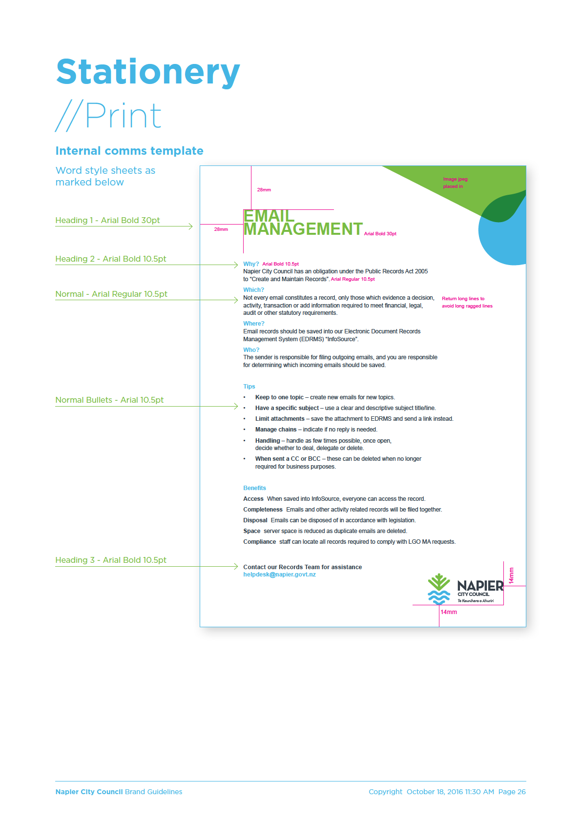
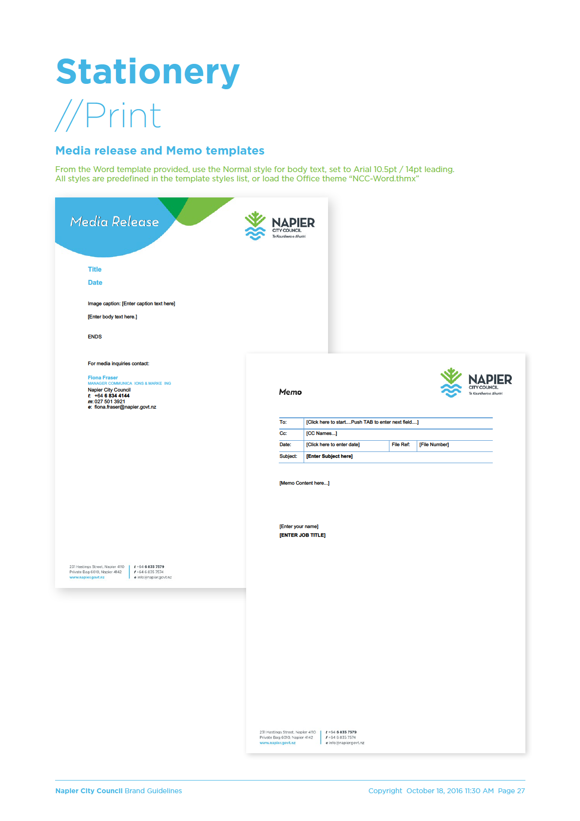
 Stationery
//Print
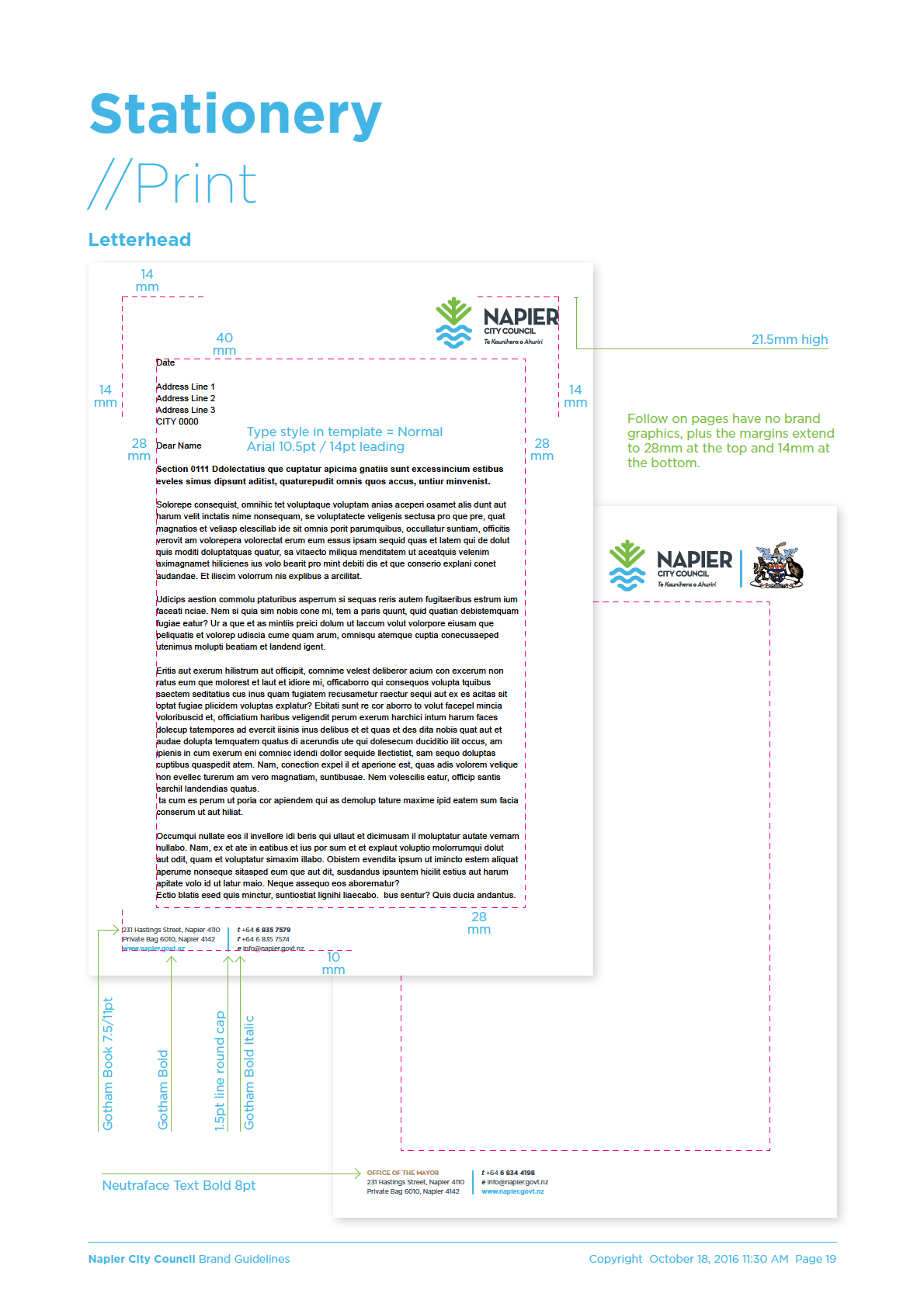
Letterhead template
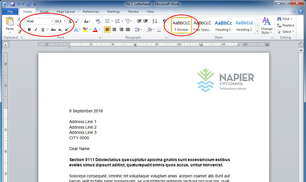
From the Word template provided, use the Normal style for body text, set to Arial 10.5pt / 14pt leading.
All styles are predefined in the template styles list, or load the Office theme “NCC-Word.thmx”
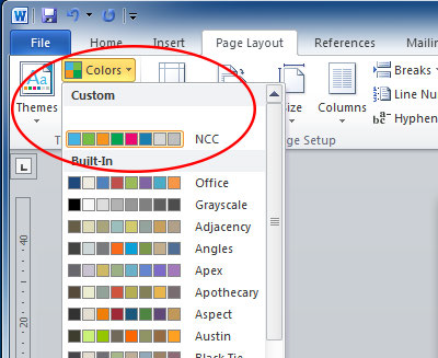
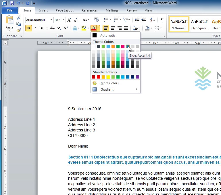
When using colours, if you’re using a template you’ll see the NCC
colour palette in the colors drop-down, along the top row of the
colour selection drop down menu, called Theme Colors.
If you don’t see the NCC colour pallette
already when you click to slect a colour,
load the Office theme “NCC-Word.thmx”
Napier City Council Brand Guidelines
Copyright October 18, 2016 11:30 AM Page 25