Identity Brand Guidelines
January 2021
Contents
Our brand
2
Colours - Printed colour palette
13
The Brand and Identity team has primary
responsibility for the development,
Our brand principles
3
implementation, maintenance and strategic
Colour Accessibility -
14
direction of ACC’s brand. To be most effective,
Printed colour palette
Our brand platform
4
this work needs support from all levels of the
organisation.
Colours - Digital colour palette
15
Our brand elements
5
These guidelines cover the basics of the ACC
Typeface - Printed
17
brand. Contact the Brand and Identity team with
Our logo (visual identity)
6
any questions.
Typeface - Digital
18
Also get in touch if you would like to talk about
Logo placement
8
ACC’s brand, need advice on how to apply these
Photography and filming
19
guidelines or how to access the Image Library.
Document design elements
9
Illustrations 21
[email address]
Co-branding 11
1
Our brand
Consistency
ACC full lock up
Our brand is much more than our name and
logo (visual identity). Our brand encompasses
One of the keys to maintaining a strong brand is
The ACC logo is always used on external communications
every type of visual and written communication
consistency. If all aspects of our brand are expressed
and is used on some internal communications, where
we produce, as well as our ‘attitude’ or the
consistently, it will be clear to people that we’re a
deemed appropriate.
way we interact with our customers, partners,
cohesive organisation. This is especially important,
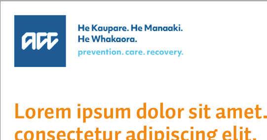
ACC’s Māori translation is an integral part of our
stakeholders and the wider community.
given that we’re a large organisation with many
brand and should always appear with the logo,
Letters and brochures are therefore part of our
different functions. By expressing our brand consistently
unless readability is an issue.
brand, as is our website, branch signage and décor,
at every opportunity, people will also have a clearer
and even phone conversations and face‑to‑face
understanding of who we are, what we do and what
In the ACC full lockup, the ACC pixel is supported by
meetings. All of these communications and
we stand for.
our new Te Reo strapline.
interactions play a part in shaping what people
'He Kaupare. He Manaaki. He Whakaora.
think, feel and know about ACC.
Attribution
Prevention. Care. Recovery'
The ACC logo (visual identity) is used across all our
This represents an evolution from where we have been
external and internal communications.
and takes a strong step toward our (whānau, people)
and customer-centred aspirations.
It is important that we recognise all of the great work
that we do. The simplest way of doing this is making
sure our logo is used.
2
Our brand principles
Kotahitanga
Whanaungatanga
Our brand reflects the very essence of ACC – who we
are and what we do. At the heart of the brand are our
He waka eke noa
He aha te mea nui o te ao
brand principles. This means all our communications
We are in this together
What is the greatest thing in the world
and interactions should help convey that we as an
Unity, togetherness, collective action.
He tangata, he tangata, he tangata
organisation have manaaki at our core.
It is people, it is people
How we show and experience Kotahitanga:
Our three principles guide how we build our
Relationship, kinship sense of family connection –
• Whaia te mahi tahi - Seek col aboration: come
brand experience and culture to express our
a relationship through shared experiences and working
together with our colleagues, partners and customers
brand authentically.
together to provide a sense of belonging.
to co-create solutions and co-produce outcomes.
How we show and experience whanaungatanga:
• Whaia te ōritetanga - Seek consistency: be aligned with
Manaakitanga
the work of others to ensure we deliver cohesive and
Te mahi whakaute - Show trust - meet as equals,
effective experiences.
with mutual trust and respect.
Te tohu o te rangatira, he manaaki
The sign of a leader is generosity
• Whaia te tauutuutu - Seek reciprocity: be prepared to
Te mahi hononga - Show connection - create
(the late Bishop Manuhuia Bennett)
provide, share and offer, as well as receive.
relationships which foster trust, respect and relevancy.
Hospitality, kindness, generosity, support – the process
Te mahi pono - Show authenticity - be real, honest and
of showing respect, generosity and care for others.
true to who we are and what we stand for.
How we show and experience manaakitanga:
• He ngākau aroha - Be human: demonstrate empathy,
warmth and kindness. Understand the person in
the process.
• He mahi whakaute - Be inclusive: respect difference
and accept all people.
• He ngākau nui - Be generous: be open with information
and share knowledge in ways that others understand.
• He kanohi kitea - Be visible: be seen when and where
it matters.
3
Our brand platform
PROMISE
Caring for
PERSONALITY
ARCHETYPE: CAREGIVER
PERCEPTION
people in
He kaitiaki
Supporting
New Zealand at
wellbeing
work, home
and play
PRINCIPLES
Manaakitanga
Inclusive
Reliable
AT THE CORE
Manaaki
PURPOSE
POSITION
Improving
Wellbeing
lives every
provider
Kotahitanga
day
Whanaungatanga
Open
Empathetic
BENEFITS
Freedom
and security
Copyright (c) ACC
1
4
Our brand elements
We stand for
At our core: Manaaki. At our core, it is what we offer in our relationship with NZ
It drives us to
Purpose:
Improve lives every day.
By
Promise:
Caring for the people in New Zealand at work, home and play.
We do this by demonstrating
Principles: Manaakitanga, Kotahitanga and Whanaungatanga in the ways we work together, with our customers, partners and communities.
We assume
Personality: a caregiver role for New Zealanders
and through being
Inclusive, Reliable, Open and Empathetic in our interactions. We will become a relevant and valued part of our audiences’ lives.
We strive to
Position:
Provide solutions which enhance New Zealanders’ wellbeing through
Benefits:
Enabling them the
freedom to live full and independent lives and the
security to know they will be supported if things go wrong.
By authentically delivering on what we promise, we will be trusted to
Perception: Support New Zealanders’ wellbeing.
5
Our logo (visual identity)
ACC full lock up - preferred option
ACC full lockup | Full colour
ACC full lockup | Black and white
ACC full lockup | Reversed
The full colour logo is the preferred logo to use and is made
Where printing methods mean that a single colour version
The reversed version of our ACC logo is available for use
up of ACC dark blue and light blue.
is required, the Black and white version of the logo must
on coloured backgrounds. However please ensure there is
be used.
enough contrast to read the 'prevention. care. recovery.'
strapline.
ACC pixel - option used when legibility is an issue
ACC pixel | Full colour
ACC pixel | Black and white
ACC pixel | Reversed
6
Our logo (visual identity) continued...
Minimum size
Clear space
Incorrect use
42mm
ACC full lock up
Do not stretch, squeeze or rotate to fit a space.
The minimum width of the
ACC full lock up used on
material is 42mm, or 180px in digital.
10mm
Do not recolour elements.
ACC pixel
If the above minimum size is not possible, then the '
ACC
When using any ACC logo, make sure there is enough clear
pixel' should be used. The minimum size of the pixel on
space around it. The clear space around the logo should
printed material is 10mm, or 30px in digital.
be the same width as the ‘ ’ in the logo, on all sides.
Using clear space ensures that the logo always appears
Do not use the ACC letters independently of
unobstructed and separate from any other graphic
the box.
elements.
7


 Logo placement
Front covers
White space - logo
White space - grid
ACC logo
Cover with image
Cover with text
The ACC logo has a right hand facing rag (the ends of the
The white space around the logo should be the same
To align all communications, we recommend utilising
words have a wavy edge), therefore the logo works best
width as the ‘ ’ in the logo, on all sides as shown below.
a white space grid around the edge of the documents.
when left aligned. This can be either up the top or bottom
Rounded corners of the box are set to the width of the ‘ ’.
When used with the logo, it creates a distinct grid.
of a document, depending on other elements.
The creative space (as shown here using grey boxes) is
flexible and can move and adapt to the available space.
Used for both internal staff documents and agency
documents.
8


 Document design elements
Line graphic device - cover with image
Line graphic device - cover with text
Inside front and back covers
Cover with image
Cover with text
Inside front cover
pager with image
pager with text
Inside back cover
A coloured graphic line as been introduced to the
A coloured graphic line as been introduced to the
A block colour of the heading and line colour will feature
document. The line and heading text will match in colour
document. The line and heading text will match in colour
on inside front and back covers.
selected from the printed colour palette on pg 13.
selected from the printed colour palette on pg 13.
Covers with images: the line will sit on top of the image.
Covers with text: the line will sit under the text.
pager with images: the line will sit on top of the image.
pager with text: the line will sit under the text.
9

 Document design elements continued...
Internal pages
Pull out or highlight boxes
Back covers
Bottom of back cover
Publication details
Internal pages
Pull out box
The coloured graphic line also features on the internal
Coloured boxes can be used to highlight important text
Back covers should have the following elements:
pages. A 100% tint of the coloured line sitting under each
within publications. They can sit within the body of a
• The full ACC logo
main heading at the top of the page and a 10% tint of the
page. The 'Auto Pro' font should be used in these boxes.
coloured line sitting at the bottom of the page, with the
• ACC website: www.acc.co.nz
page number positioned below this.
• ACC 0800 number (usual y 0800 101 996)
• Publication details – ACC number (available from
[email address]) and print date plus
ISBN number if needed
• ‘All of Government’ branding if required
(on documents such as the Annual Report or Statement
of Intent).
10
Co-branding
Clear space
Signalling partnership
The ACC logo can be used by partners, providers
or suppliers to endorse a partnership or
We use additional messaging to endorse
Partnership messaging
sponsorship arrangement.
the relationship ACC has with the partner.
For example:
All co‑branding scenarios need to be reviewed by
the Brand & Identity team.
•
Created by
Landscape co-branding
For instances where ACC has ownership of a project.
•
Government partner
For instances where ACC is endorsing a project in
Partnership messaging
partnership with a private organisation (outside of
government).
•
In partnership with
For instances where ACC is endorsing a project equal y
Portrait co-branding
with another organisation.
When co-branding using the ACC logo, make sure there
is enough clear space around it. The clear space around
the pixel should be the equal to the width of the ‘
’
lettering, between the two logos.
11


 Co-branding examples
ACC lead initiatives,
Joint initiative,
ACC contributed,
in partnership with others
equal partnership
however another party leads
The overall look and feel should fit with the ACC brand.
• Standard ACC logo is applied.
• An example might be a situation where ACC has
This is achieved with the grid, fonts and colours.
supplied some content, and the third party asks
• The logo should be of a similar size to those of other
to use the ACC logo as an endorsement.
Logo placement should be as follows:
equivalent partners.
• Unless the work has been quality-checked, do not use
• Standard ACC logo is in the top left hand corner.
• An extra line of text may help to explain ACC’s
the ACC logo at al . Instead use a line of text to show
involvement, for example, ‘Proudly supported by ACC’,
• Any other logos are placed opposite in the top right
the relationship, for example, ‘Content supplied by ACC’.
or ‘Supported by ACC’.
hand corner. Options include the cover (front or back),
or the inside front cover.
12
Colours - Printed colour palette
Primary colours
Secondary colours
This is ACC's main colour palette and should be
used for the majority of ACC's work.
Core Blue
C80 M20 Y0 K0
R0 G150 B219
Purple
C100 M90 Y0 K0
R33 G63 B152
Hex #213F98
For digital mediums (ie: websites, mobile apps)
PMS 2925
Hex #0096DB
we have a Digital colour palette which have been
created with screen accessibility and colour
Dark Blue
C95 M64 Y22 K5
R5 G93 B142
Teal
C76 M0 Y15 K12
R7 G169 B194
PMS 647
Hex #005E8F
Hex #07A9C2
contrast optimisation. These can be found on
page 15.
Light Blue
C51 M7 Y1 K0
R113 G194 B234
Sea Green
C100 M0 Y56 K0
R5 G169 B149
These colours should not be used as a way of
PMS 297
Hex #71C2EA
Hex #05A995
segmenting different audiences and business
streams. Colour is instead used as a design
Dark Green
C45 M0 Y100 K20 R131 G184 B36
Hex #83B824
element to lift internal pages of publications,
for functionality and ease of navigation.
Green
C30 M0 Y100 K10 R173 G195 B43
Colours can be used in tints where required.
Hex #ADC32B
However consider what colour the tint will
produce. For example a tint of red will produce
Mustard
C0 M19 Y100 K15
R222 G179 B8
Hex #DEB308
pink, a tint of orange will produce salmon.
These are not colours we want to use in the
ACC colour palette.
Yellow
C0 M15 Y90 K0
R255 G214 B50
Hex #FFD632
Considerations should also be made to ensure the
work produced meets the AA accessibility rating.
Orange
C0 M50 Y100 K0
R247 G147 B29
Hex #F7931D
Contact the Brand & Identity team if you have
any questions.
[email address]
Red
C10 M100 Y60 K0 R218 G29 B83
Hex #DA1D53
13
Colours Accessibility - Printed colour palette
For documents to be viewed online
Colour
HEX Value
AA Rating
For Level AA conformance, WCAG 2.1 Success Criterion
Core Blue
Hex #0096DB
1.4.3 recommends that regular text has a minimum
Text
Text
Text
contrast ratio of 4.5:1 and that large text (18-point or
Dark Blue
Hex #005E8F
Text
Text
Text
14-point bold) has a minimum contrast ratio of 3:1.
The ratios have been scientifically calculated to ensure
Light Blue
Hex #71C2EA
Text
Text
Text
that text can be read by those with moderate low vision
Purple
Hex #213F98
and that contrast is enough for those who have colour
Text
Text
Text
deficiencies. The AA WCAG 2.1 criteria is the Government
Teal
Hex #07A9C2
Text
Text
Text
standard that ACC adheres to.
Sea Green
Hex #05A995
Large text is defined as:
Text
Text
Text
Dark Green
Hex #83B824
• 14 point and bold or larger, or
Text
Text
Text
• 18 point or larger.
Green
Hex #ADC32B
Text
Text
Text
Therefore colour should only be used for headings (18pt+)
Mustard
Hex #DEB308
Text
Text
Text
or large subheadings (14pt and bold) in designs.
Yellow
Hex #FFD632
Text
Text
Text
Exceptions to this rule are the ACC Dark Blue and Purple
which can be used in text sizes below 14 point.
Orange
Hex #F7931D
Text
Text
Text
When creating a printed document, consider whether this
Red
Hex #DA1D53
Text
Text
Text
will also be used online and select colours for headings
appropriately.
14
Colours - Digital colour palette
Primary colours
Secondary colours
ACC's digital colour palette has been brightened
and optimised for digital use. These colours should
Blue
R5 G93 B142
be used sparingly, rather than heavily applied.
Blue bright
R0 G150 B219
Hex #005E8F
Hex #0096DB
As per our existing digital products, we use white
space to allow content to breathe and use colour
Blue light
R41 G127 B164
Blue bright light
R113 G194 B234
Hex #297FA4
Hex #71C2EA
to aid way‑finding, create visual interest, or as a
tactile response for hover states.
Blue pale dark
R128 G175 B199
On this page are our primary colours, which
Blue dark
R0 G53 B108
Hex #80AFC7
Hex #00356C
revolve around our core identity blue as seen in
the ACC logo. We also have a Blue bright, Blue
Blue pale
R231 G244 B250
Hex #E7F4FA
These are an extension of the brand blue palette,
bright light and Blue dark (Secondary colours),
designed to cover a wider range of digital design
which should be used sparingly to help highlight
and accessibility needs.
a call to action for instance. If in doubt, use our
Blue grey
R239 G245 B248
Hex #EFF5F8
Primary colours.
Blue bright is helpful to highlight a call to action
interaction, such as a sign-up button. Blue bright
The NZ Government AA accessibility rating is
Blue grey light
R249 G251 B252
Hex #F9FBFC
light is the colour seen in our full logo as the tagline
essential for ACC’s digital identity. Ensure all text
text, and can be used in graphics and illustrations
and interactive elements meet AA level WCAG 2.1
The primary blue palette is based on the original ACC
along with Blue dark.
with minimum contrast of 4.5:1 for text and 3:1
brand, and is designed for a digital environment.
for graphics.
ACC Blue is our primary colour and can be used for text,
As the section implies, these colours should
links, backgrounds, icons and supplementary graphics.
always be used after Primary colours have been
considered.
ACC Blue Light is used in button hover states, and in
graphics.
ACC Blue Grey is used as a background fill in tables,
and in graphics.
15
Colours - Digital colour palette continued...
Monochromatic Colours
Tertiary Colours
Function colours
Black
R0 G0 B0
Magenta R242 G160 B191
Error
R254 G228 B228
Hex #000000
Magenta R229 G66 B128
Error
R189 G10 B38
Hex #E54280
Tint
Hex #F2A0BF
Hex #BD0A26
Tint
Hex #FEE4E4
Grey Dark
R74 G74 B74
Bright
R219 G233 B86
Bright
R250 G255 B219
Warning
R245 G160 B36
Warning
R255 G240 B182
Hex #4A4A4A
Green
Hex #DBE956
Green Tint Hex #FAFFDB
Hex #F5A024
Tint
Hex #FFF0B6
Grey
R105 G105 B105
Teal
R5 G169 B149
Teal
R227 G247 B244
Success
R56 G189 B12
Success
R226 G248 B221
Hex #696969
Hex #05A995
Tint
Hex #E3F7F4
Hex #38BD0C
Tint
Hex #E2F8DD
Silver
R167 G169 B172
Turquoise R81 G207 B214
Turquoise R215 G246 B248
Accessibility R146 G99 B222
Hex #A7A9AC
Hex #51CFD6
Tint
Hex #D7F6F8
Purple
Hex #9263DE
Grey Light
R234 G234 B234
These are our wider colours (inspired by our wider
These colours are only used for notifications (following a
Hex #EAEAEA
corporate brand) that are typically used to differentiate
traditional traffic-light system) and accessibility purposes.
between sections or customer types.
White
R222 G179 B8
• The red Error colour and tint is used for error notifications
Hex #FFFFFF
For example, the Magenta is sometimes used for
and icons
Injured Clients and the Teal seen in Business Customer.
Our range of grayscale tones to supplement
• The orange Warning colour and tint is used for warning
Whenever using these Tertiary colours, they must not
the brand.
notifications and icons
overpower the Primary and Secondary colours and are
to be used sparingly - more for wayfinding, rather than
• Use Black for text on a white background
• The green Success colour and tint is used for success
core areas of focus. If in doubt, it’s safer to not use
where possible to maximise legibility and
notifications and icons
these colours.
contrast.
• The purple Accessibility colour is only used for focus
• White is used for headings on ACC Blue
states
background and within graphics
16
Typeface - Printed
External use
External use
Internal use
Auto Pro Light
Dolly Pro
Use Arial and Cambria for all communications generated
ABCDEFGHIJKLMN
ABCDEFGHIJKLMN
in-house (eg, letters, e-mails, reports, presentations).
OPQRSTUVWXYZ
OPQRSTUVWXYZ
Auto Pro and Dolly Pro are not available on ACC’s
abcdefghijklmnopqrstuvwxyz
abcdefghijklmnopqrstuvwxyz
computer system.
1234567890 !@#$%^&*()
1234567890 !@#$%^&*()
Campaign fonts
Auto Pro Black
Dolly Pro Bold
Macbeth features in the ACC internal purpose campaign.
ABCDEFGHIJKLMN
ABCDEFGHIJKLMN
This may be used in other internal campaigns, however
this is at the Brand & Identity teams discretion. Macbeth
OPQRSTUVWXYZ
OPQRSTUVWXYZ
is not available on ACC’s computer system.
abcdefghijklmnopqrstuvwxyz
abcdefghijklmnopqrstuvwxyz
1234567890 !@#$%^&*()
1234567890 !@#$%^&*()
Macbeth
A B C D E F G H I J K L M N O P Q R S T U V W X Y Z
a b c d e f g h i j k l m n o p q r s t u v w x y z
Auto Pro family has 24 different weights ranging from
Dolly Pro is to be used for secondary headings and short
1 2 3 4 5 6 7 8 9 0 ! @ # $ % ^ & * ( )
Light, Regular, Bold and Black. This typeface is to be used
quotes. Dolly Pro is not designed to be used in large
for main headings and body copy.
blocks for readability reasons.
17
Typeface - Digital
External use
Fallback fonts
Sofia Pro
Sometimes, typography has to default to system fonts
ABCDEFGHIJKLMN
External use
– for example if your browser cannot access the required
OPQRSTUVWXYZ
Trola
data for your chosen fonts.
abcdefghijklmnopqrstuvwxyz ABCDEFGHIJKLMN
By ensuring you define the fallback font, it means the
1234567890 !@#$%^&*()
OPQRSTUVWXYZ
visual identity won't be comprised too much if this
abcdefghijklmnopqrstuvwxyz
occurs.
1234567890 !@#$%^&*()
Use Georgia as the fallback font for Trola and Helvetica as
Sofia Pro Semi bold
the fallback font for Sofia Pro.
ABCDEFGHIJKLMN
OPQRSTUVWXYZ
abcdefghijklmnopqrstuvwxyz
1234567890 !@#$%^&*()
Sofia Pro is only used in Regular & Semi-Bold weights
Trola is to be used for H2 headings and only appears in
(no italics or Bold/Black). Sofia Pro Regular is used for
Regular weight.
all body text. Semi-Bold is used for headings (or when
body-text needs to be bolded for emphasis).
Note we do not use italics.
18

 Photography and filming
We want to tell visual stories that connect with people’s
Photographic values
everyday lives. By incorporating a documentary style,
there is an integrity and honesty which represents the
The goal is to produce materials that are consistent, of
diversity of our audiences together.
high quality and that reflect the brand attributes and
values of ACC. Photography and filming should be:
Use the following three principles when seeking to
commission or select photography or video work:
• people focused and inclusive – in terms of ethnicity,
gender, ability, location and age.
• Use empathy to drive connection
• positive and focused on injury prevention or a return to
• Be contemporary
work and life as opposed to depicting the actual point
• Communicate a visual consistency
of injury. This is in line with our focus on delivering
positive outcomes
To access ACC image library visit
brandkit.acc.co.nz
• respectful of cultures:
• no cropping of faces, necks or heads
• no depictions of soles of feet
• showing more than one person wherever possible
to depict the whānau or extended family that can
provide support
• ‘slice of life’ rather than contrived or set-up situations,
except in an interview format
• colour saturated and vibrant to help bring life and
vitality to the brand.
Contact the Brand and Identity team if the photography
Approved images are available at brandkit.acc.co.nz
available on brandkit doesn't fit your needs.
19

 Photography and filming continued...
Talent approvals
All talent used in photography or filming, including staff,
must sign a talent agreement as per the ACC Talent
Policy. All external talent must also undergo the formal
Ministry of Justice criminal check and ACC fraud check.
The criminal check can take up to two weeks.
Stock imagery
Where possible we should use our brand library for
images, however there will be instances where we don't
have appropriate imagery. When this occurs we are able
to use stock library images, although there a few things
to consider.
• If using people, their faces must not be recognisable.
This is because we don't have any oversight around
criminal convictions they may have. Therefore use
imagery which shoots from behind, on a side angle
where their face isn't visible or faces are blurred.
• Does the scenery look like Aotearoa? Alot of these
images are American shots and may not convey visual
consistency with our ACC photographic library.
• Is the image in keeping with our photographic values?
• Is it cultural y appropriate?
20


 Illustrations
Our illustrations have been created for use when
photography is not appropriate or available.
Our illustration style needs to be used consistently.
We have a wide range of illustrations that can be
used independently, as icons or arranged to create
a scene.
No attempts to edit or redraw our illustrations
should be made.
Contact the Brand and Identity team if you are
Approved illustrations are available at brandkit.acc.co.nz
animating the illustrations, or need to commission more.
21