From:
s 9(2)(a)
To:
Cc:
Subject:
AHB_cycle_traffic_analysis_v0.1
Date:
Monday, 14 June 2021 5:05:08 PM
Attachments:
AHB_cycle_traffic_analysis_v0.1.docx
Hi s 9(2)(a)
s 9(2)(g)(i)
Cheers
s 9(2)(a)
AHB traffic demand and capacity
Current Operation – Andy, we need to say when is current, travel patterns have changed
dramatical y since Covid.
The Auckland Harbour Bridge (AHB) is part of the Auckland motorway system which is currently over
capacity in many locations across the network. Currently, the AHB is one of the few locations within the
network which has spare capacity in both peak directions, although it is at capacity during the PM peak in
the contra-peak direction as shown in Figure 3. It is important to recognize that the bridge is not the
motorway network’s biggest capacity constraint, for example in the AM peak, southbound the main
capacity constraints are north of Tristram Avenue on-ramp where there just two lanes. Further, in the PM
peak northbound, north of Stafford Road off ramp there four traffic lanes plus a storage lane for the
Onewa Road off-ramp. So, while reducing the capacity of the bridge is a capacity concern for the
motorway network, there are many other bottlenecks in the system which cause capacity issues which
lead to congestion.
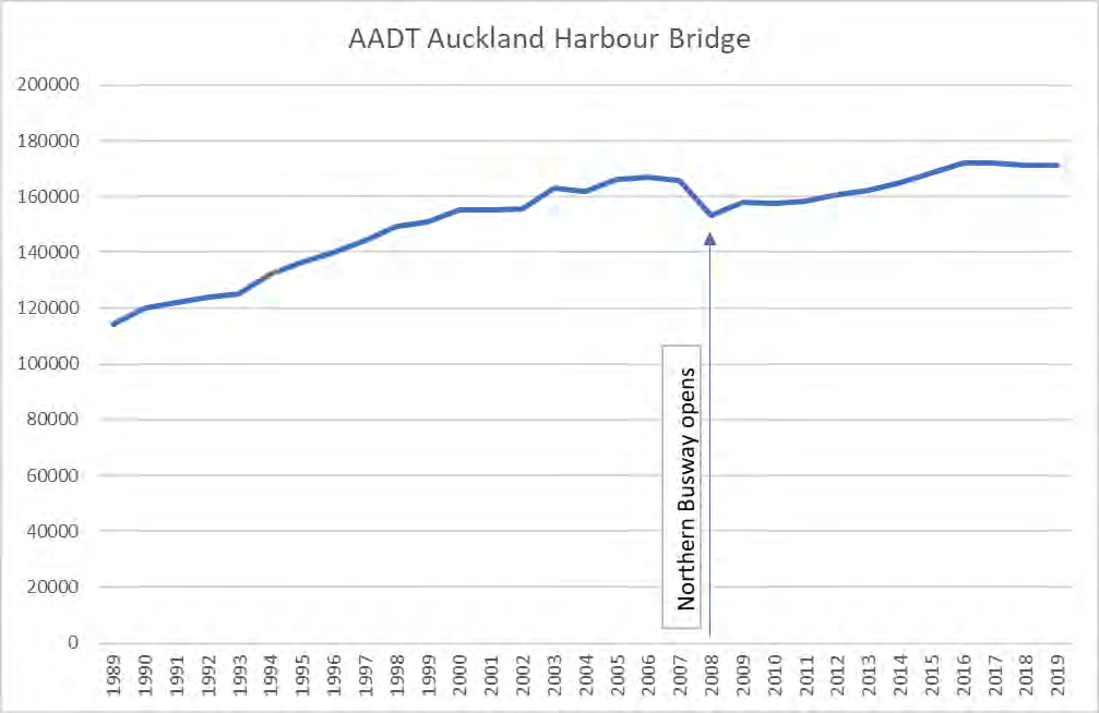
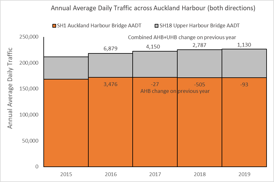
The AHB currently carries daily traffic volumes of between 180,000 and 190,000 on typical weekdays and
between 140,000 and 160,000 at weekends. Vehicle trips across the bridge are more or less evenly split
between those to / from the CBD and those to / from SH16 to the west and SH1 to the south. Traffic
volumes over the AHB have been decreasing slightly for the last three years and have only risen 3% in the
last 12 years, an average of 0.2% a year.
link to page 3 link to page 6 link to page 5 link to page 6 link to page 5 link to page 6
Lane configurations and lane capacity by configuration. MLB timing and capacity impacts of move
operation. SMB and Fanshawe.
Figure 1 to
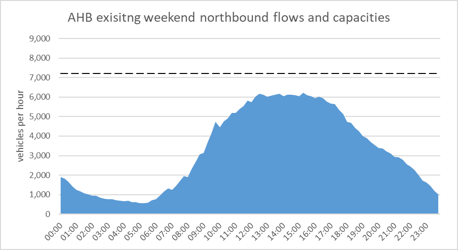
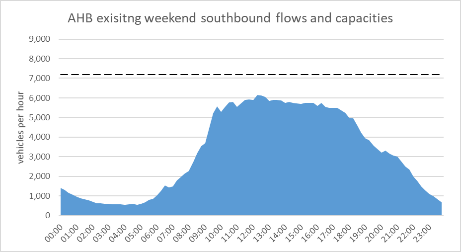
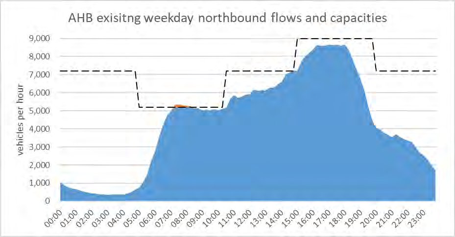
Figure 3 illustrate typical profiles of flows arriving at the bridge and the lane capacity available
on the bridge over the day, by direction for both weekdays and weekends. At weekends when the bridge
remains in a 4-northbound / 4-southbound configuration from Friday evening to Monday morning, the
bridge itself forms the capacity constraint on the SH1 corridor. Demands peak around 6,000 vehicles per
hour and are roughly sustained between about 11am and 4pm – meaning there is around half a lane of
spare capacity in each direction during this time.
Figure 1 – Summary of typical weekend day northbound (top) and southbound (bottom)
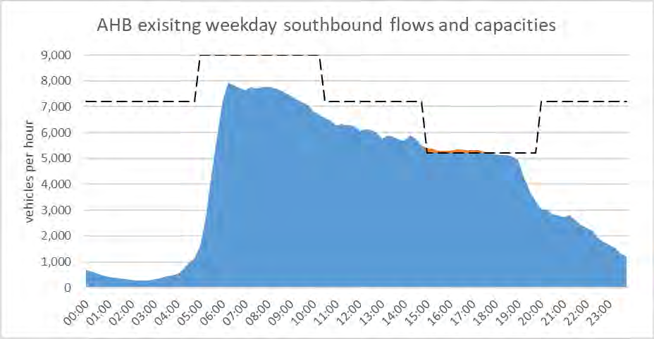
On weekdays these flows reach the capacity of the bridge during the peaks, in the counter-peak direction
(3 lanes), indicated by the red lines on the graphs i
n Figure 2 an
d Figure 3. In the peak direction at these
times (5 lanes) there are upstream capacity constraints where congestion forms - providing a measure of
protection against bottlenecks forming at the foot of the bridge itself. As a consequence, the flows shown
in the graphs do not fully reflect demand at these times, but rather the rate at which traffic can reach the
bridge itself (referred to as “arrival flows”)
. Figure 2 and
Figure 3 include lane diagrams of the approaches
to the bridge in the peak (5 lane) configurations illustrating the flow relative to capacity at these approach
link to page 5 link to page 6 link to page 4
constraint locations. Volume-to-Capacity (V/C) ratios in excess of 0.95 are essentially at capacity since
capacity in practice is not a fixed value and flows over this level cannot be sustained for long before flow
breaks down and congestion starts to for
m1.
In the southbound direction the 5-lane bridge configuration in the AM peak is fed by four lanes upstream
– three from downstream of Esmonde Road, plus a lane gain at Onewa Road on ramp. The Esmonde on-
ramp merge is one of the primary critical bottlenecks on the motorway network, and along with the 5-
lane AM peak configuration on the bridge performs an important strategic function: it ensures no delays
to AM peak PT services on the Rapid Transit Network that use general traffic lanes from Onewa Rd to
Fanshawe Street. The 4-lane capacity at Onewa lane gain (immediately prior to the addition of the AM
fifth lane on the right hand side) exceeds the 4-lane capacity of the bridge itself, due to the bridge
approach gradient and high lane changing associated with traffic joining at Onewa Road. As a
consequence, the AM peak arrival flows at the bridge exceed the capacity of a 4-lane bridge configuration.
In the northbound direction the 5-lane capacity of the bridge exceeds the 5-lane capacity of St Mary’s Bay
due to the significant curvature and lane changing of the St Mary’s Bay section, and the gradient exiting
Victoria Park Tunnel. However, traffic entering from Curran Street merges into the segregated 2-lane
section leading up to the western clip-on of the bridge. The additional input of demand from this on-ramp
routinely leads to the 2-lane section reaching capacity during the PM peak - causing localised flow
breakdown and congestion while the 3 lanes on the main truss have some capacity remaining. This
localised flow breakdown creates minor delays to peak PT services on the Rapid Transit Network that use
general traffic lanes on approach to the bridge. Note that since the start of NCI construction, capacity
constraints associated with the long-term traffic management at this work zone cause extensive queuing
on the northern motorway northbound in the PM peak. This often extends back to the bridge – limiting
the peak flows it achieves and causing more extensive congestion through St Mary’s Bay. This is expected
to reduce once NCI construction completes.
Figure 2 and
Figure 3 also illustrate the how many vehicles using the bridge use city exits (southbound)
and how many enter from the city (northbound), compared to how many vehicles come from or continue
onto the southern and northwestern motorways. Vehicle flows are more or less evenly split both in the
peak and over the whole day between those to/from the city and those to/from other parts of the region.
1
Volume-to-capacity ratios more than 1.0 cannot occur in practice. In this situation measured volume is the actual
capacity achieved on that day (with the resulting V/C at, or very close to, 1.0). Excess arrival demand then queues
upstream of the constraint, waiting to be discharged at the capacity rate – in other words a bottleneck.
 AHB Northbound
AHB Northbound
AHB Northbound
93,000
Daily
93,000
Daily
8,500
PM peak hr
8,500
PM peak hr
AHB
From CBD From SH1+SH16
8,500
9,000
Capacity
47%
53%
Daily
0.94
V/C ratio
52%
48%
PM peak hr
Curran
Curran
PM peak hr
900
Daily
9%
St Mary's Bay
PM peak hr
10%
7,600
8,250
Capacity
0.92
V/C ratio
Fanshawe
Fanshawe
PM peak hr 2,400
Daily
22%
Vic park Tunnel
PM peak hr
31%
5,200
5,400
Capacity
0.96
V/C ratio
Wel igton St
Wel igton St
Daily
7%
PM peak hr
300
PM peak hr
3%
SH16
Port
SH16
Port
Daily
13%
9%
Daily
PM peak hr
500
600
PM peak hr PM peak hr
5%
7%
PM peak hr
SH1
SH1
Daily
41%
PM peak hr
3,800
PM peak hr
43%
Figure 2 – Summary of typical weekday northbound
 SH1
AHB Southbound
SH1
AHB Southbound
4,600
91,000 Daily
Esmonde
7,600 AM peak hr
1,200
To CBD To SH1 + SH16
53%
47%
Daily
53%
47%
AM peak hr
Exmouth Rd
Capacity
5,800
5,800
Shel y Beach
V/C ratio
1.00
9%
Daily
9%
AM peak hr
Fanshawe
200
off
14%
Daily
Onewa
18%
AM peak hr
2,000 on
Cook
10%
Daily
Tol Plaza
12%
AM peak hr
Capacity
9,750
V/C ratio
0.78
7,600
AHB
SH16
Port
Capacity
9,000
Daily
8%
20%
Daily
V/C ratio
0.84
AM peak hr
7%
14%
AM peak hr
AHB Southbound
SH1
7,600 AM peak hr
40%
Daily
91,000 Daily
40%
AM peak hr
Figure 3 - Summary of typical weekday southbound
link to page 7 link to page 8
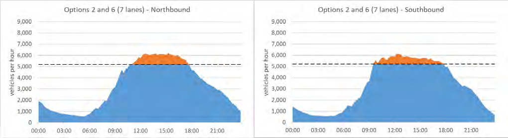
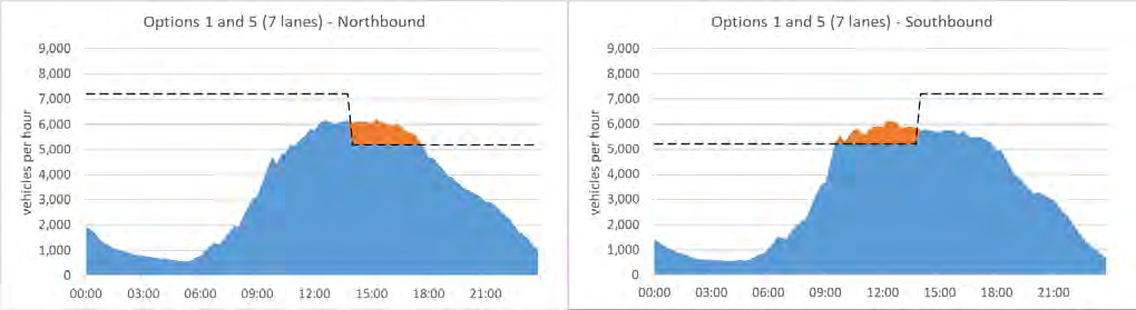
Traffic Capacity of Cycle Lane Options
Al options being considered for either a temporary (weekend) or permanent (7 days per week) cycle
facility across the AHB will lead to lane configurations on the bridge with capacities that are inadequate
to accommodate existing peak arrival flows, to a greater or lesser extent. The red sections on the graphs
in
Figure 4 and
Figure 5 below provide a comparative visual guide to the timing and extent of existing
arrival flows that would be in excess of bridge capacity under each option.
Some of the graphs represent more than one option because the overall effect on lane capacity is the
same irrespective of which side of the bridge the cycle facility is provided. For the purposes of these
illustrations it has been assumed that the timing of Moveable Lane Barrier (MLB) shifts would be
optimised to minimise the overall extent of the existing arrival flows profile being in excess of bridge
capacity considering both directions.
Figure 4 – Demand in excess of bridge capacity – temporary (weekend) options
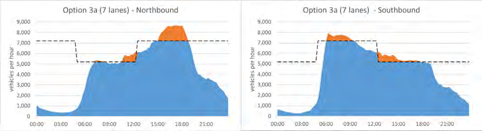
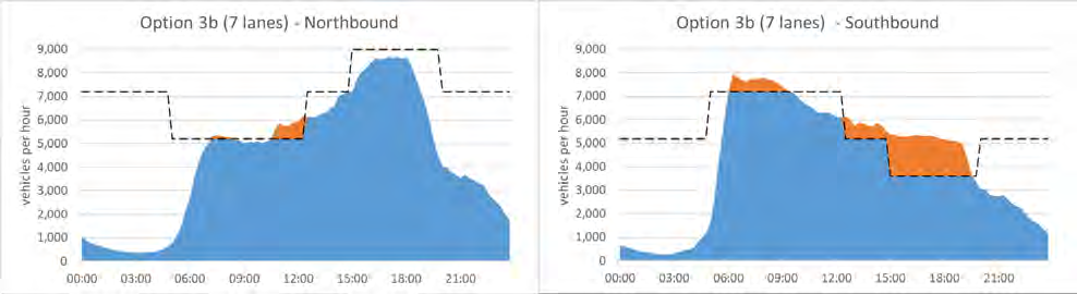
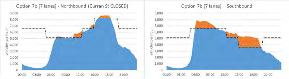
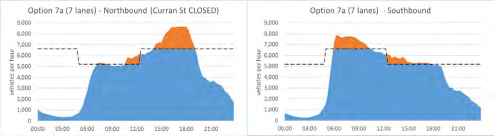
 Figure 5 - Demand in excess of bridge capacity – Permanent (7-day) options (continued overleaf)
link to page 8 link to page 8
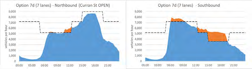
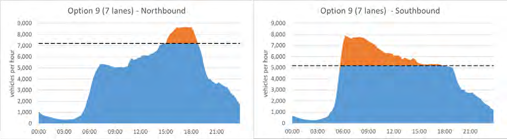
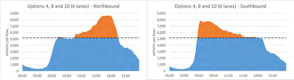
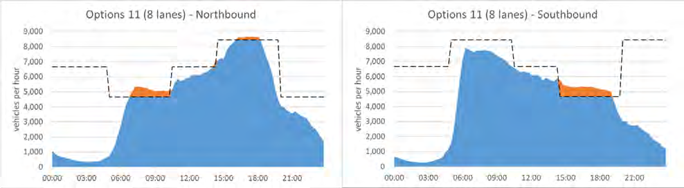 Figure 5 (continued) - Demand in excess of bridge capacity – Permanent (7-day) options
Note the fol owing in relation to the weekday graphs in
Figure 5:
• The northbound traffic capacity achieved in 4-lane and 5-lane configurations is slightly lower in
options where Curran Street on ramp is closed (options 7a and 7b). This is because with the
addition of Curran Street traffic at Fanshawe Street, St Mary’s Bay becomes the critical capacity
constraint (with its slightly lower per lane capacity than the bridge).
link to page 10
In option 11 the 5-lane configuration in either direction has slightly lower capacity than the current
operation. This is due to the lane narrowing on the clip-ons which wil introduce a capacity reduction of
around 15% on each of the clip-on lanes.
The key question for the traffic analysis is - what will happen to the traffic represented by the red areas if
a cycle facility is introduced on the bridge? There are two broad, interrelated responses:
1. Demand change. Customers affected will chose to modify their trip behaviour to avoid the
congestion and delays. This could include choosing the alternative route via SH18, SH16 and SH20,
re-timing their trip to a less busy time, choosing an alternative mode of transport (including
cycling or walking over the bridge on the new facility), undertaking a different trip that doesn’t
require crossing the harbour, or cancelling their trip altogether.
There has been a massive change in travel patterns since Covid, with significant numbers stil
working from home at least part of the working week. The US economists
2 have surveyed 30,000
workers and believe that 20% of workdays will be supplied from home in future compared to 5%
before Covid. Bus patronage figures over the AHB in June 2021 are 24% lower than pre-Covid
levels, a reduction of over a 1000 passengers in the AM peak hour. However, congestion levels on
the motorway are at a similar level to before the pandemic, consequently there must a large
number of people who were previously travelling by bus are choosing to drive today, to take
advantage of the spare capacity in the transport system.
2. Traffic congestion. This wil be generated on the approaches to the bridge, which will propagate
upstream over time impacting adjoining sections of the motorway, city and local roads upstream.
This will create delays not only for cars, buses and trucks using the bridge but also for other
customers caught in the upstream congestion. The congestion will persist until the available
bridge capacity is able to clear the backlog.
Demand changes expected over the next few years
Independent of the introduction of a cycle facility on the bridge over the expected life such a facility there
are a number of factors that are likely to change to both the overall traffic demand for the bridge and
potentially the profile of traffic arriving at the foot of the bridge. The main factors are:
• Ongoing changes to travel patterns caused by technological and societal changes such greater
ability to work remotely.
• Ongoing regional population growth in general (and significant expected growth around
Silverdale, Orewa and Warkworth in particular).
• The completion of the NCI project. Hiatus in AHB traffic growth since 2017 due to – WVT opening
+ NCI LT-TTM. Slow growth likely to return to AHB after NCI completes. Opposing drivers: removal
of TTM = attraction back to SH1, completion of NCI = attraction to WRR.
2 J M Barrero, N Bloom, S J Davis Why working from Home wil stick April 2021
link to page 7 link to page 8
Analysis Tools and Their Limitations
“All models are wrong, but some models are useful.”
The statistician George Box is known for this aphorism – and he goes on to say that the question you
should ask is not “is the model true?”, but “is the model good enough to be helpful for this particular
application?”
There are a number of available traffic analysis and modelling tools that can help to answer the question
of what will happen to the traffic represented by the red areas in the graphs o
f Figure 4 an
d Figure 5 if a
cycle facility was introduced on the AHB. However, none of these tools are ideally suited to the job, and
none on their own can give a fully robust answer. However, they all provide some help in trying to
understand the likely impacts on traffic.
The available tools are:
• AHB Queuing model (AHB-Q)
• Auckland Motorway Network Cell Transmission Model (CTM)
• NCI – SATURN
• AWHC – SATURN
• Auckland Dynamic Traffic Assignment Model (ADTA)
• Auckland Macro Strategic Model (MSM)
Brief paragraph on each tool supplemented by matrix on next page.
Then explain how each wil contribute to understanding the traffic response to each cycle lane option.
Coverage vs detail vs complexity. Include realistic congestion propagation in detail category. AHB cycle
lane options are essentially operational changes – not the sort of intervention EMME or SATURN or
intended for.
However, the critical strategic nature of the AHB link, combined with Auckland’s geography and poor
regional road network connectivity means the ripples from this stone will spread wide, requiring a tool
with large geographical coverage to understand impacts fully.
Issue of single-result nature of most models encourages a false-sense of accuracy + certainty in the results.
Uncertainty over demand changes are the biggest risk to this traffic assessment. Acknowledging the
uncertainty and testing multiple demand scenarios to provide ranges of results will help to tackle this.
Network and Mode coverage
Re-routing and
No re-routing
Re-routing
PT mode shift
Motorways and
Motorways and
Motorways and
AHB only
Motorway
and on ramps
local roads
local roads
local roads (whole
(partial network) (whole network) network) plus PT
Less realistic
No upstream queuing
MSM
Average upstream
queuing - peak period
SATURN
only
Representation of
Growth and recovery of
Congestion
queues over peak period
ADTA
only
Growth and recovery of
queues over the whole
AHB-Q
day
Growth and recovery of
queues over the whole
More realistic
day, plus congestion
AMN-CTM
responsive ramp signals
operation
Complexity and resource effort required
Very simple and quick - modify and execute in minutes
Simple and quick - modify and execute in under an hour
Moderate - modify and exectue in under 1 day
Complex - modifying and executing can take several days
Effects on Traffic Demand
• Re-route
o AHB journeys – UHB TT too high? Compare weekday v weekend
o other journeys – SH1/SH16 – SH20/SH16 to reduce SH1S queues?
o Use ADTA and SATURN volume difference plots to establish baseline level of re-routing
• Re-time
o Weekend only?
• Re-mode (AHB trips)
o to active modes – max-min
o Some active modes transfer from PT, not general traffic.
o Some active trips will be new generated trips, not transfers from other modes.
o PT – check shift needed to avoid all traffic impacts – then ask is this realistic?
• Summarise combined changes into demand sets for AHB-Q and CTM assessments (max-min
range):
o Min – high re-route, re-time and re-mode
o Max – min re-route, re-time and re-mode
o Re-route – based on ADTA/SATURN then inc/dec based on TT differences to give max-
min range.
o Re-time – global shift in LDM, plot network profiles – judge magnitude.
o Re-mode – CBD trips based on cycle counts SH16 and PT patronage trends?
o Traffic growth – high + low global factors based on recent network growth
o NCI completion – reflected in high + low re-route (both SATURN + ADTA have NCI
complete)
o Current demand = low re-route, low growth factor, low re-mode?
o Future demand = high re-route, high growth factor, high re-mode
o 3rd scenario sensitivity testing Current with high re-mode?
o 3 sets of H,M,L demands needed to cover all options (9 total demand scenarios) – as the
lower the remaining AHB capacity the more pressure for AHB demand to change
7 lane options HML demands
6 lane options HML demands
8 lane option HML demands
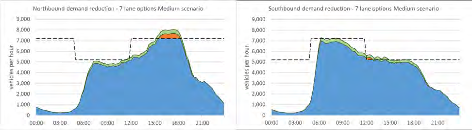
• Present demand profile plots for all scenarios? Example below – green indicates reduced
demand, red is remaining demand over config capacity
Effects on Network and Customer Journeys:
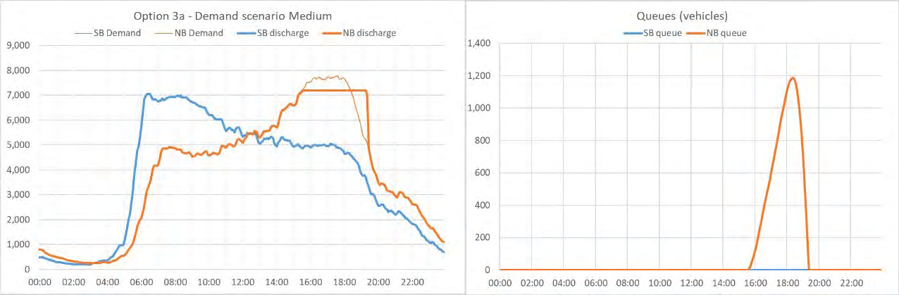
• AHB Q – baseline assessment and common-sense check
o Use flow profiles from CTM including demand changes
o Example profile graphs for one weekday + one weekend option
o Summary graphs for weekday options + weekend options (max-min ranges)
• MSM and DTA – region wide impacts
o Single congestion map for each peak? Compared to base
o Distribution of impacts rather than magnitude
o Issues with re-routing to WRR/SH16?
• SATURN NCI
o Compare distribution of impacts with ADTA. If seem inconsistent this will require
commentary
• CTM
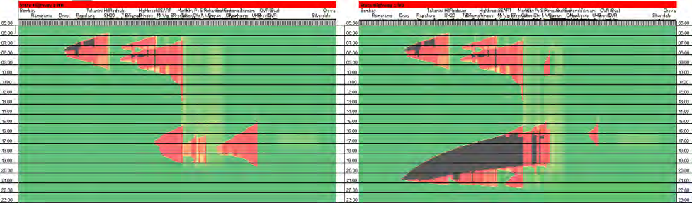
o SH1S NB and SH1N SB heat maps for al options
1 set weekdays (max + min plots for each option, 1 per page)
1 set weekends (max + min plots for each option, 1 per page)
o Network metrics (LCH) mainline + ramps
Weekday graph (al options, max-min)
Weekend graph (al options, max-min)
o Example SH1 NB heatmap – base vs Option 3a (7 lanes).
Note demand reductions not yet applied on this example
Improve presentation, legibility, labelling etc. and legend for colour scale
Appendices
CTM base model validation report?
CTM truck strike mini-validation?
Detailed heatmaps